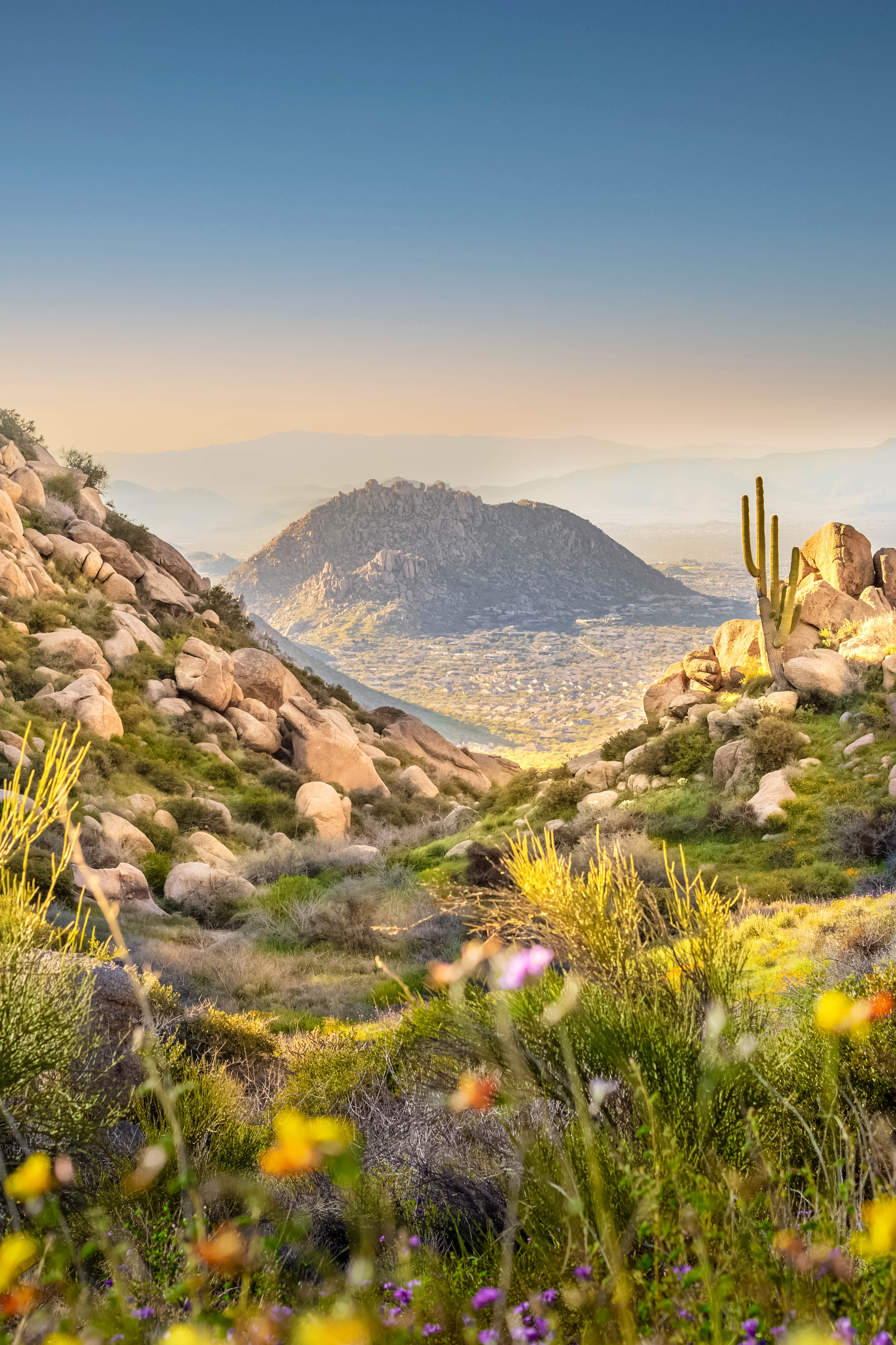
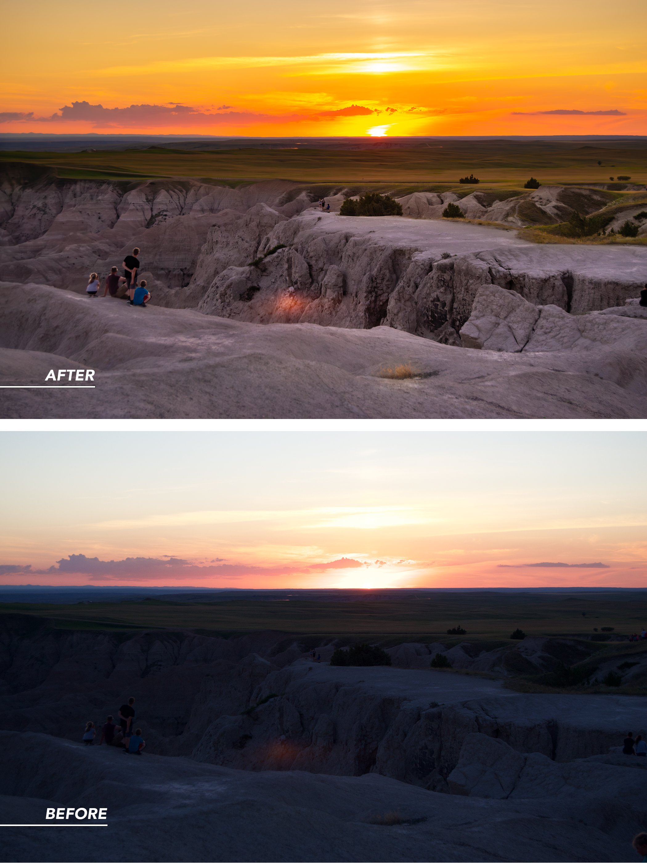
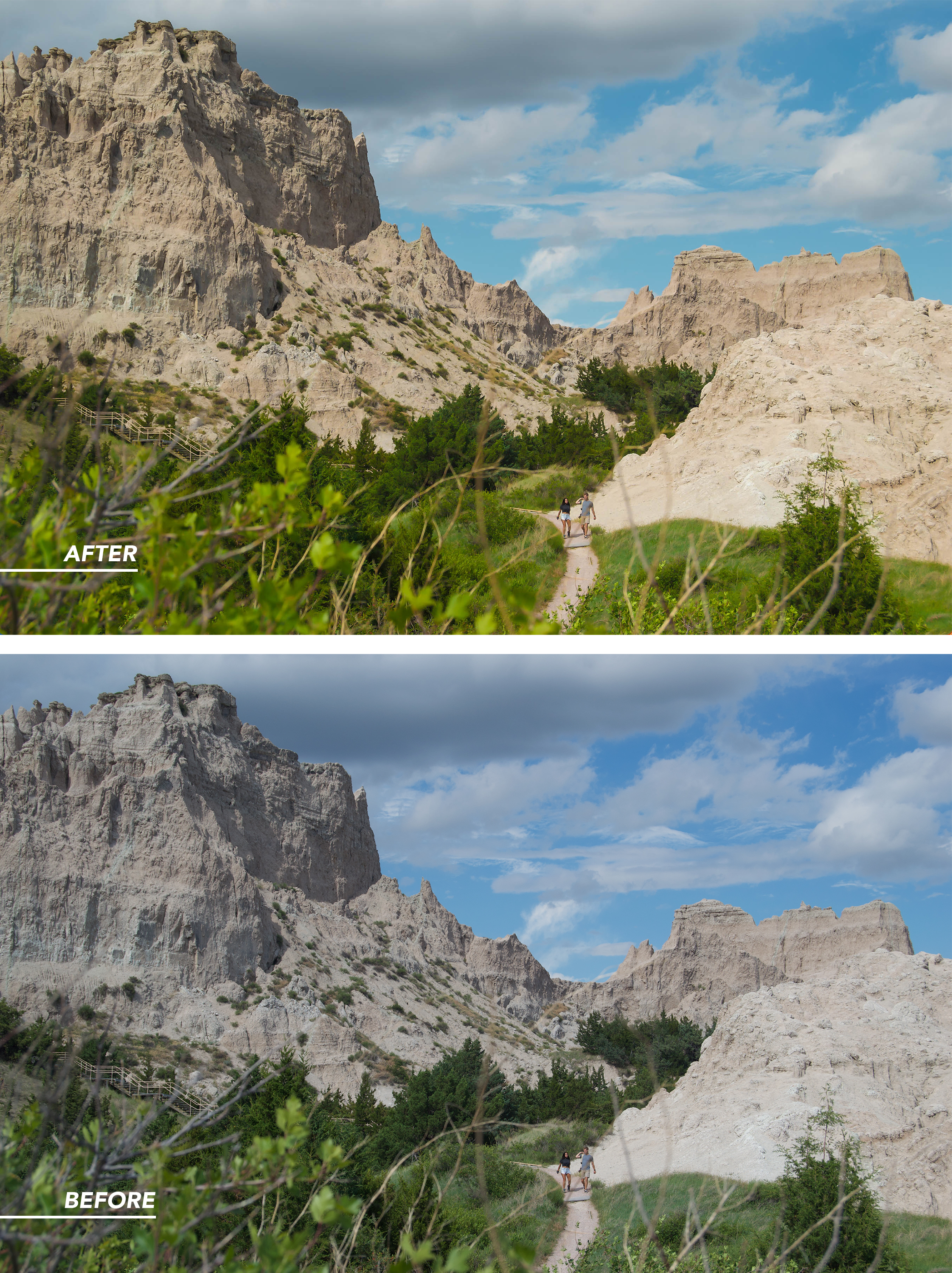
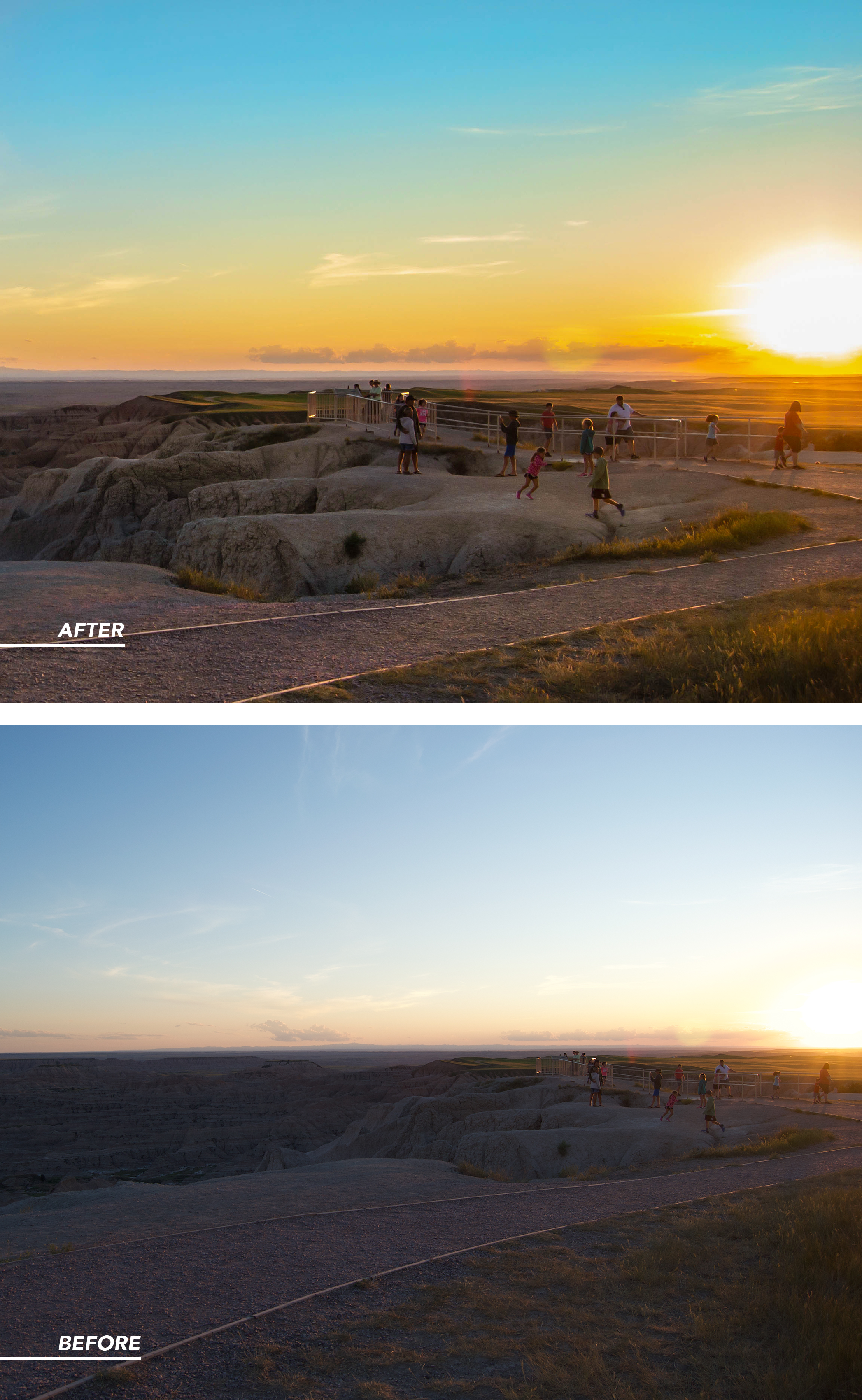
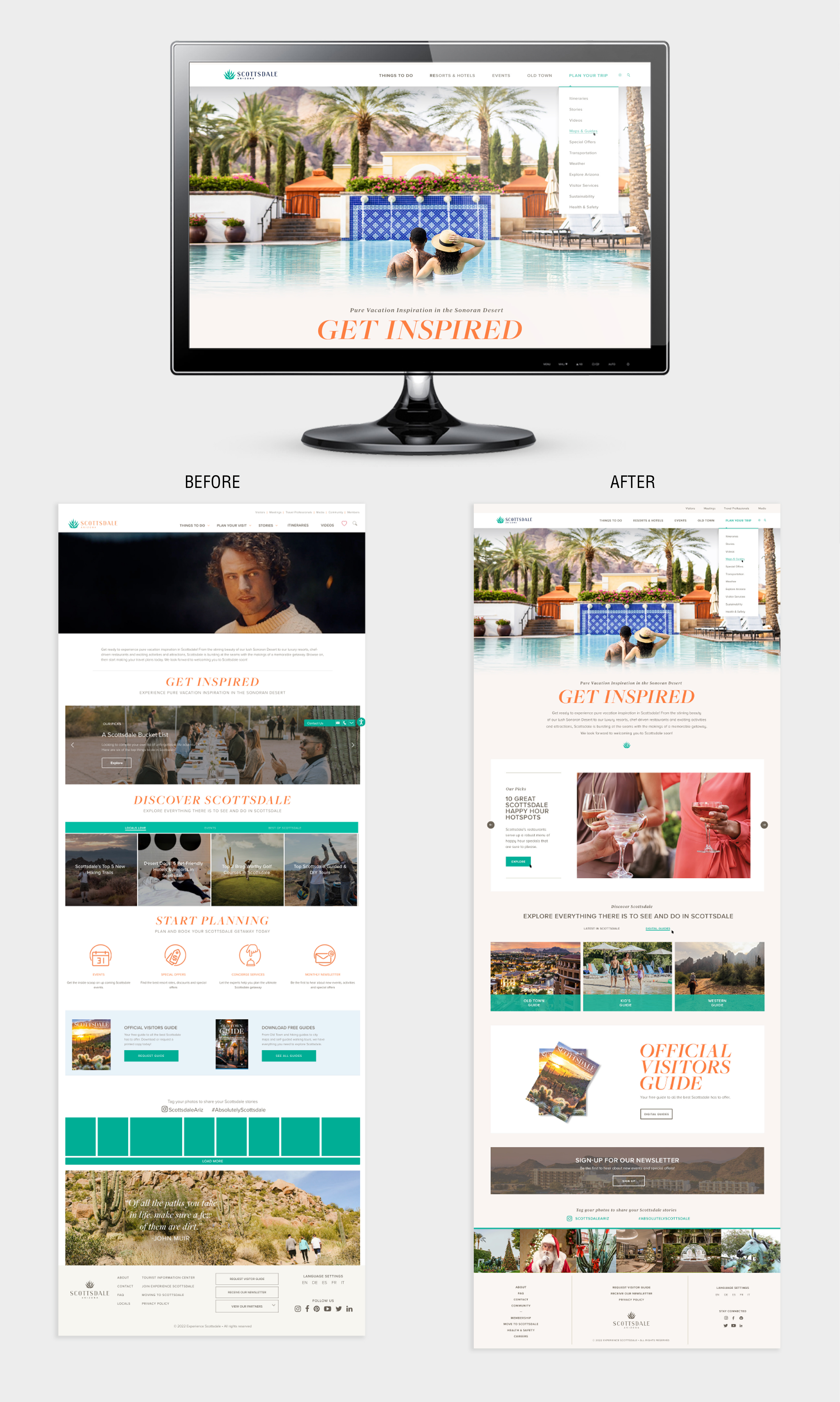
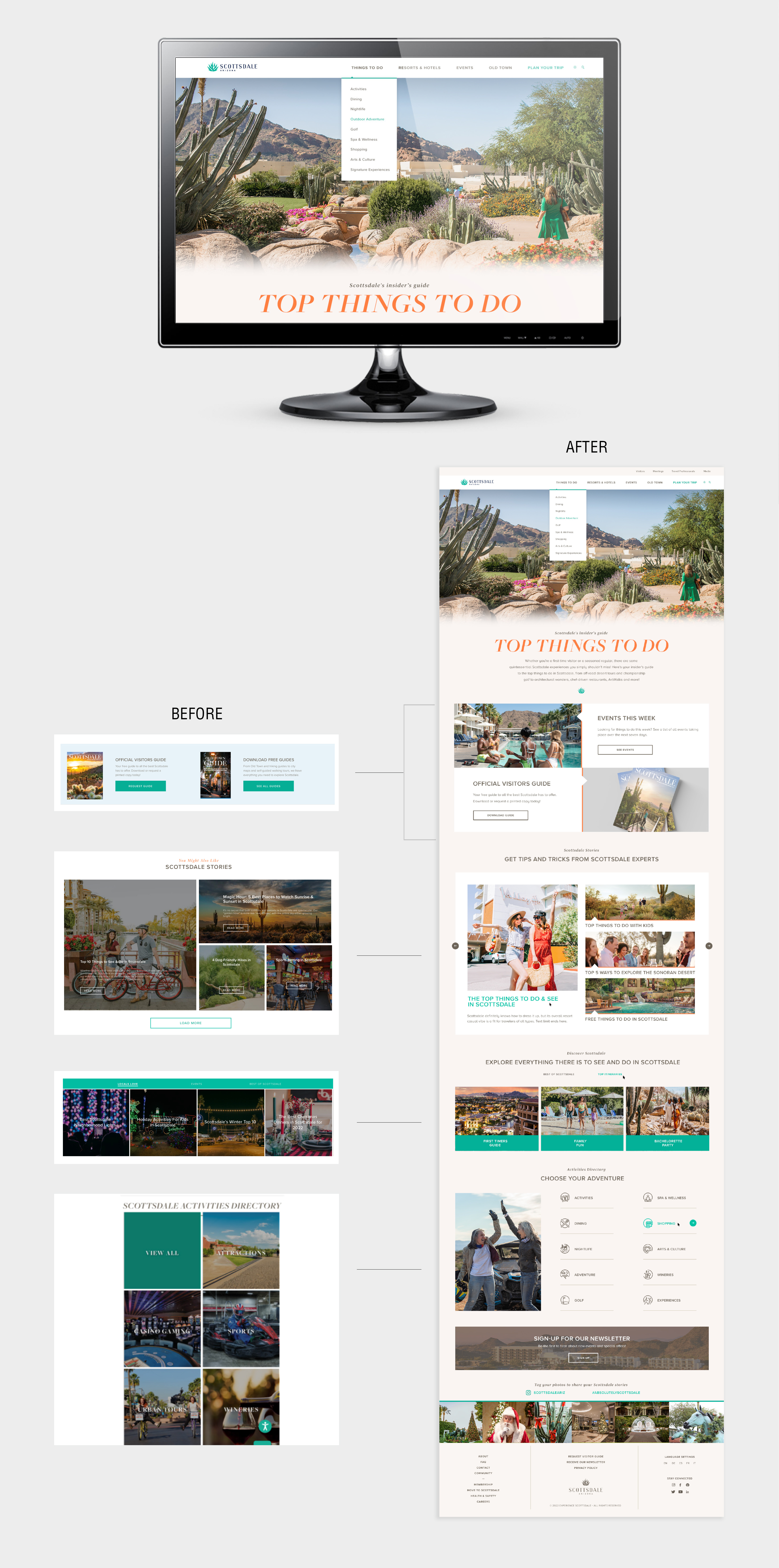
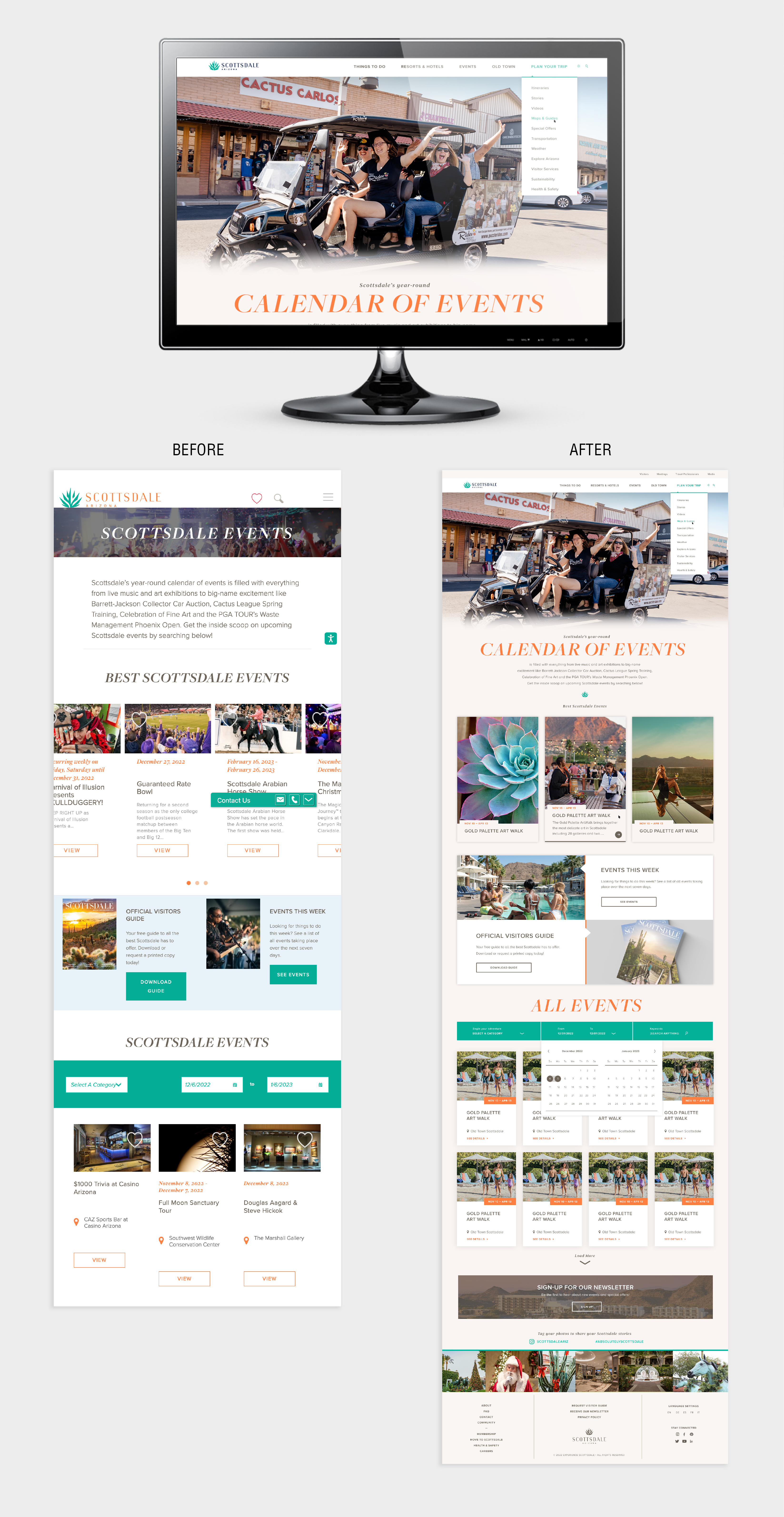
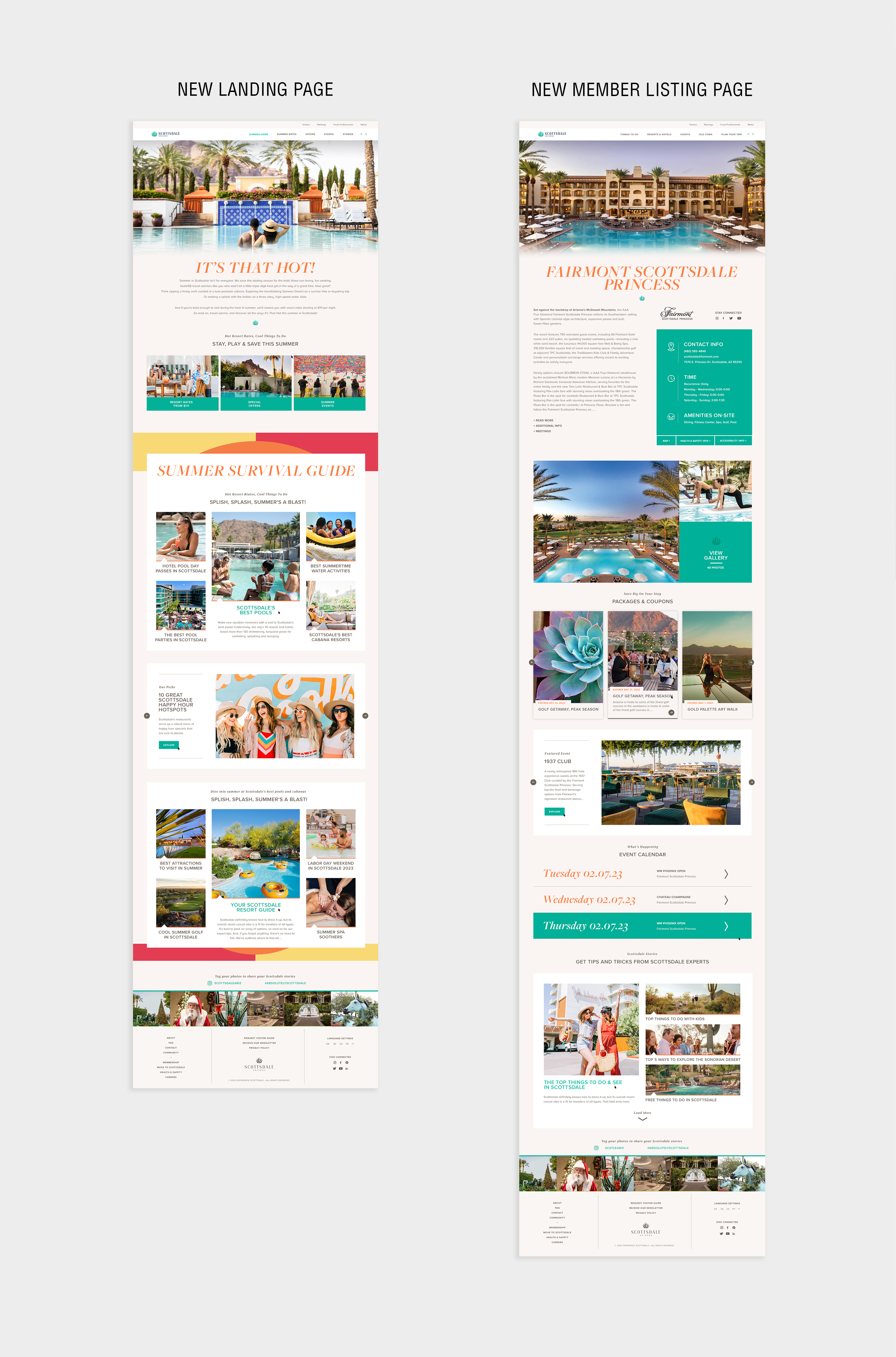
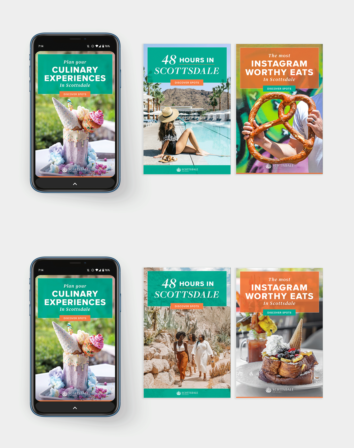
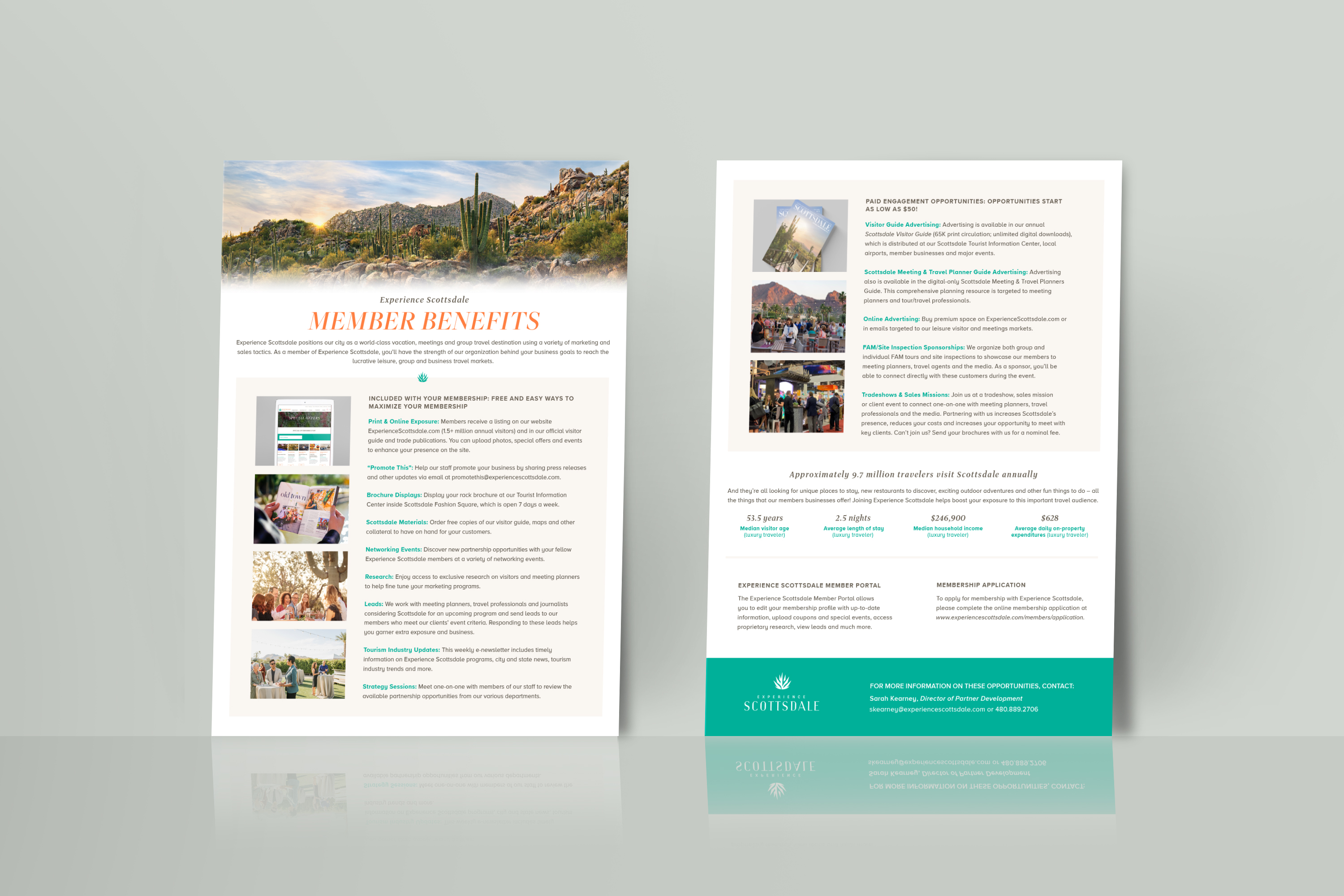
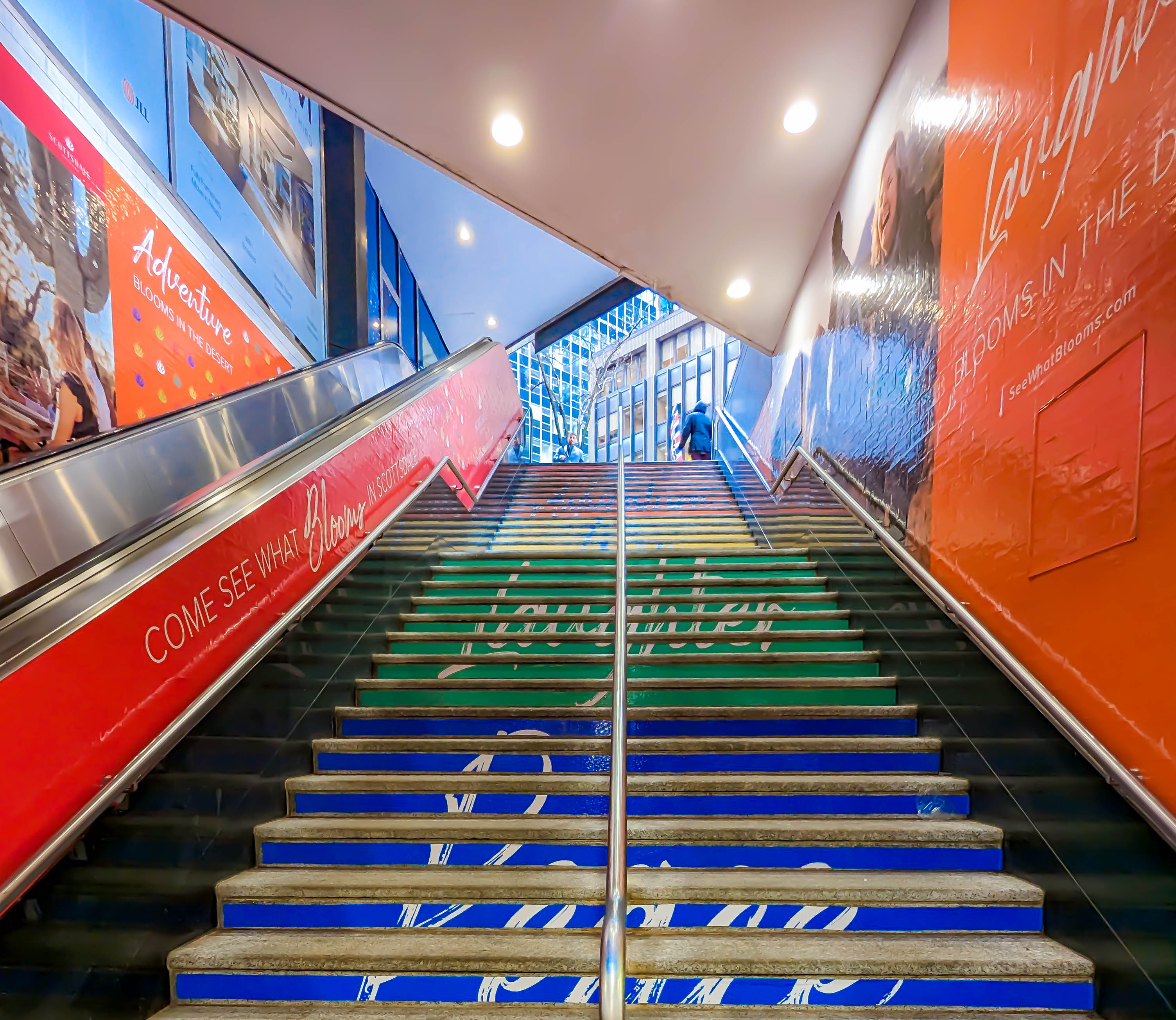
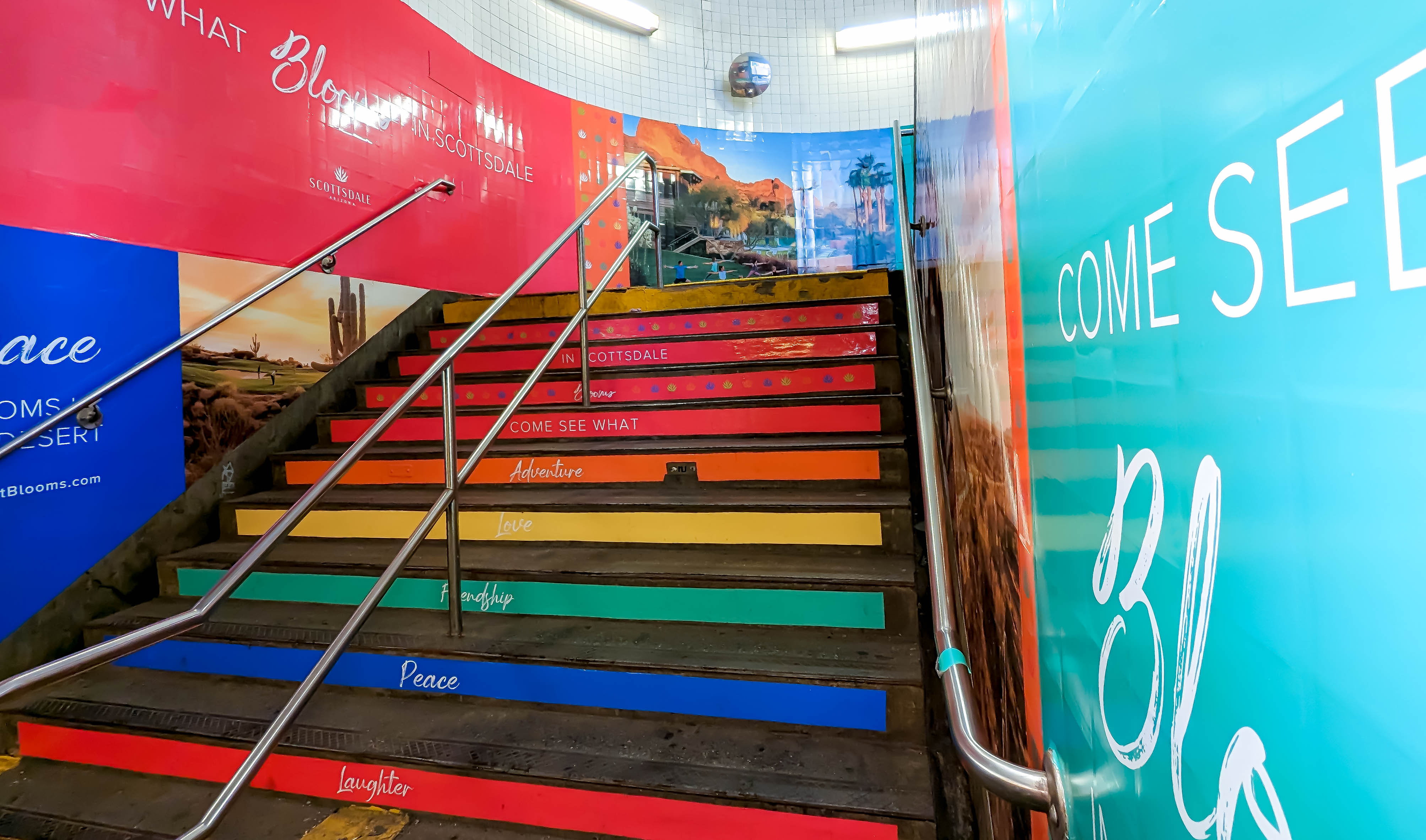
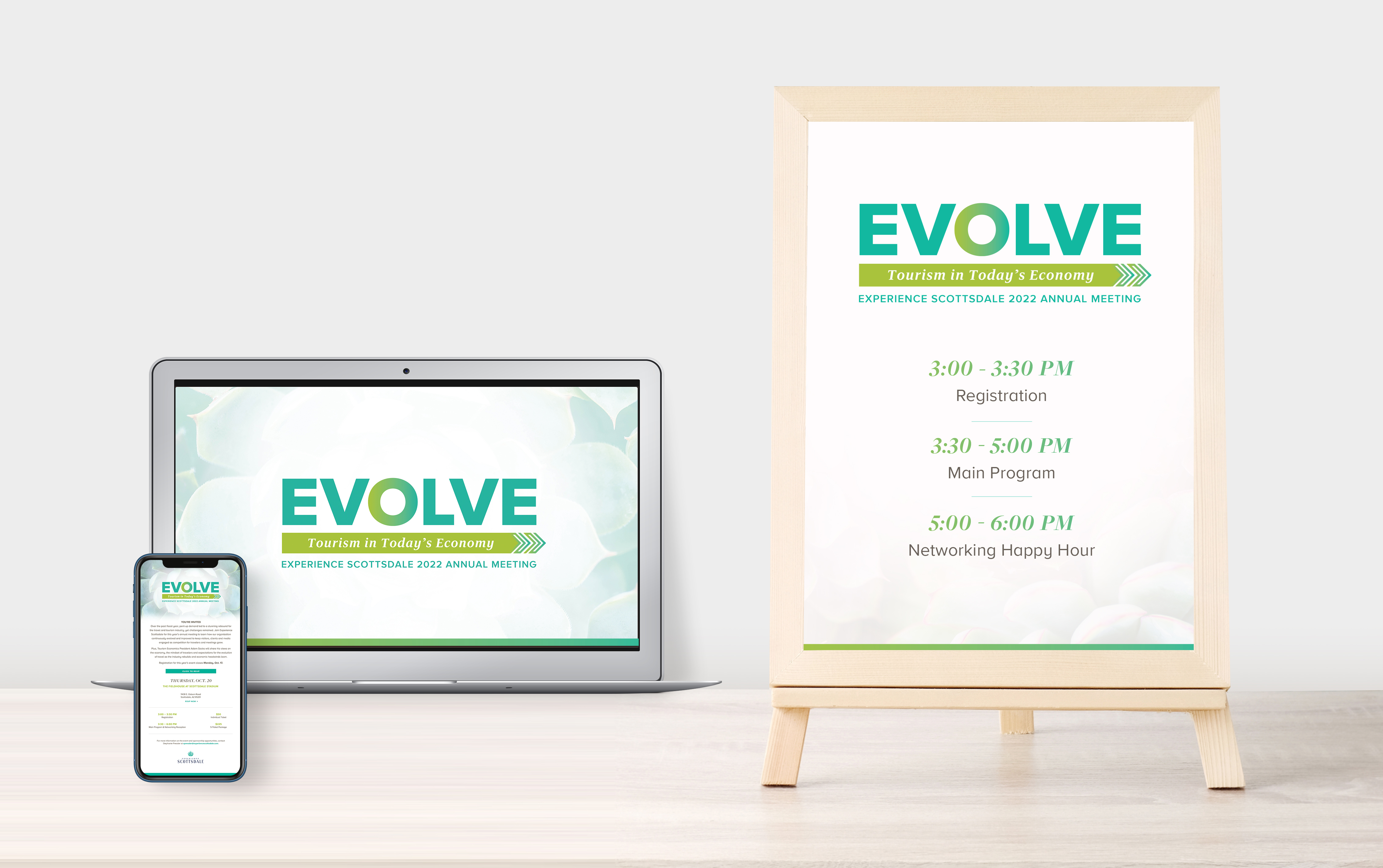
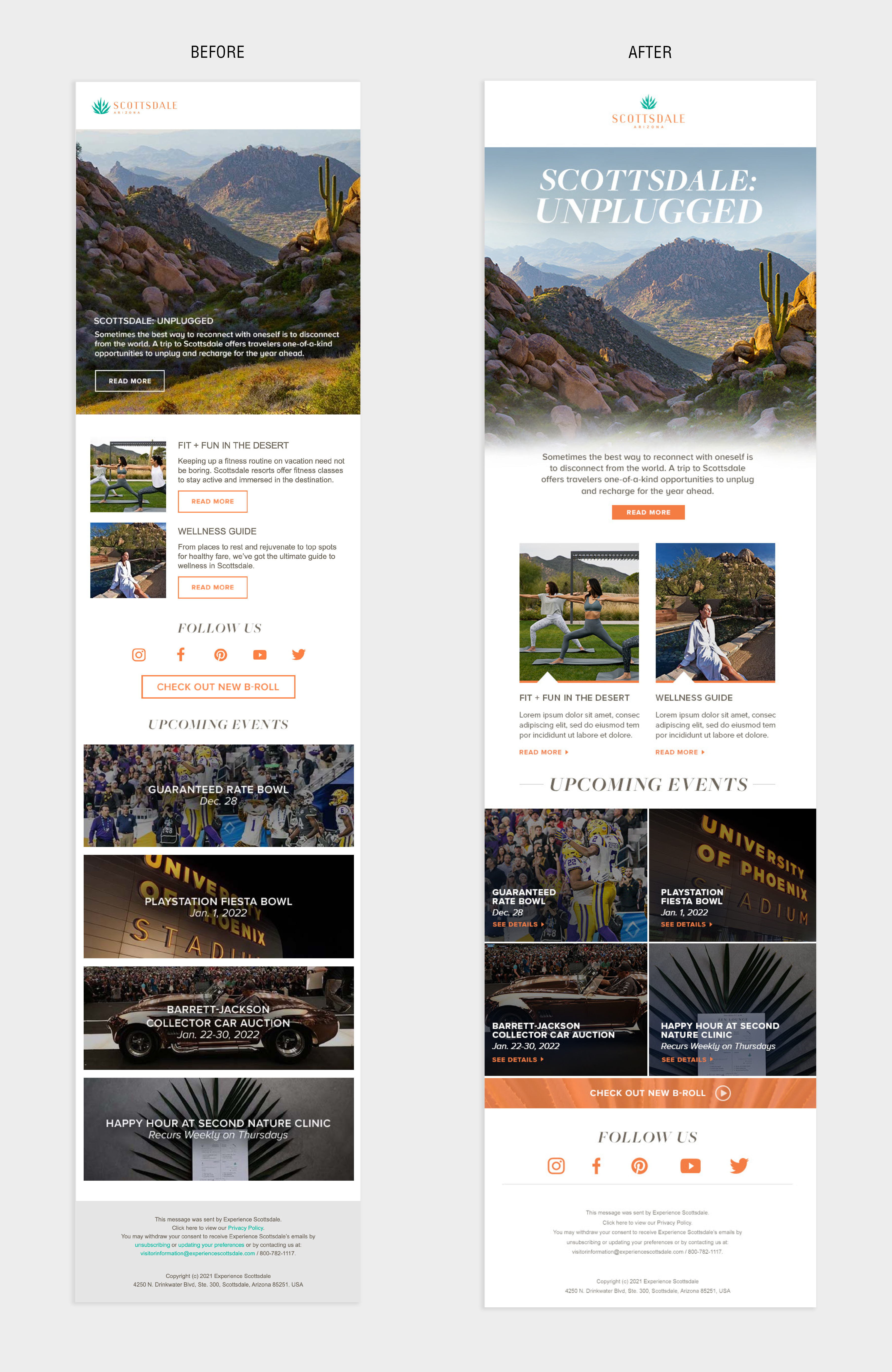
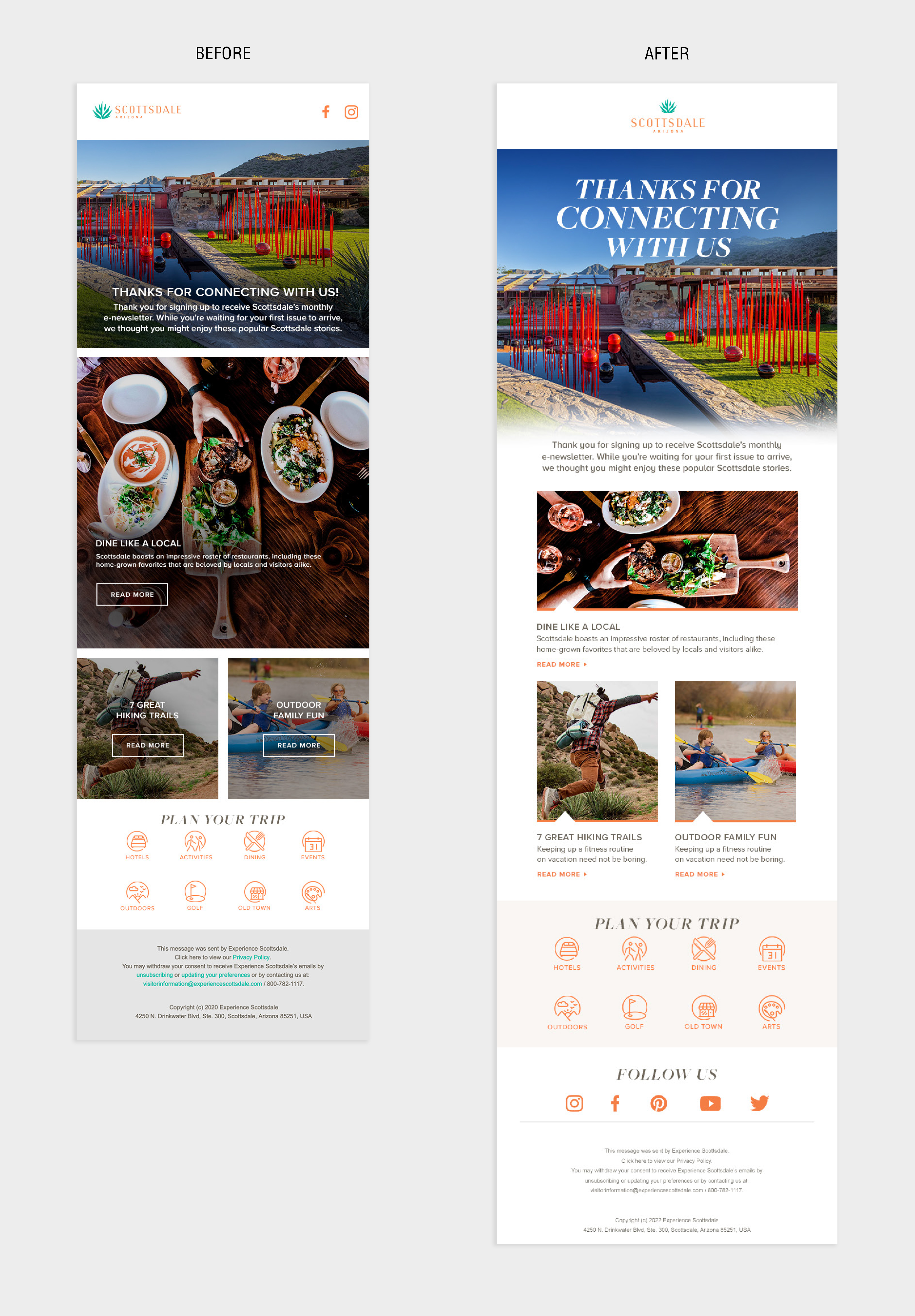
I worked on the Experience Scottsdale brand refresh, helped modernize their email campaign designs, animated display ads, advertising, sell sheets, tradeshow marketing, website, and all marketing materials while still adhering to the brand guidelines and it's core identity. Below you can see some of the before and afters I designed, as well as other materials I helped create for their annual meetings and tradeshows.
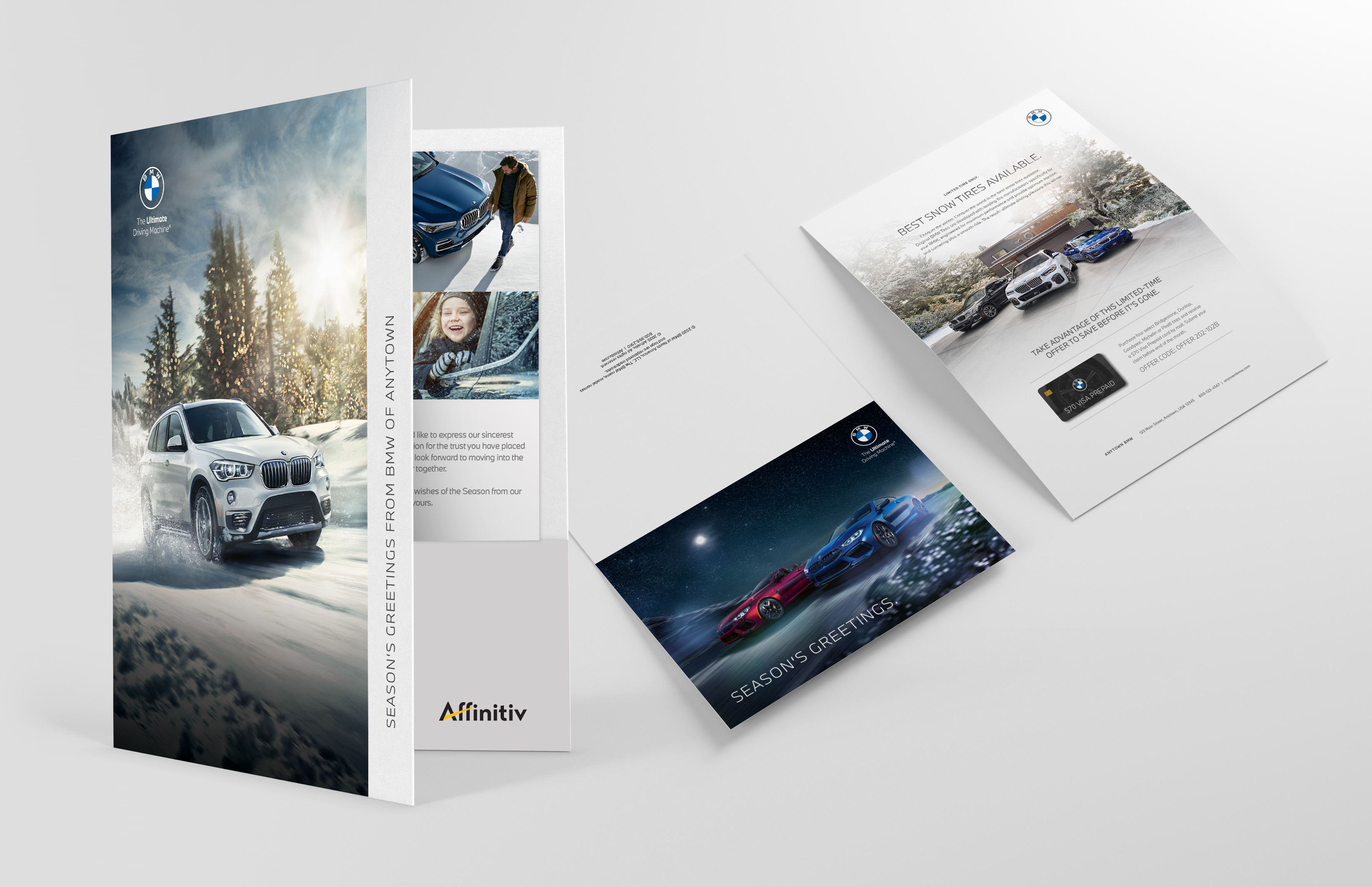
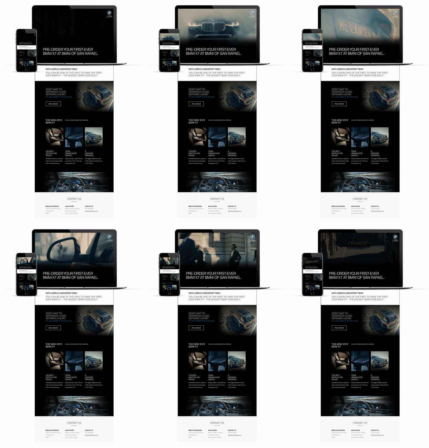
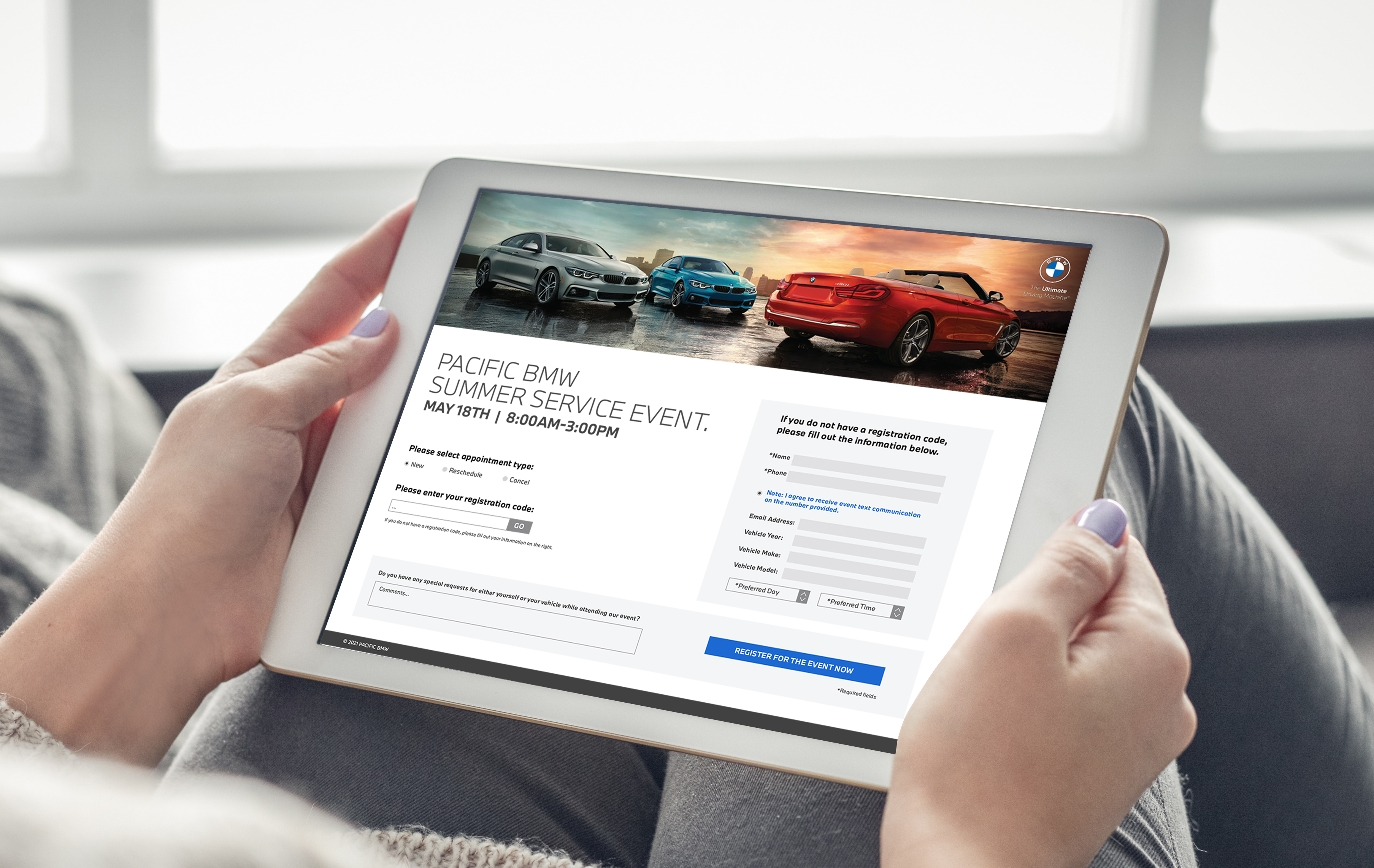
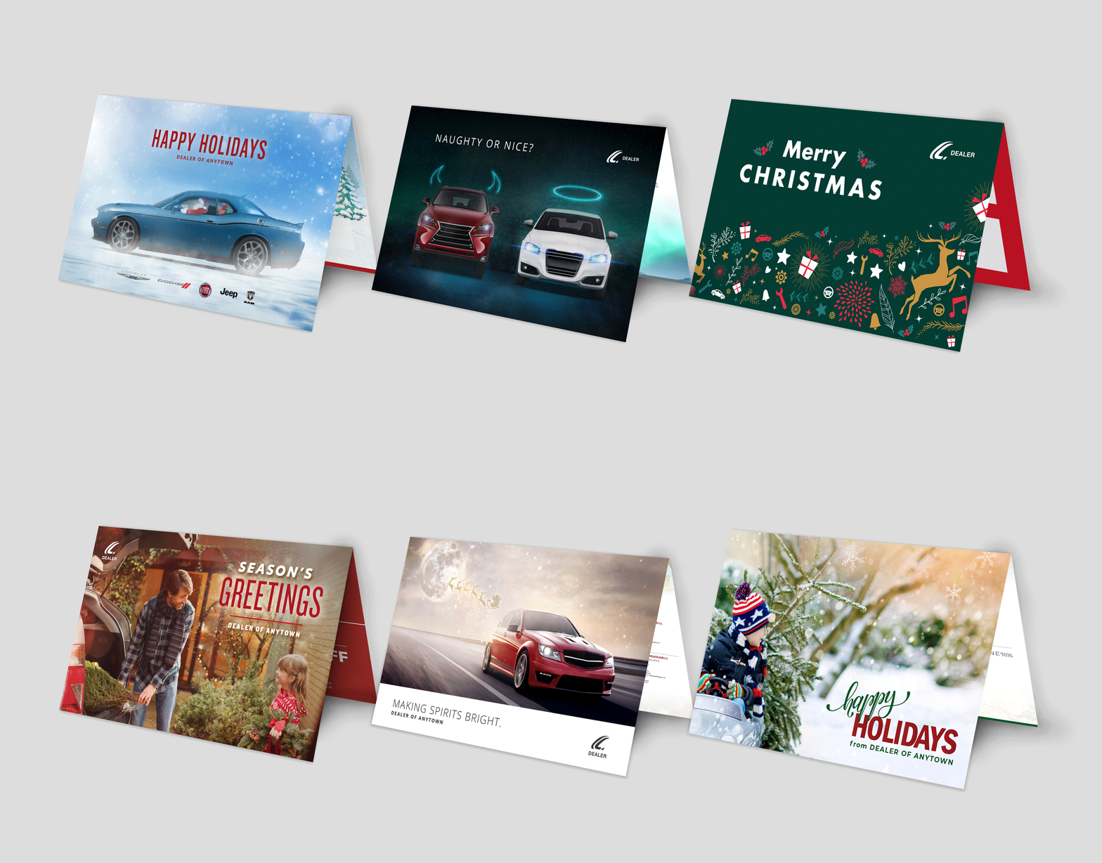
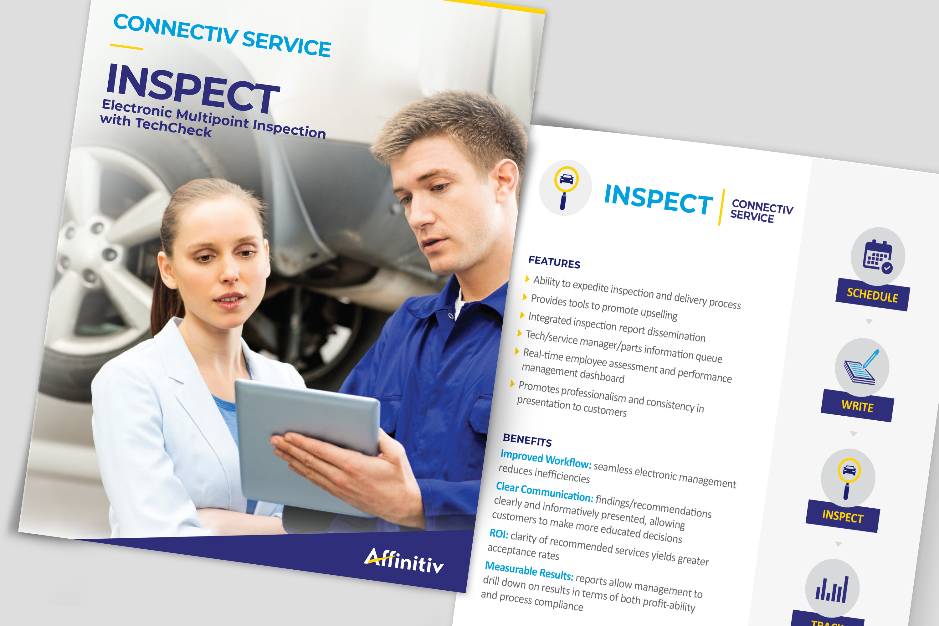
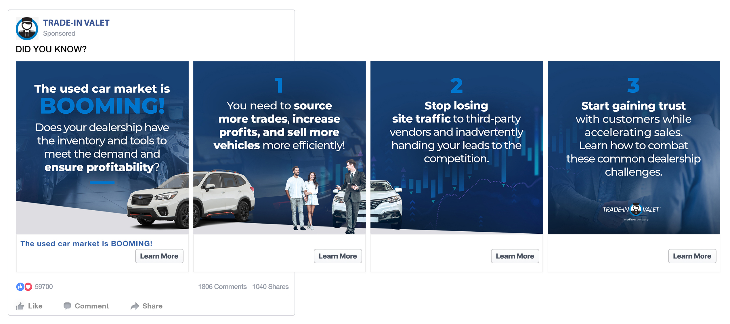
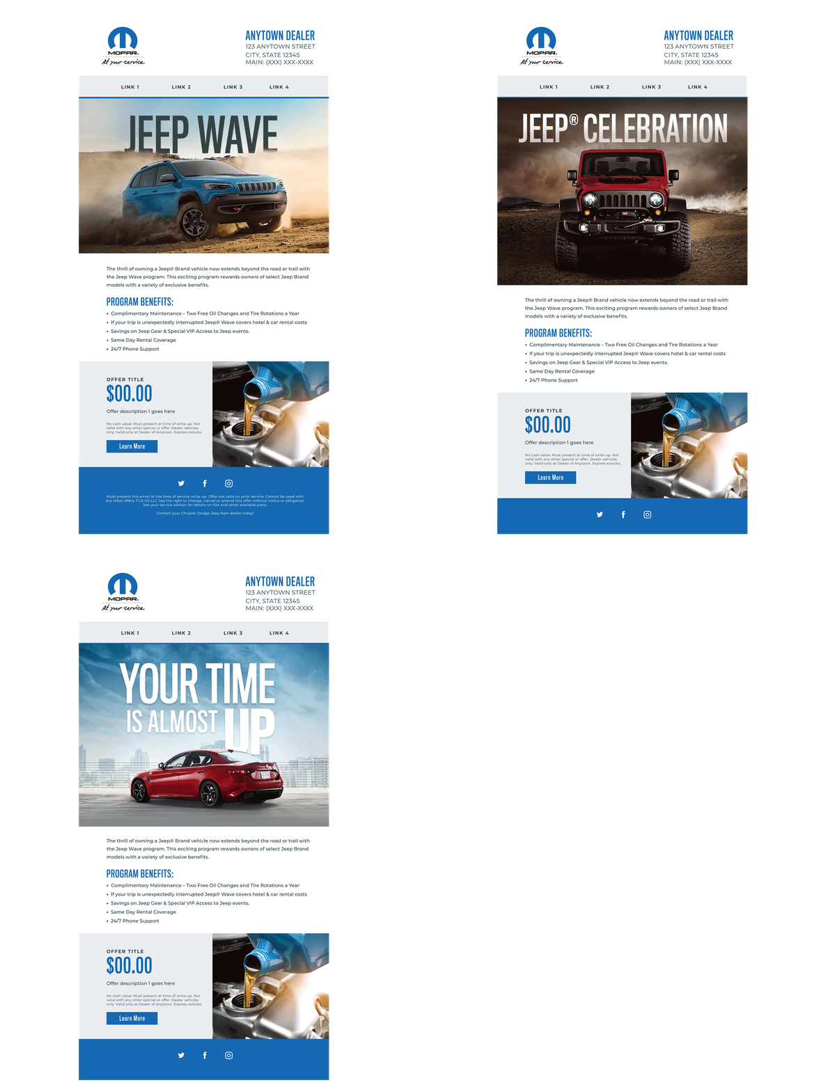
Affinitiv is a marketing advertising agency for the automotive industry, so I get to create artwork for many of the major manufacturings in the country. Here are some of the custom digital and print solutions I have designed over time. These vary from email marketing, ads, print marketing collateral mailers, brochures, postcards, landing page banners, artwork for website sliders and graphics for their websites. Clients include BMW, Kia, Subaru, Porsche and many others.

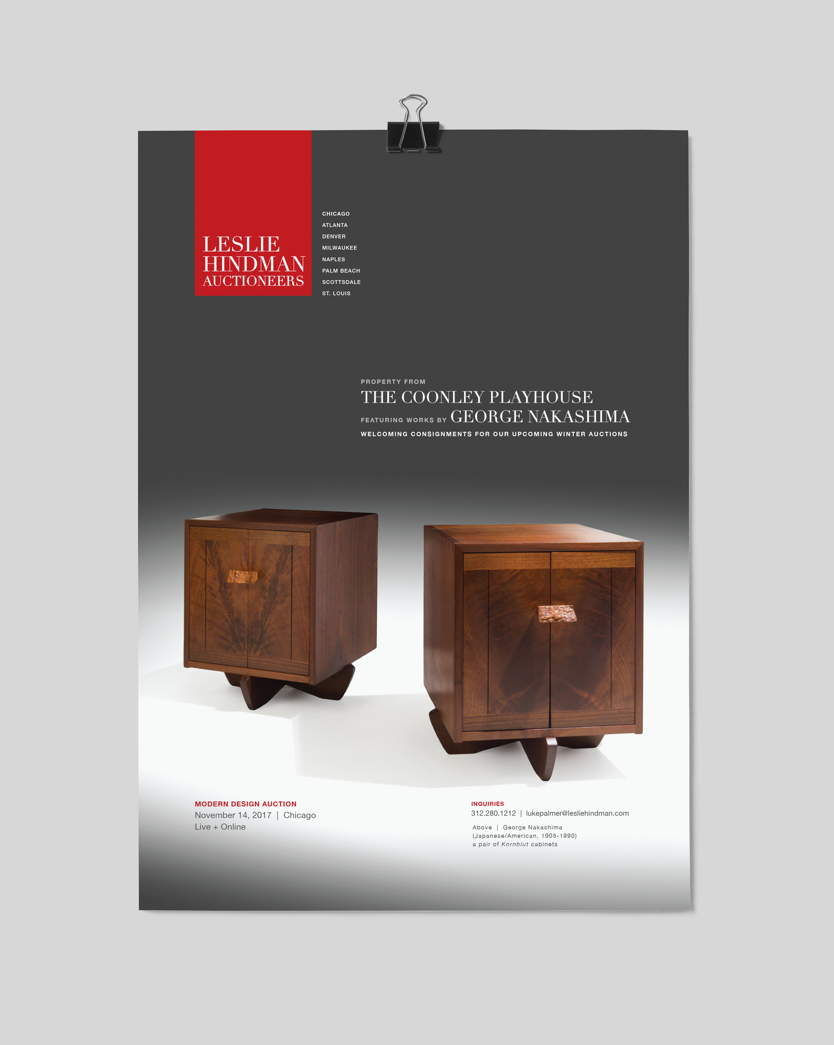
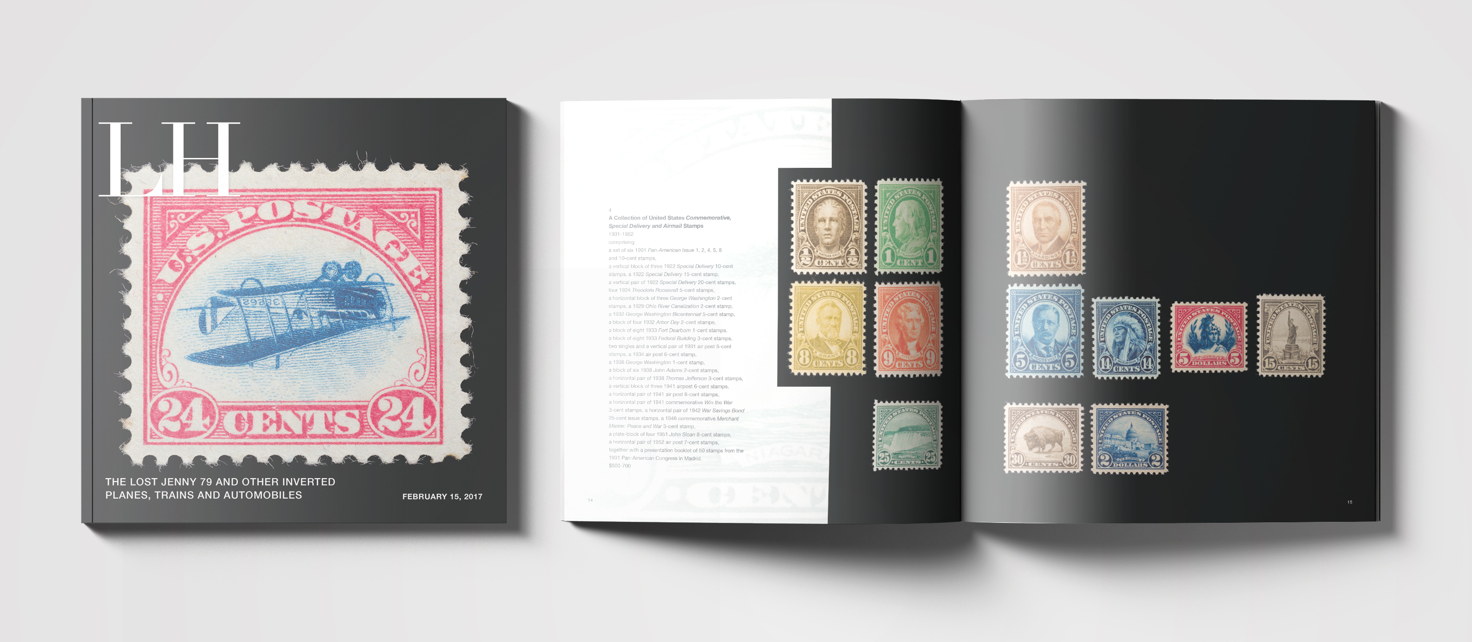
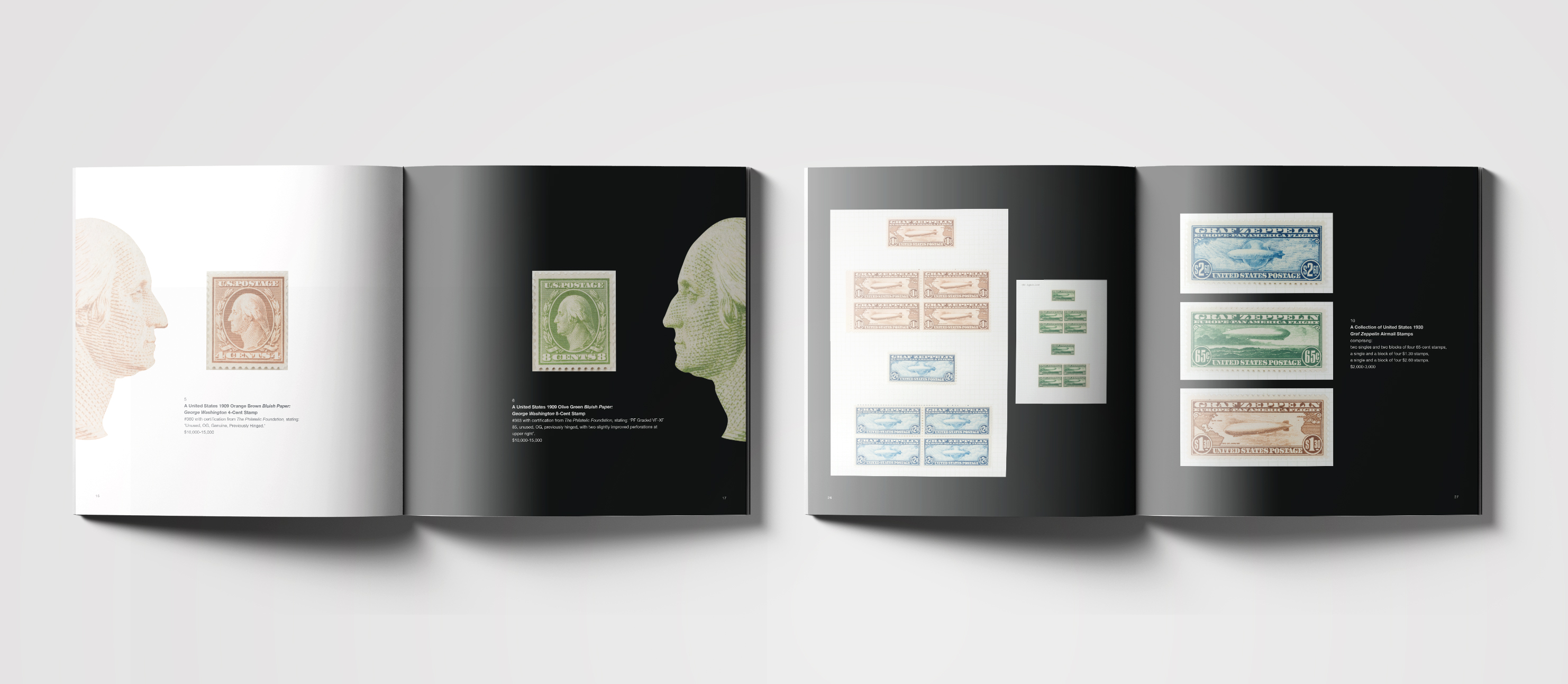
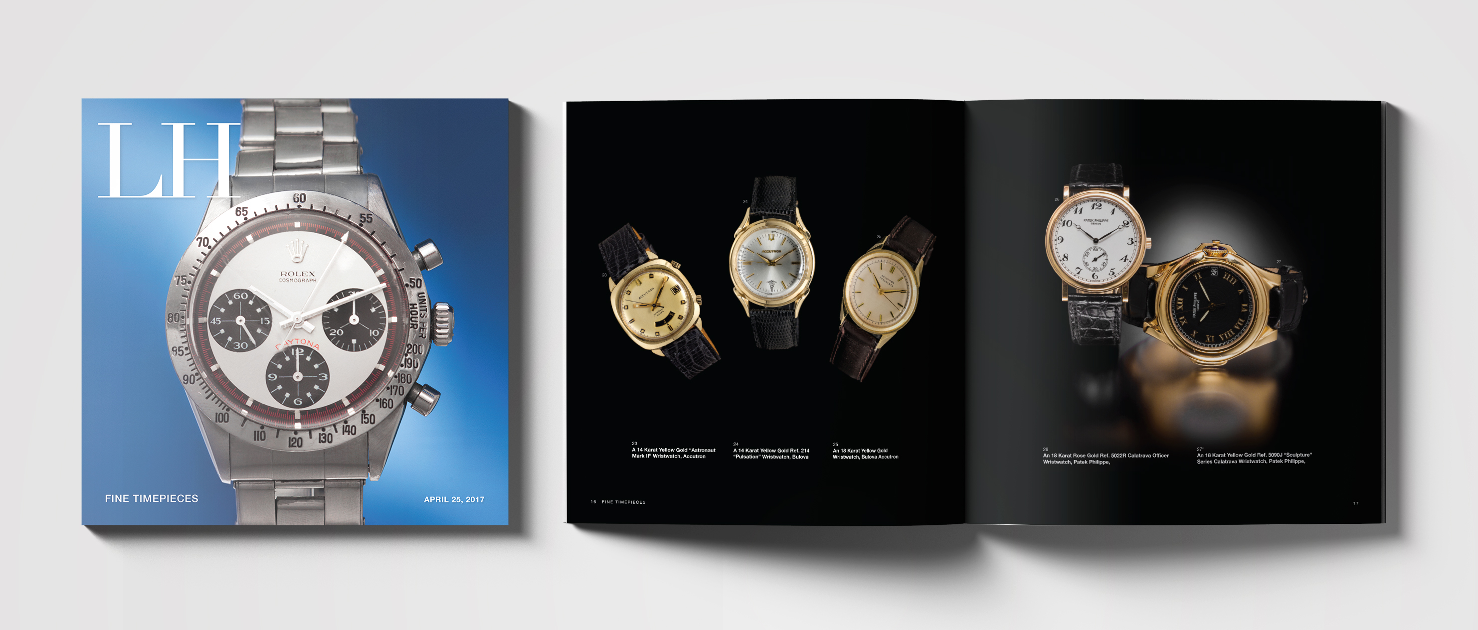
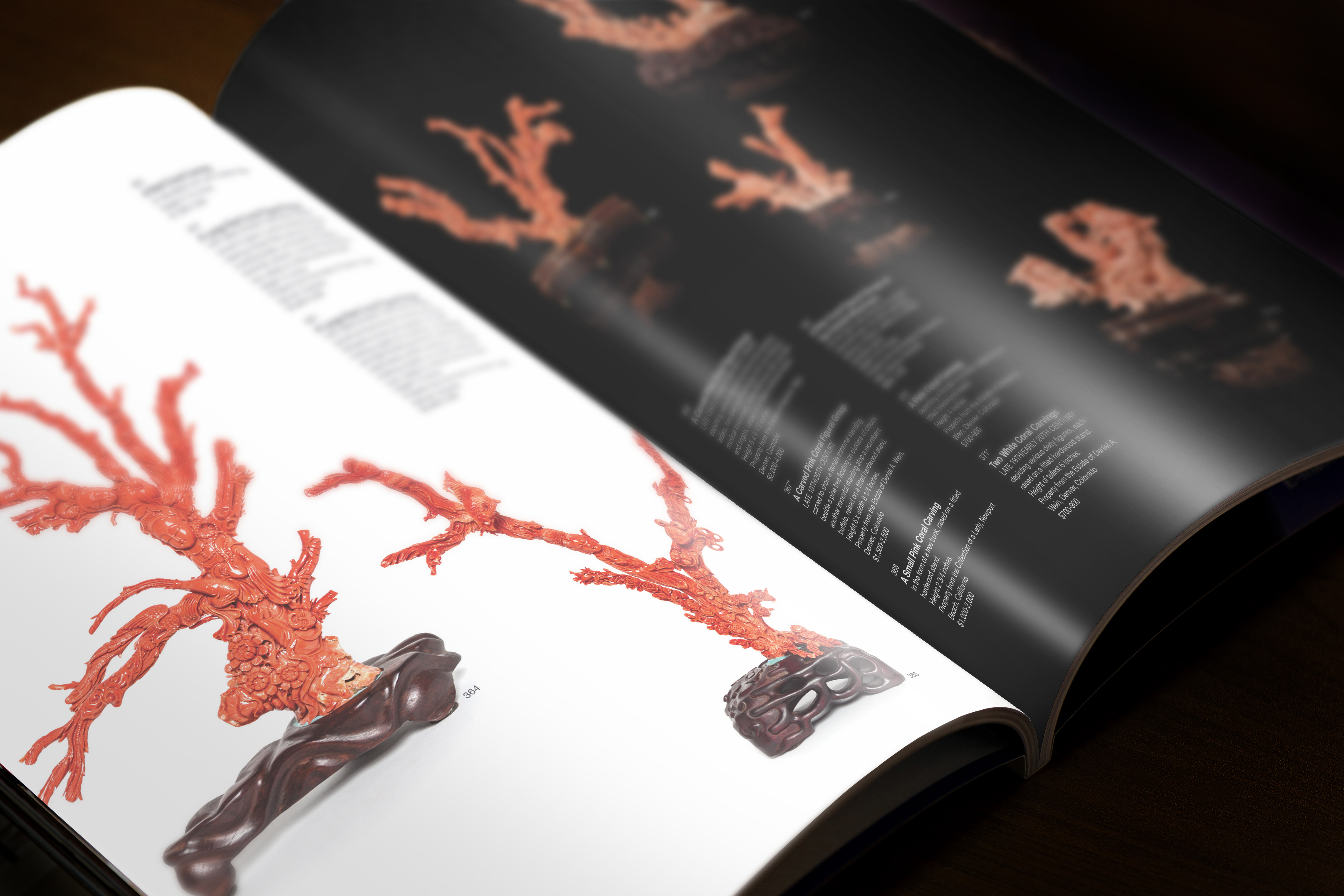
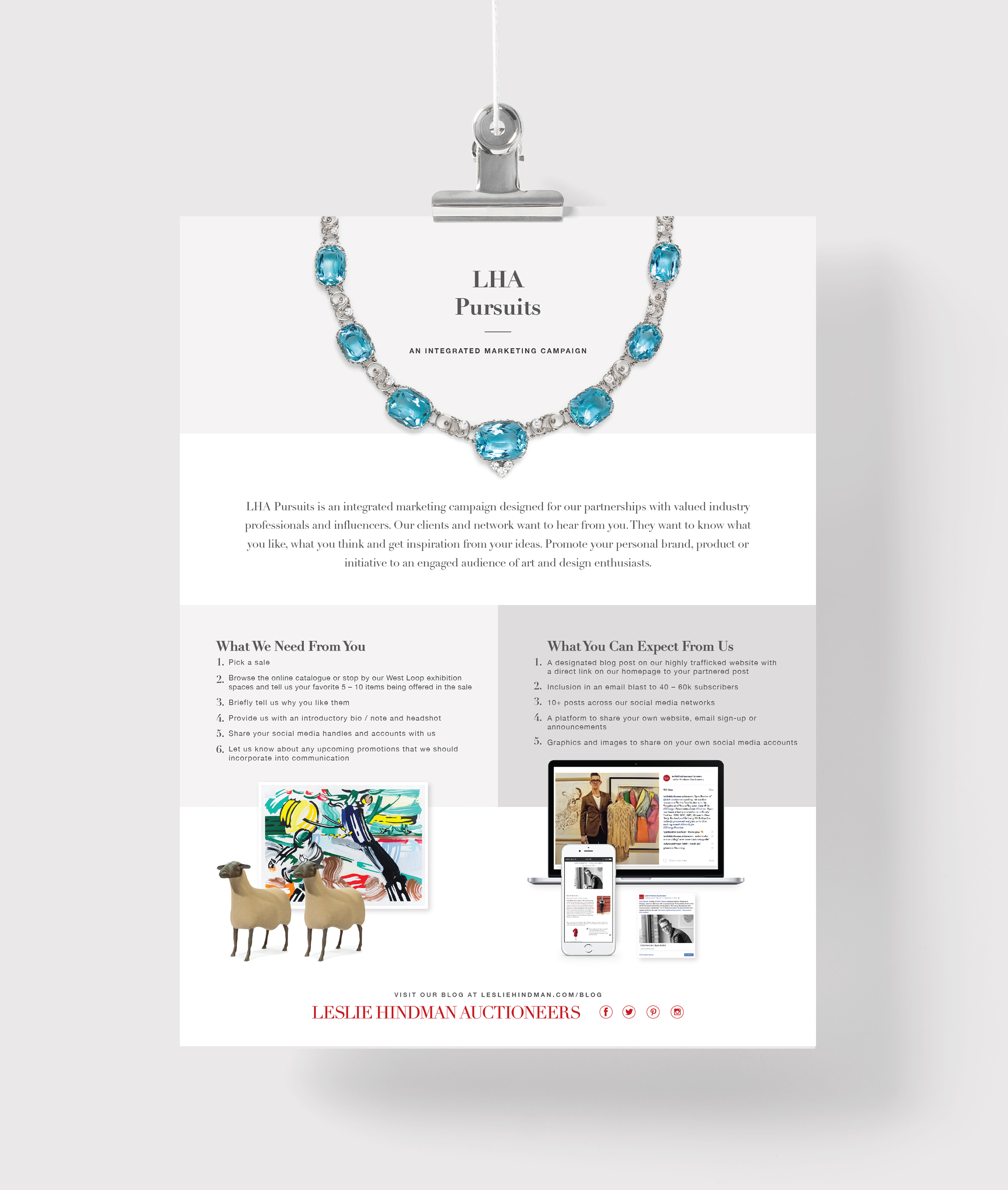
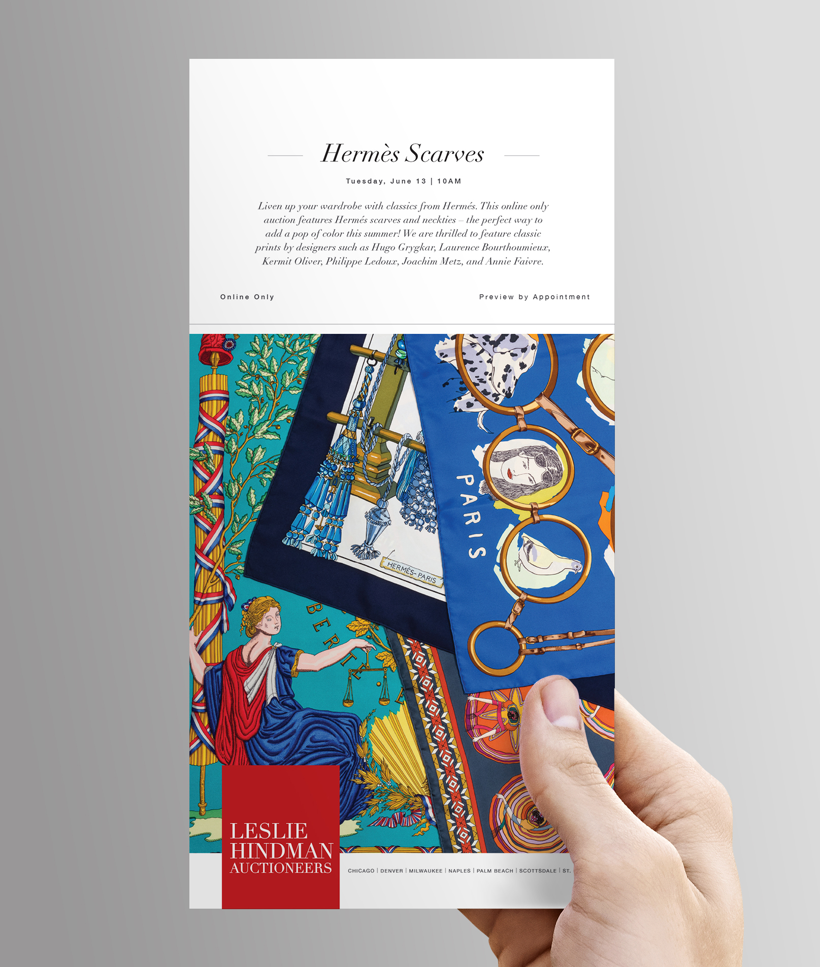
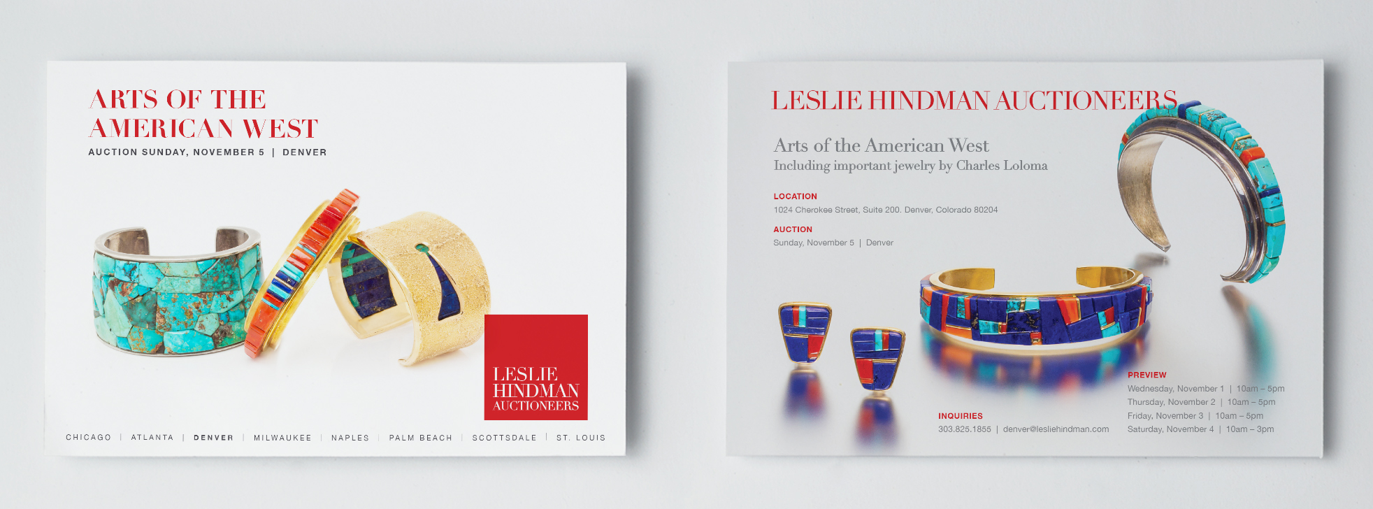
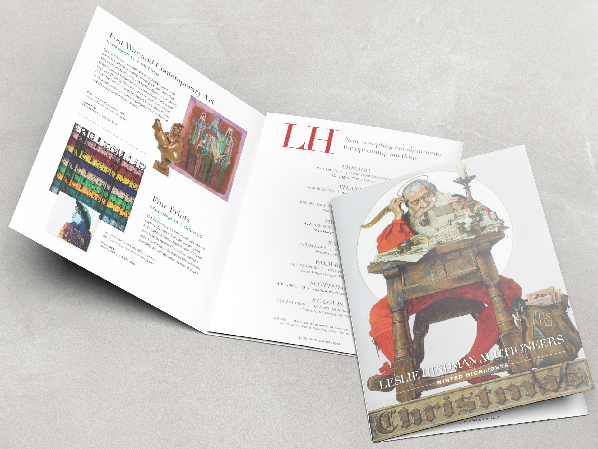
I was privileged to contribute with my design skills to one of the leading auction houses of the world. At LHA I got the chance to create beautiful promotional materials such as auction catalogues, email templates, invitations, proposals, website banners and more.


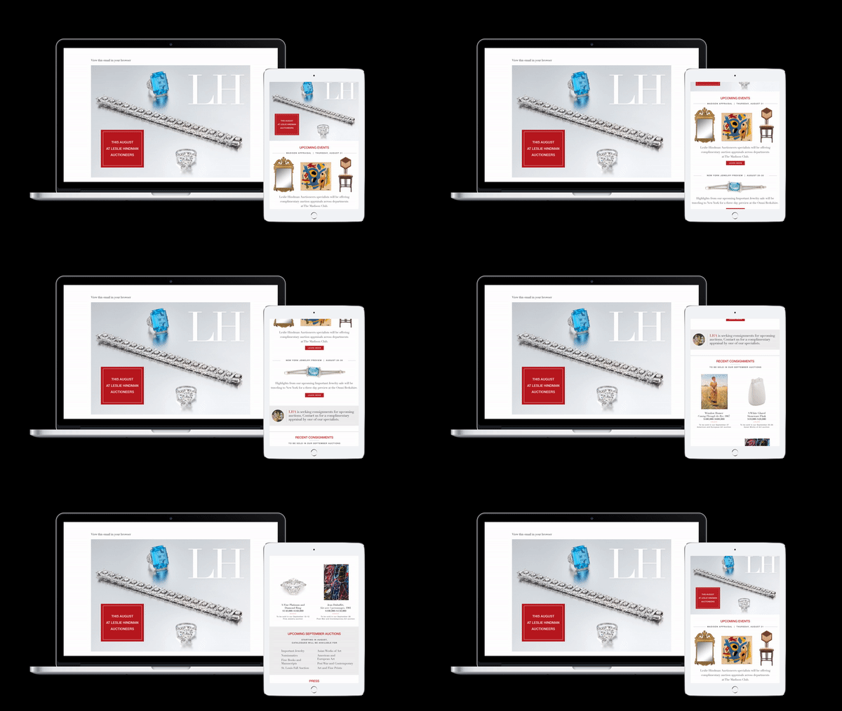
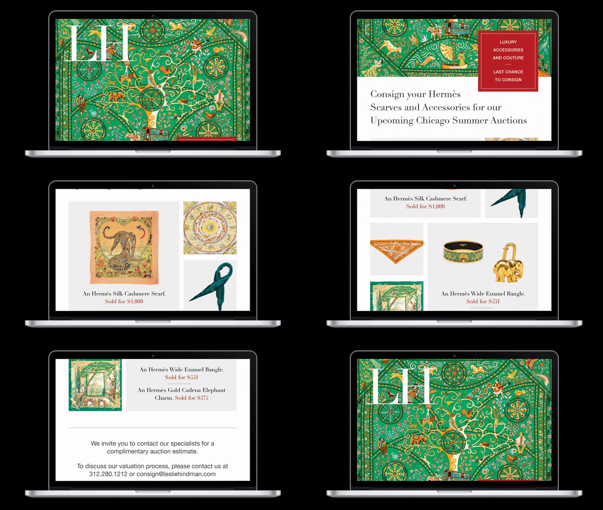
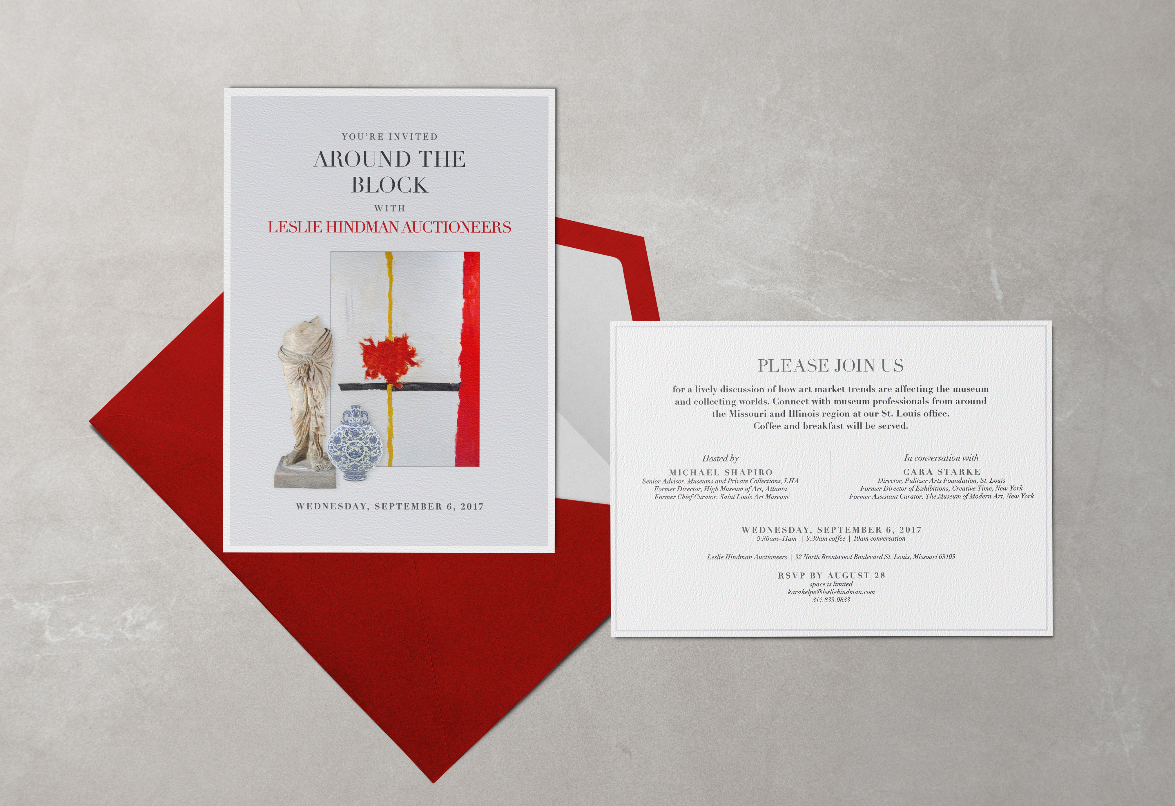
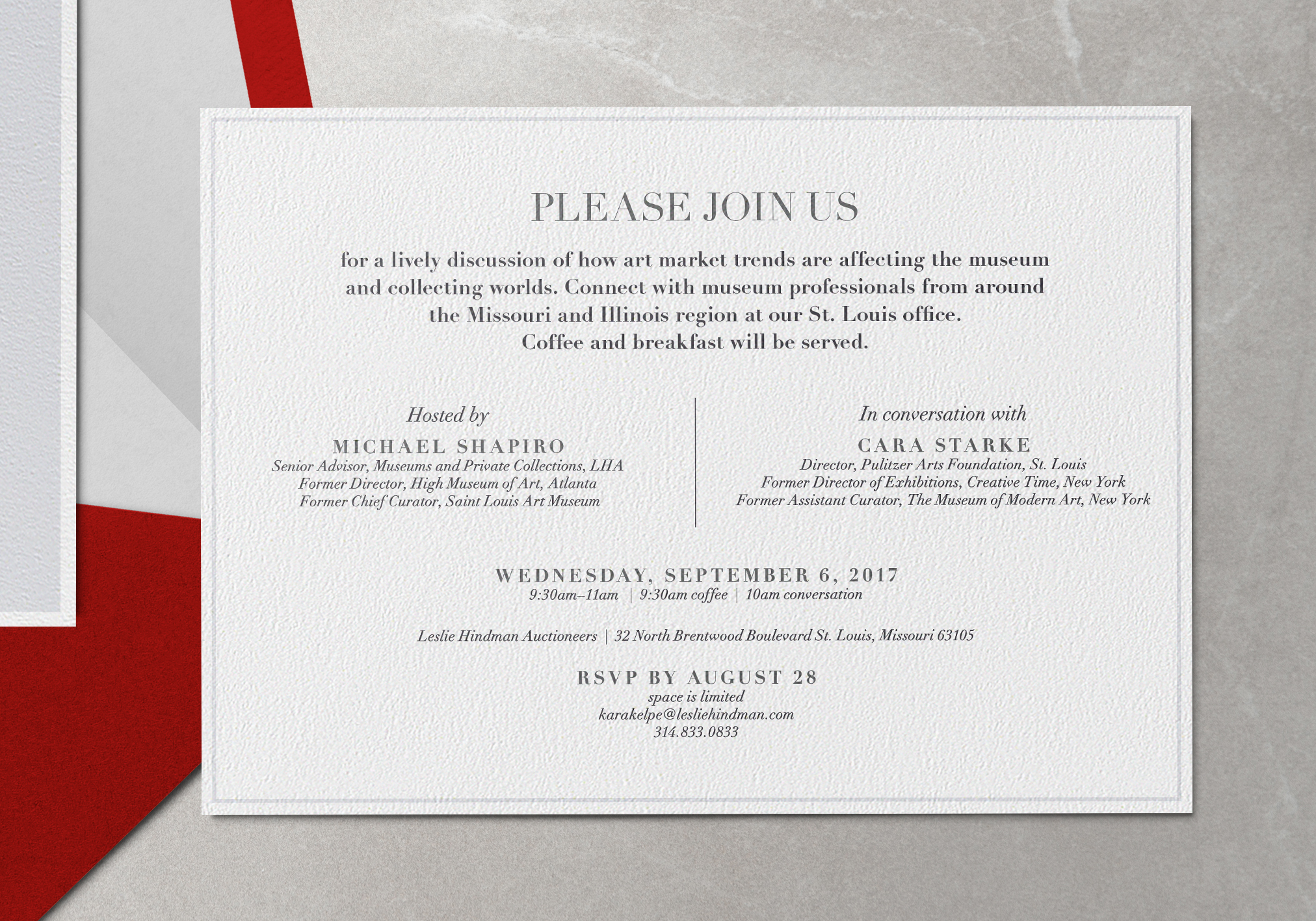
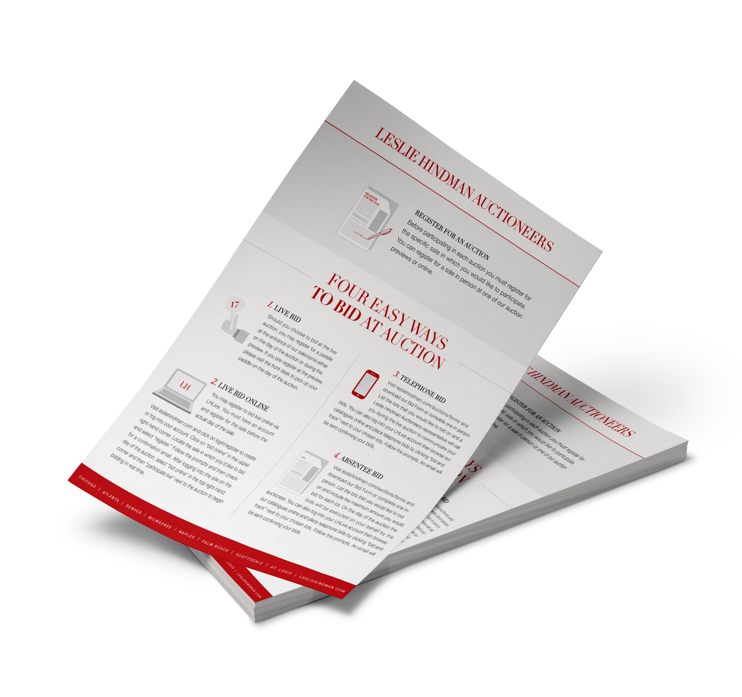
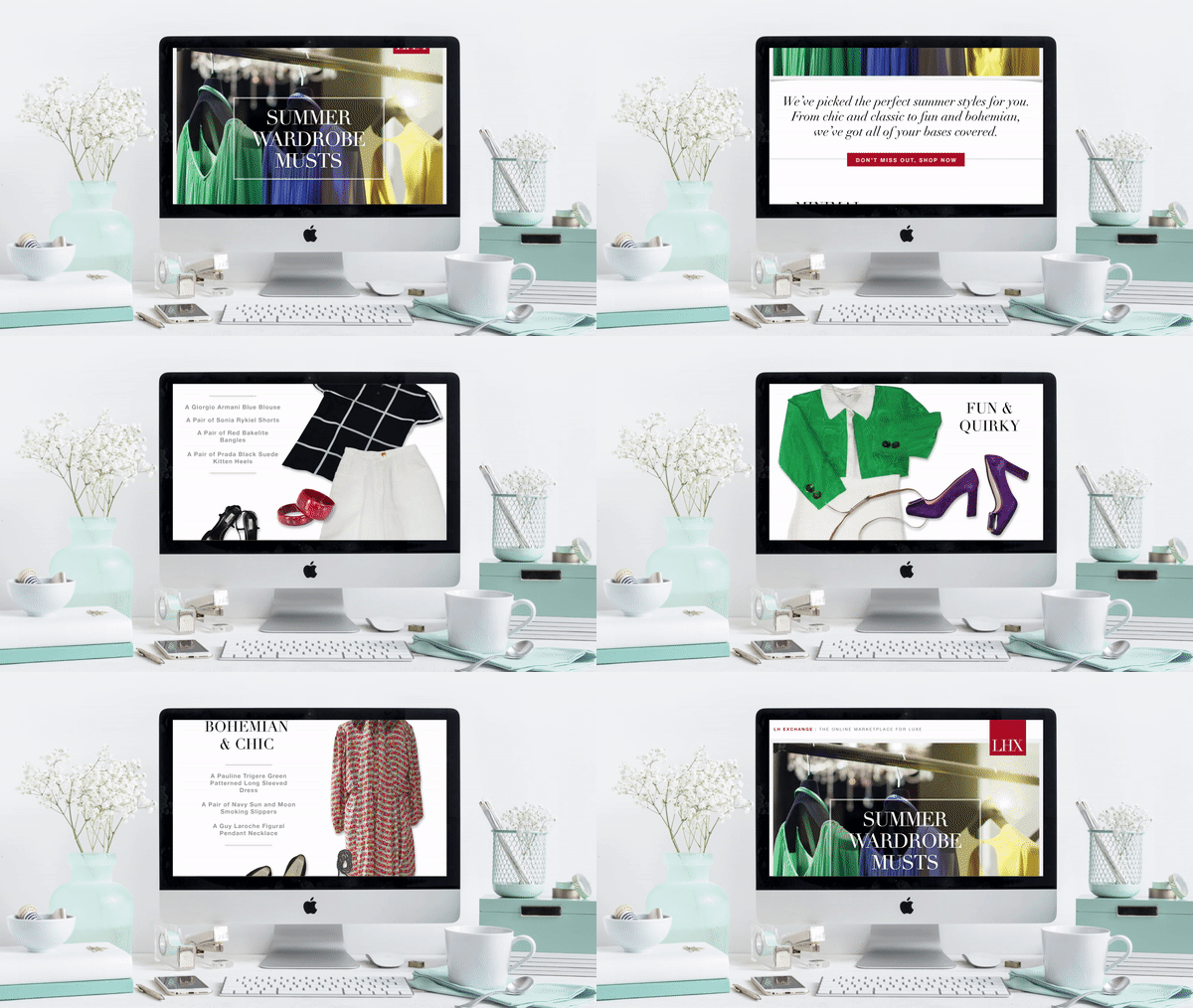
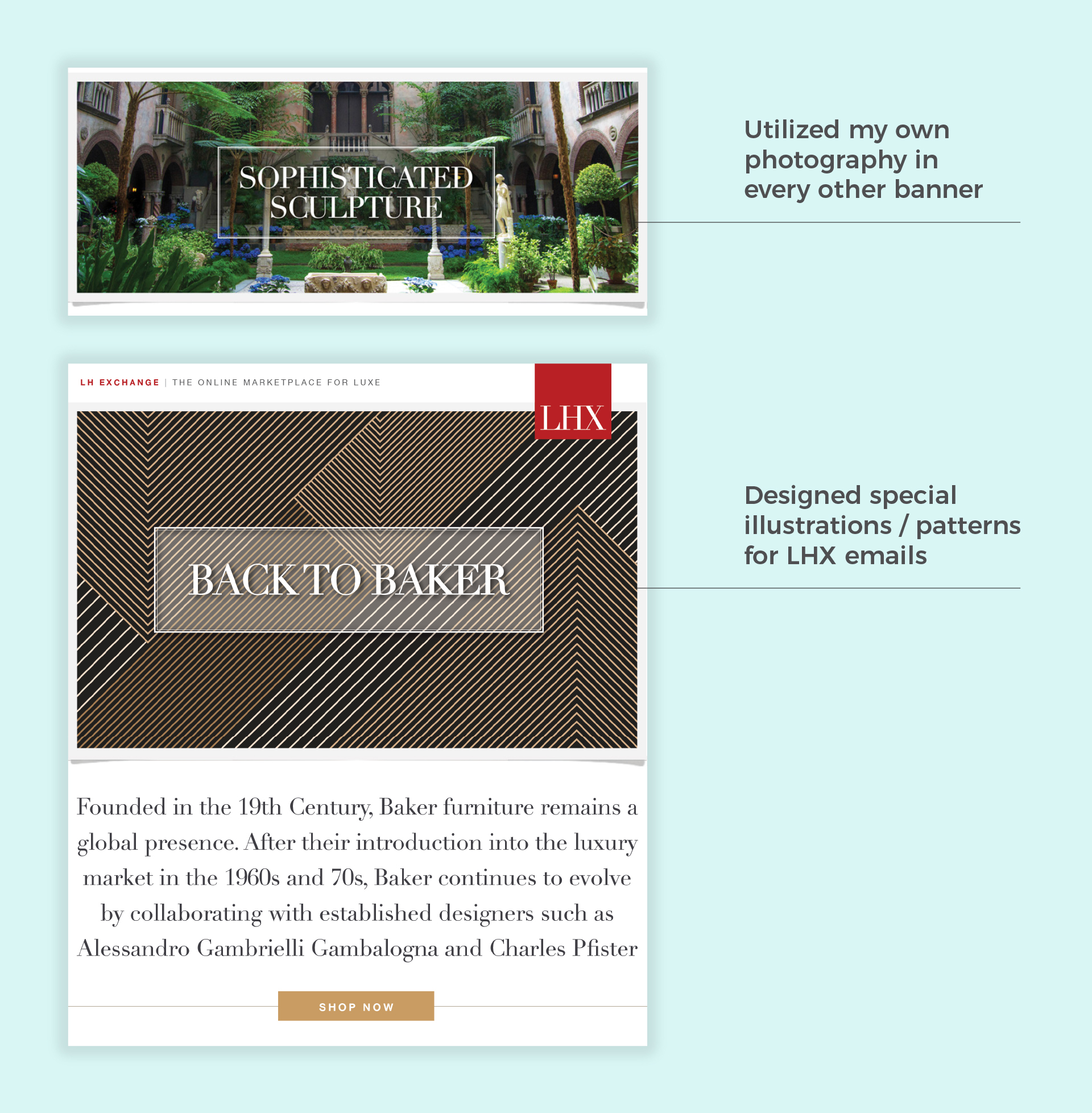
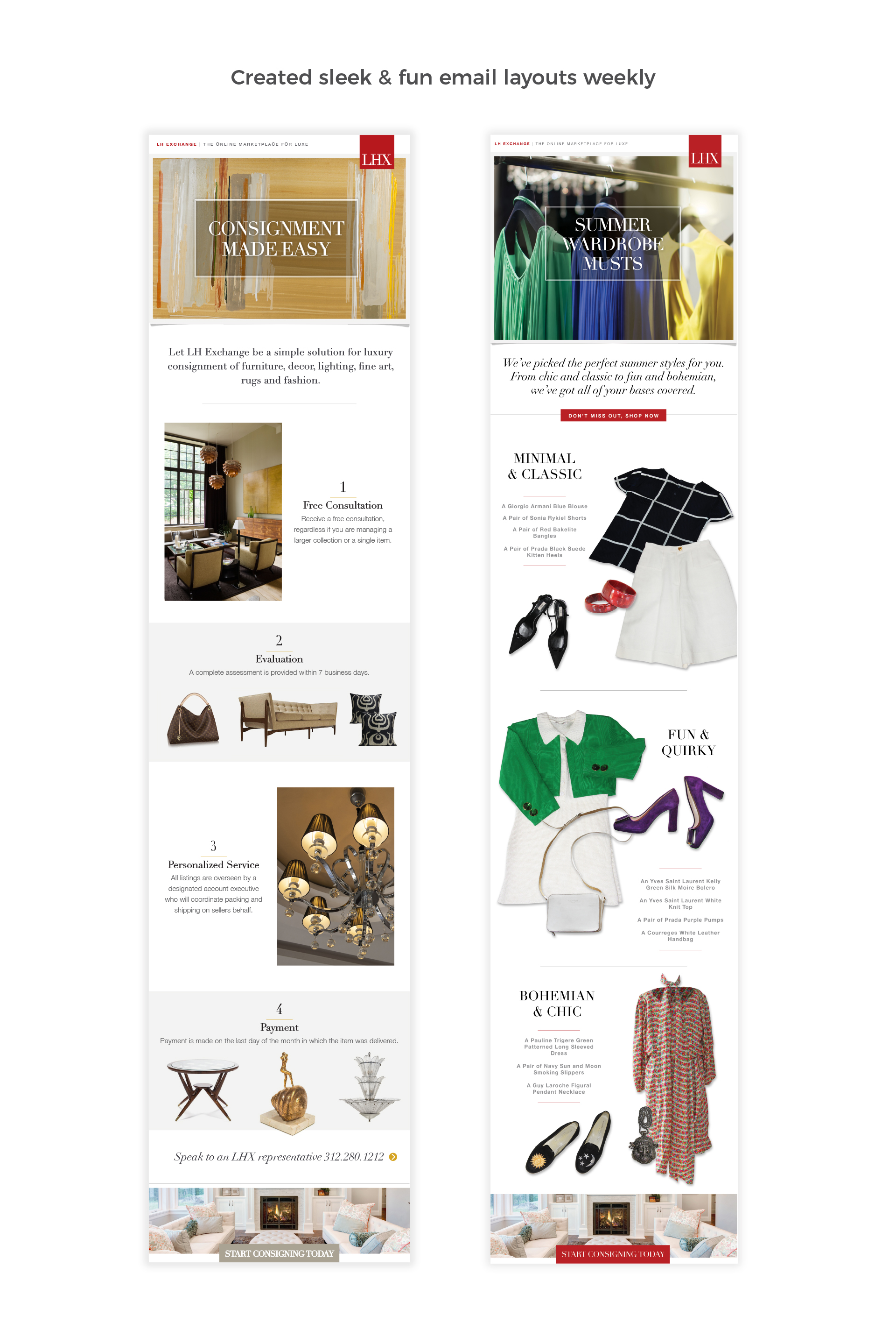
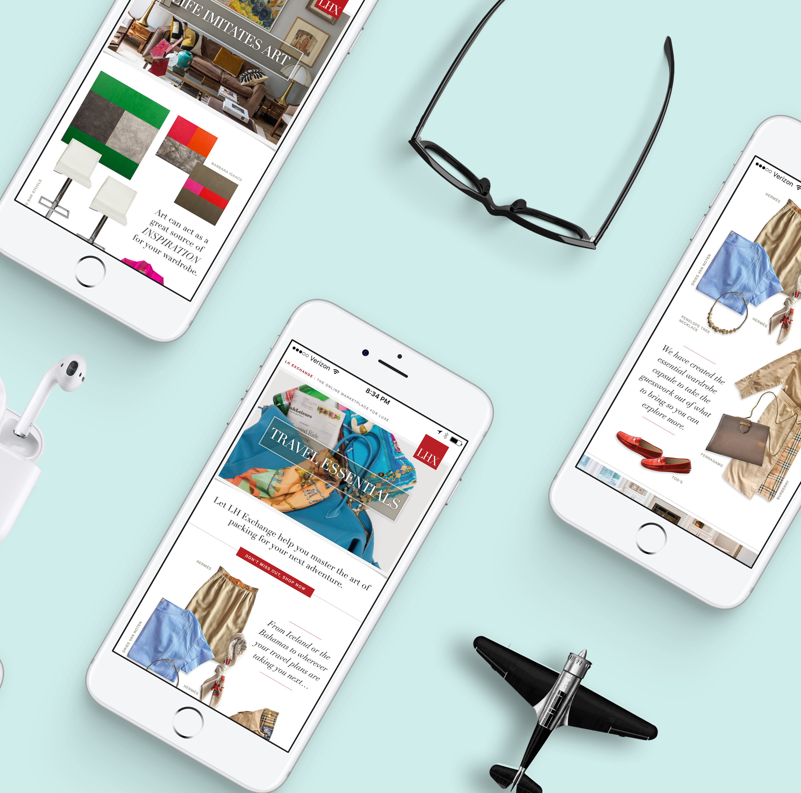
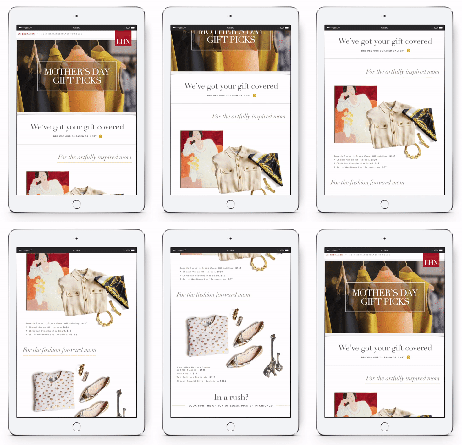
LH Exchange is an online marketplace owned by Leslie Hindman Auctioneers. It offers an excellent selection of highly curated luxury items all available for immediate purchase and delivery. I was lucky to contribute to such a stylish company by creating a variety of fun weekly emails, website banners for their homepage and landing pages, as well as graphics for their social media platforms and google adwords.
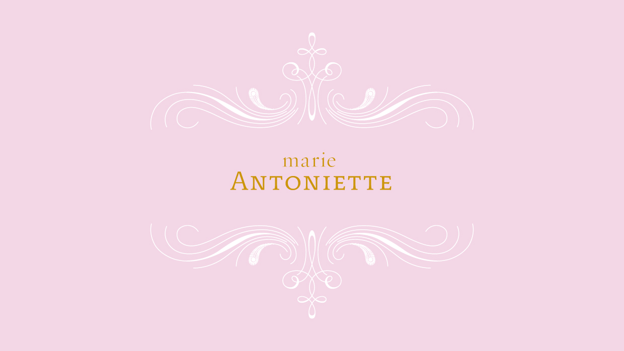
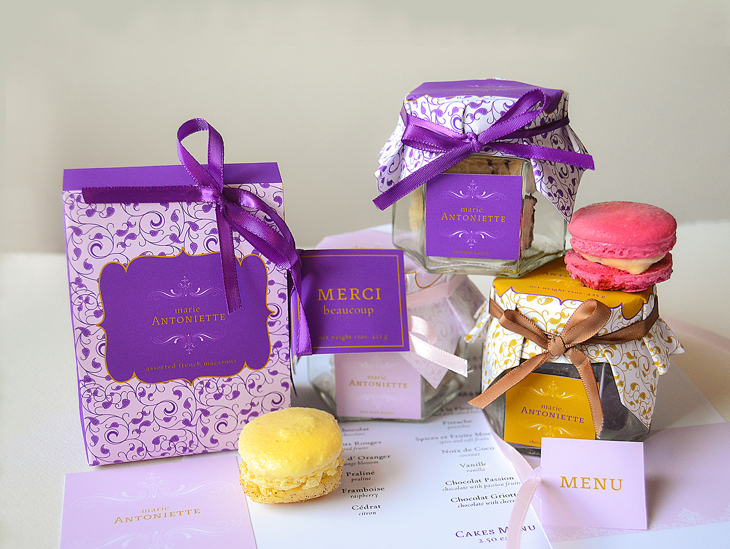
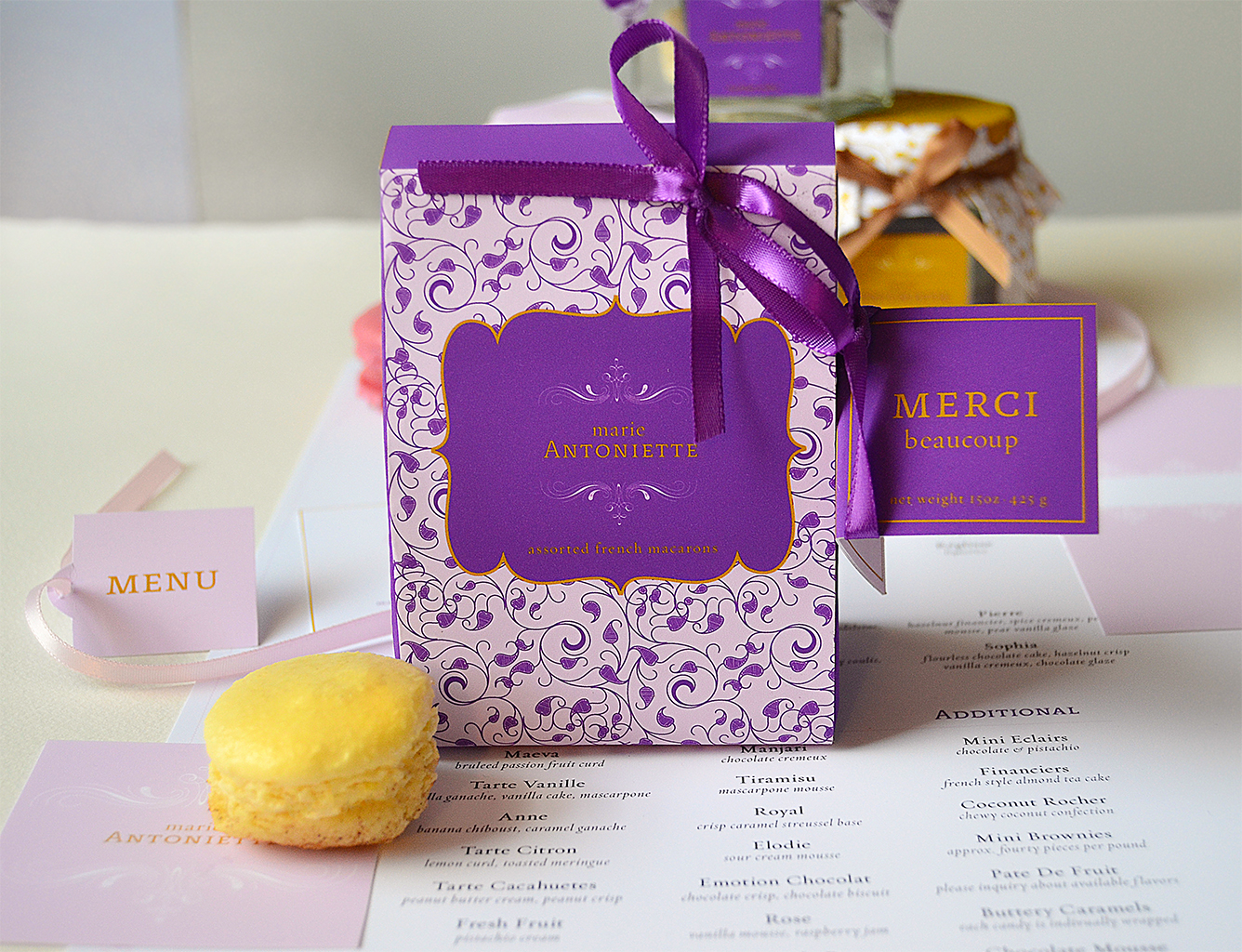
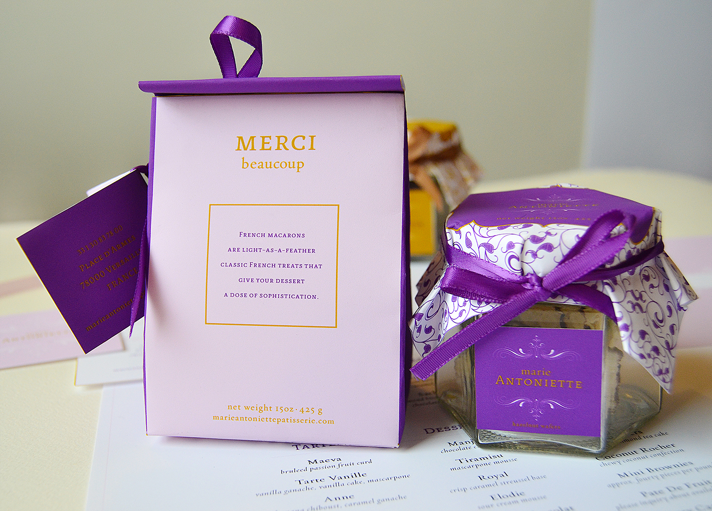
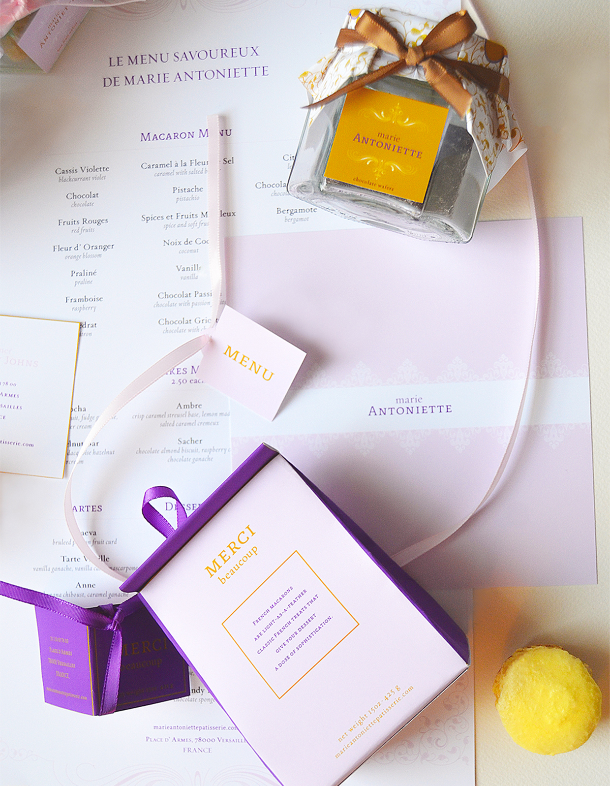
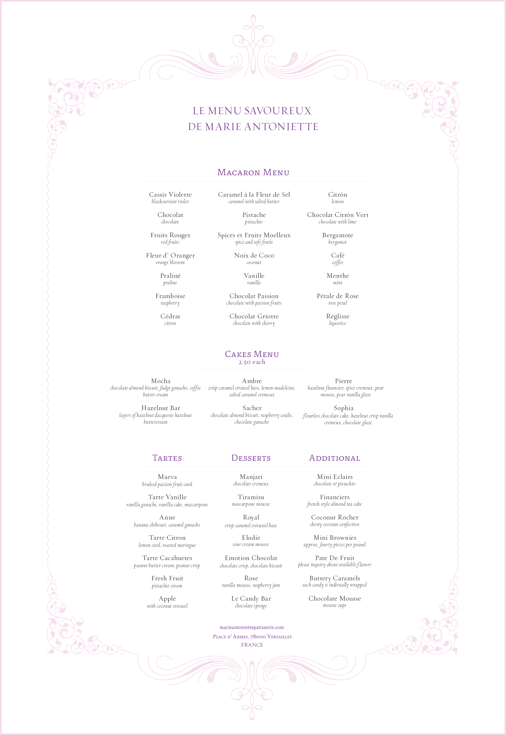
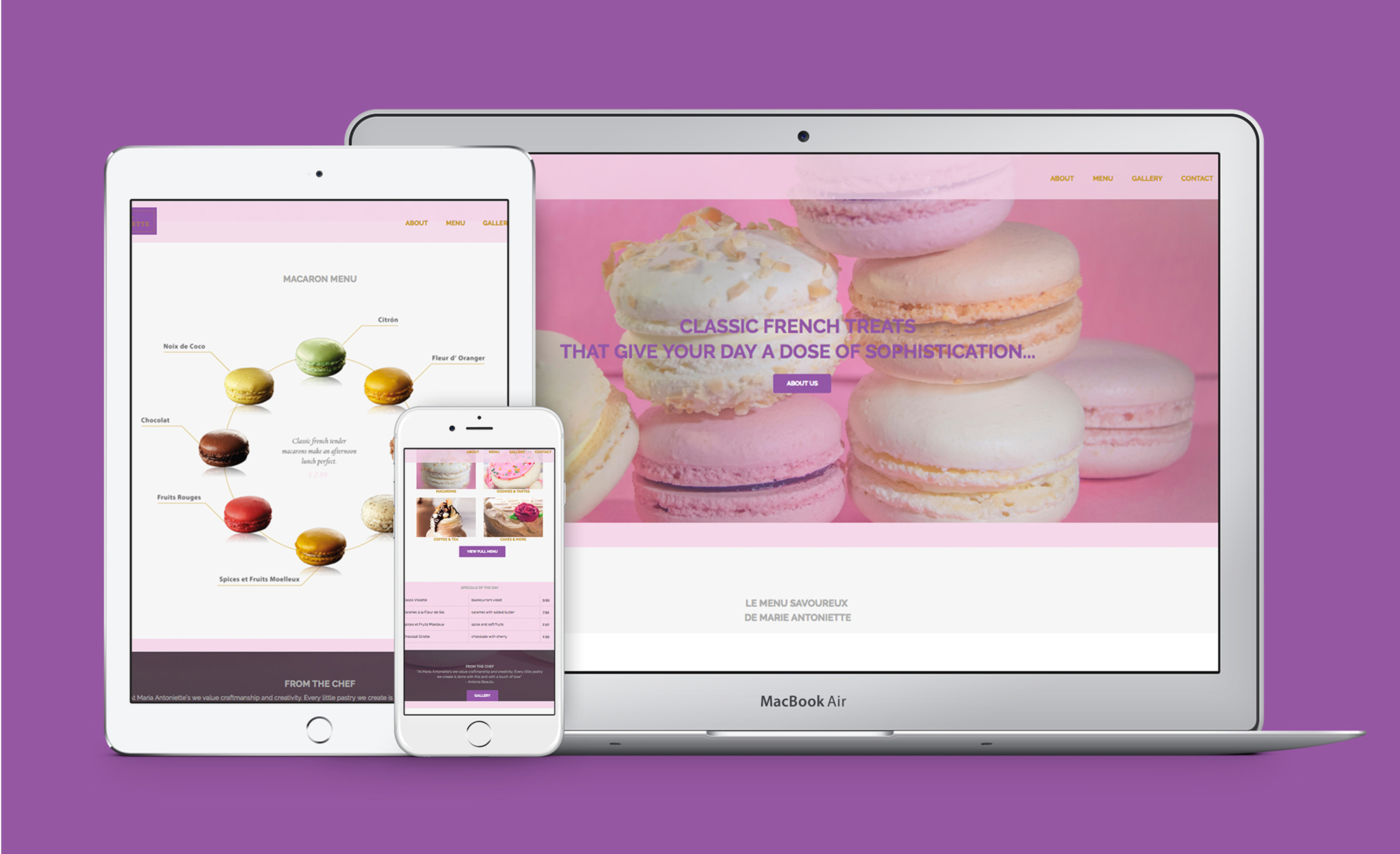
Marie Antoniette's Patisserie is a pastry boutique from France. The client didn't have a brand identity and was looking for a modern yet classical image in order to expand and open stores in the US.
The client wanted simplicity and timelessness in their logo, so an elegant typographic mark was selected. The brand proposal is clean, elegant yet fun and adaptable to the different packaging and applications that were imagined for the brand.
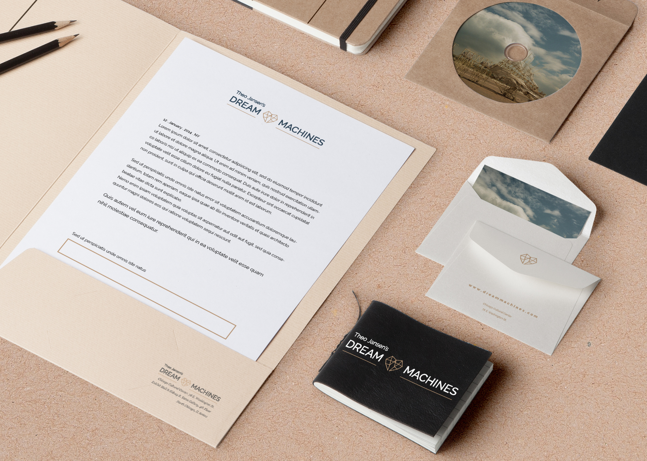
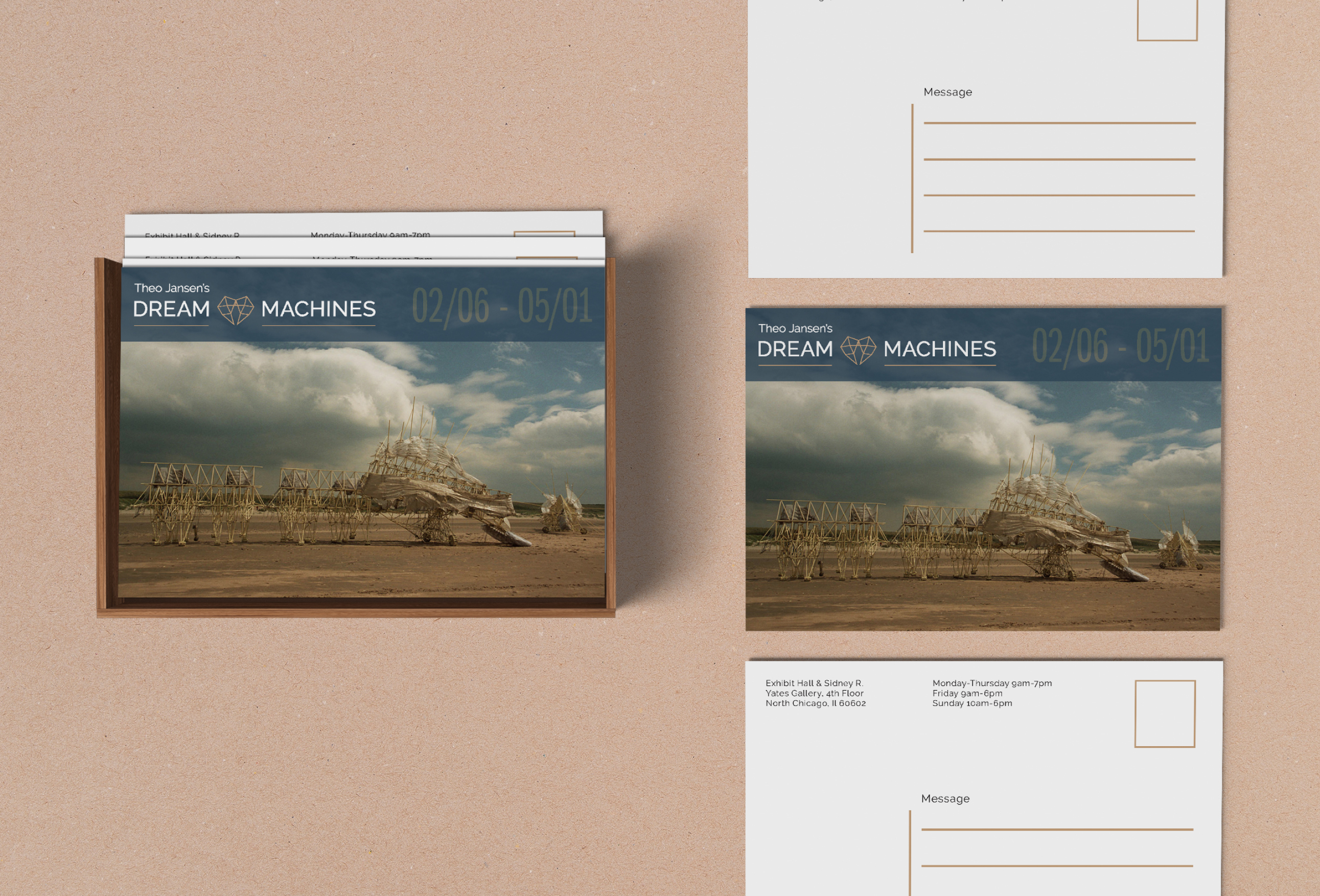
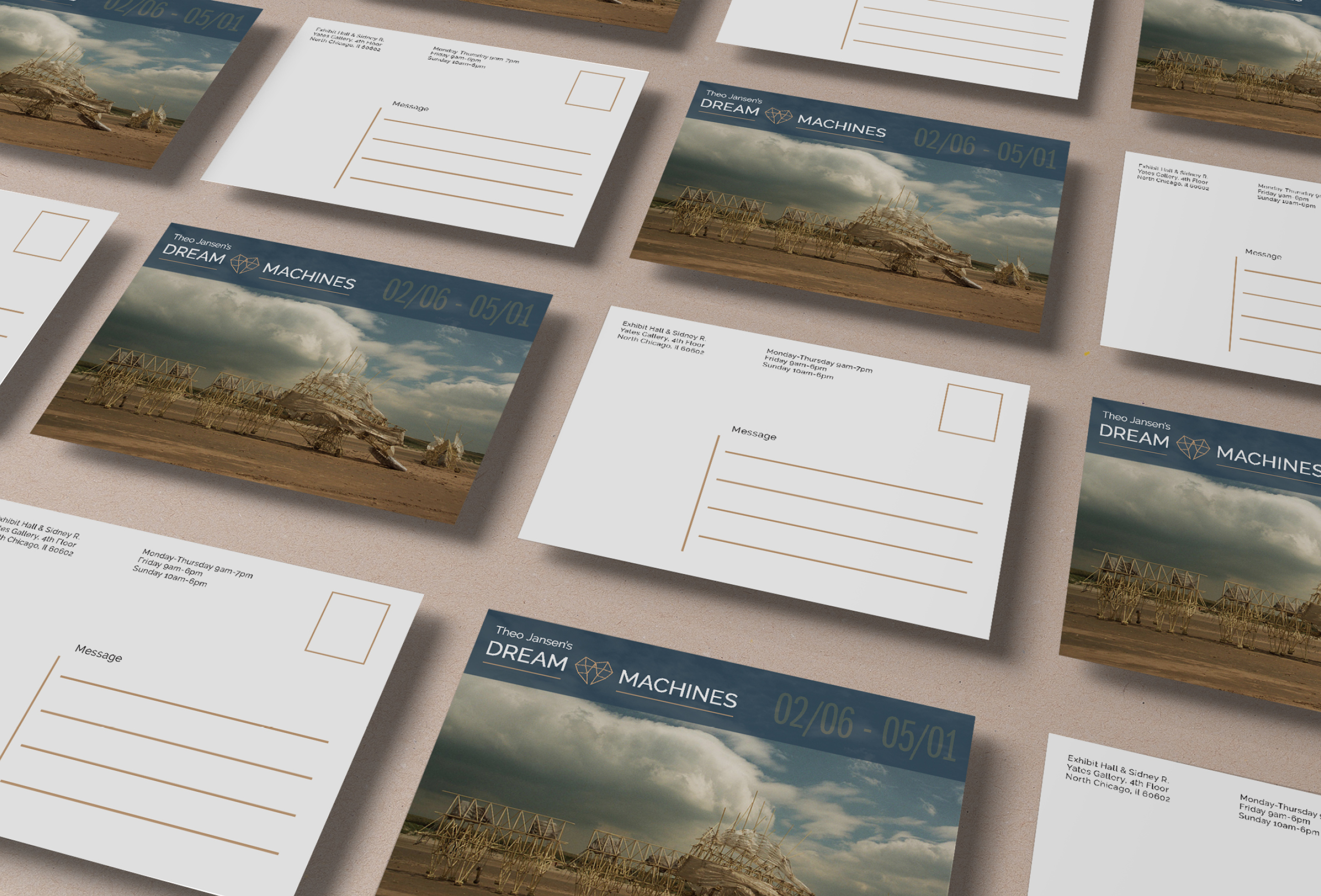
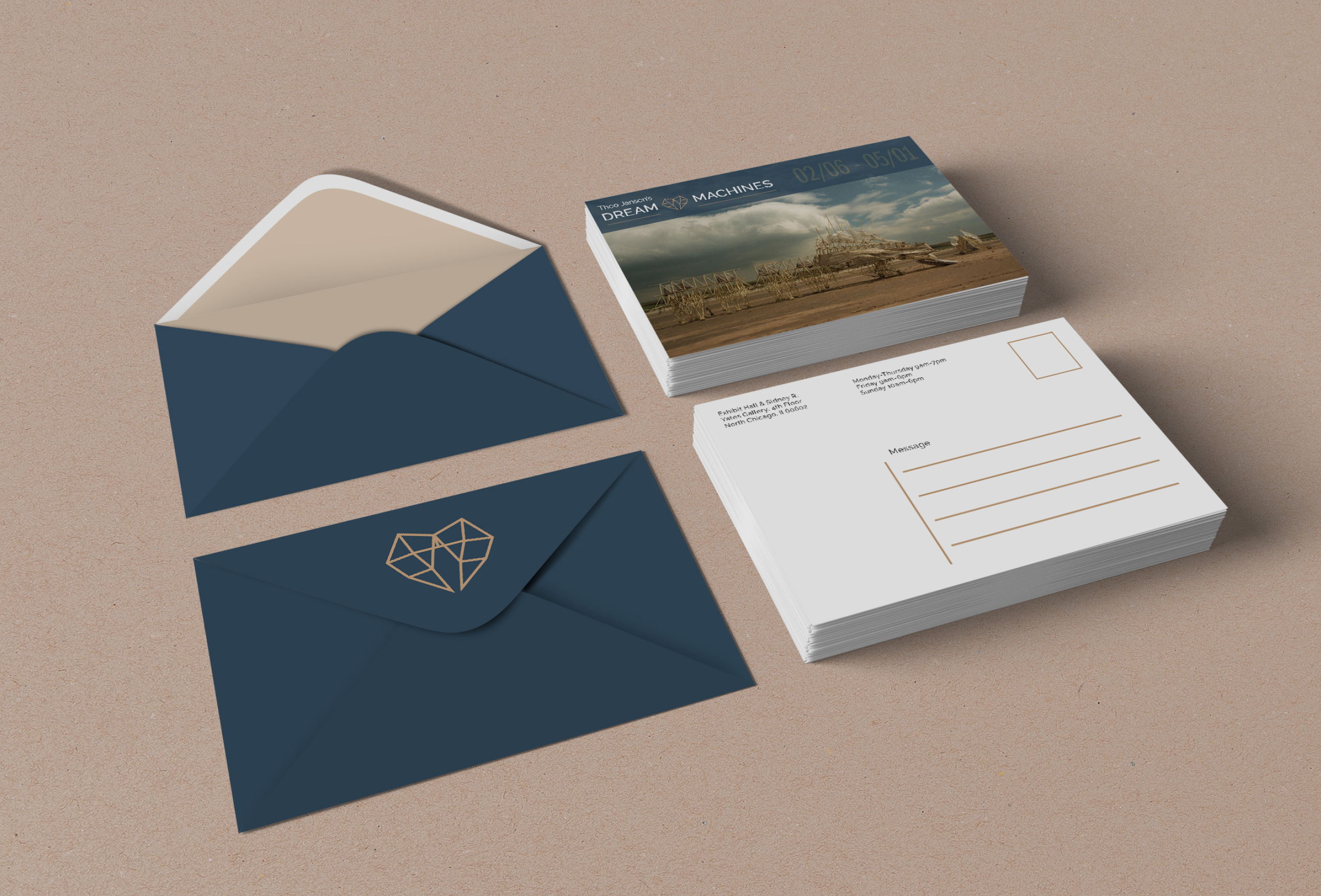
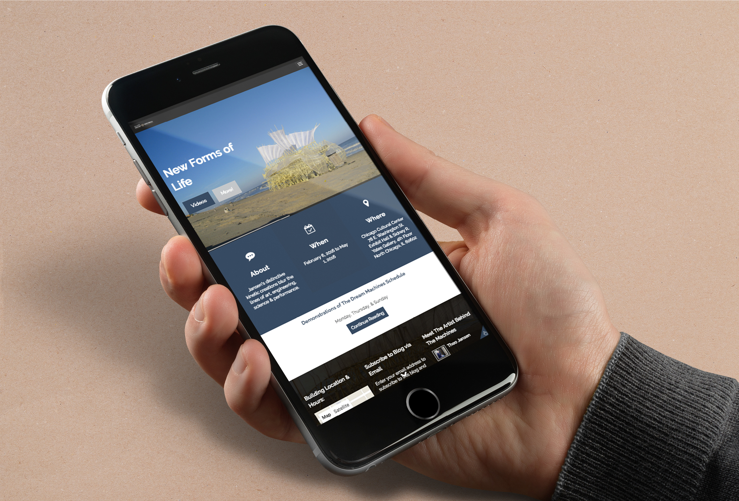
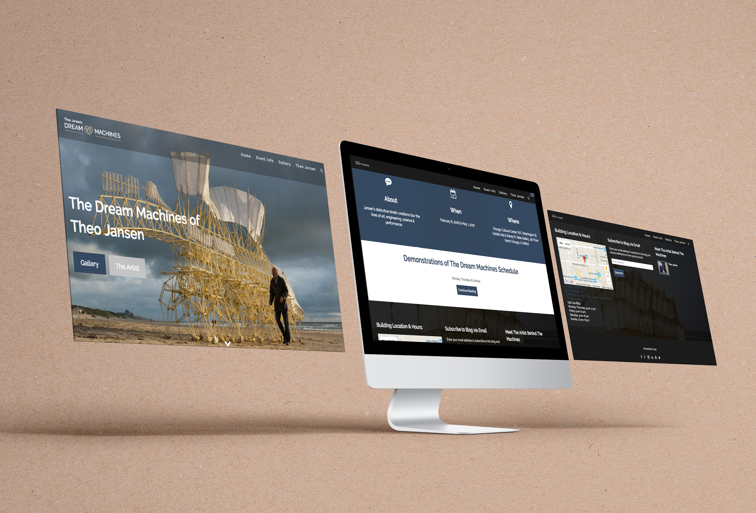
A website for the Dream Machines Event was designed to promote this event and to get even more people to go. Usability was number one in the list of requirements, as well as the details about the event, these needed to be clear and easy to find.
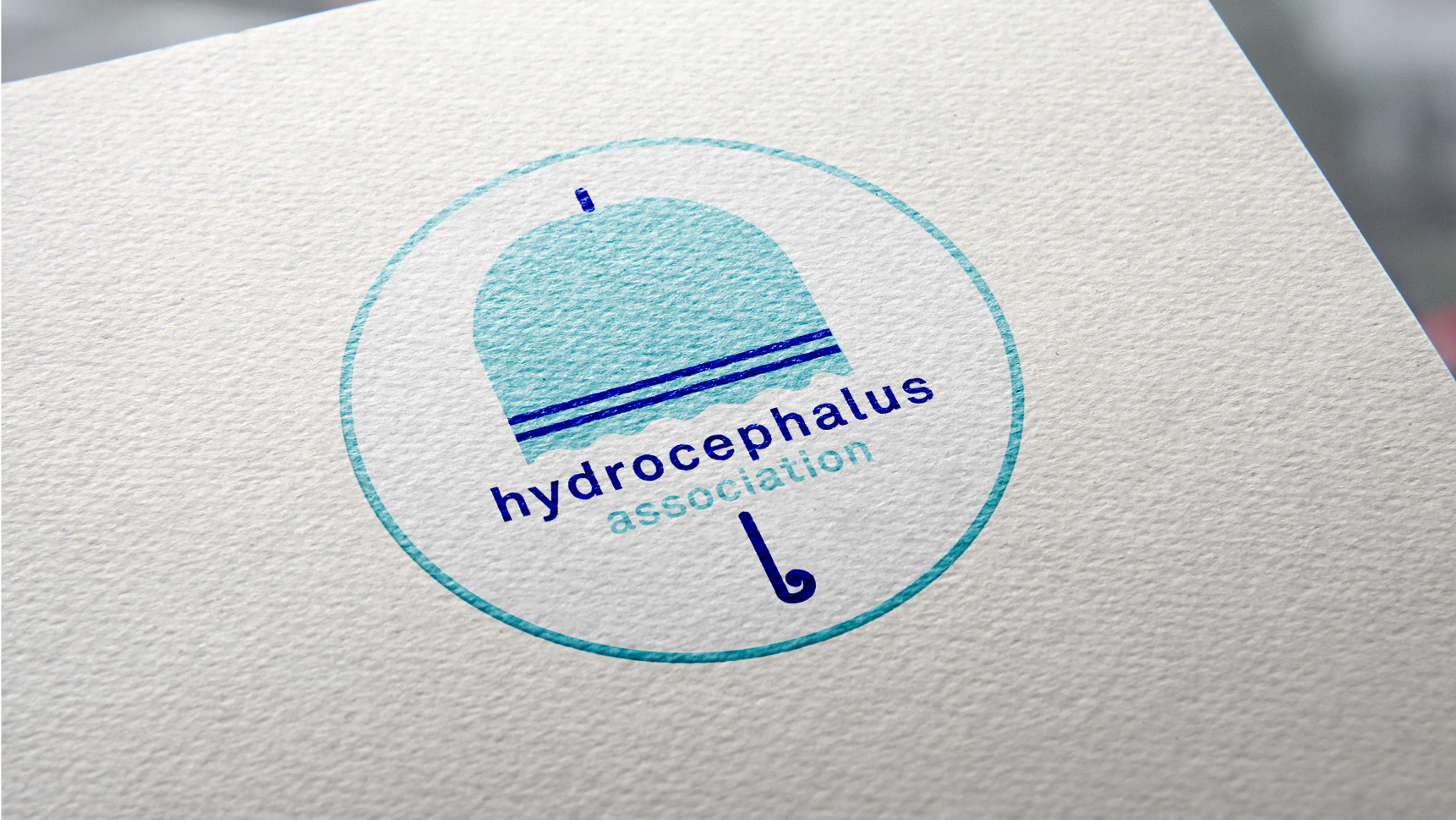
The mission of the Hydrocephalus Association is to promote a cure for hydrocephalus, improve the lives of those affected by the condition, and support the people going through this illness.
The association needed a logo that could let people know that they are there for you through the good and bad times, a clinical logo but still friendly looking and warm. I illustrated an umbrella for their logo since heavy rain showers remind me of challenges in life.
It is said to never ask for a lighter rain, instead pray for a stronger umbrella because is only then when you can see that all things in life have their own beauty. This association is the umbrella which every person is looking to rely on when things in life get "rainy". People won't feel alone in the Hydrocephalus journey since this association is there for them like a strong umbrella to hold on to.
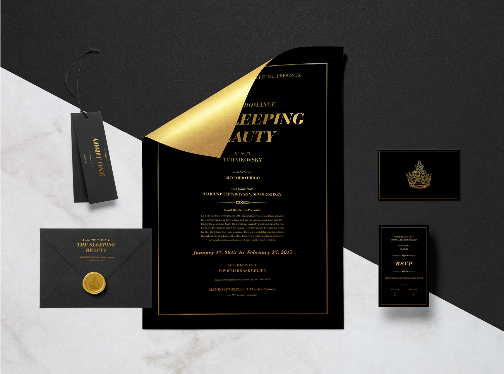
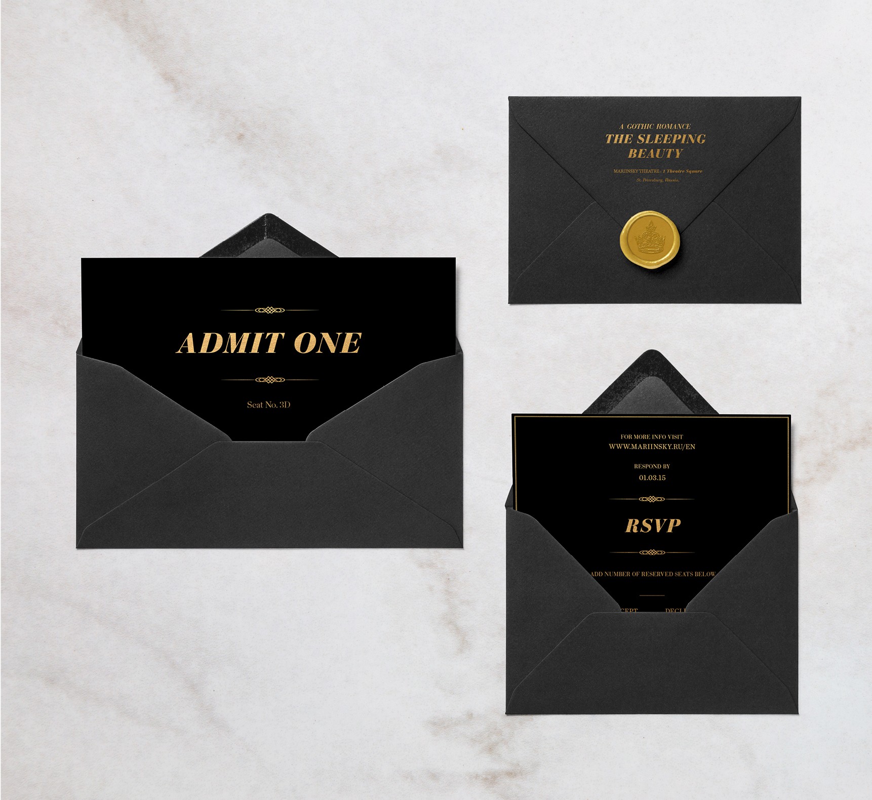
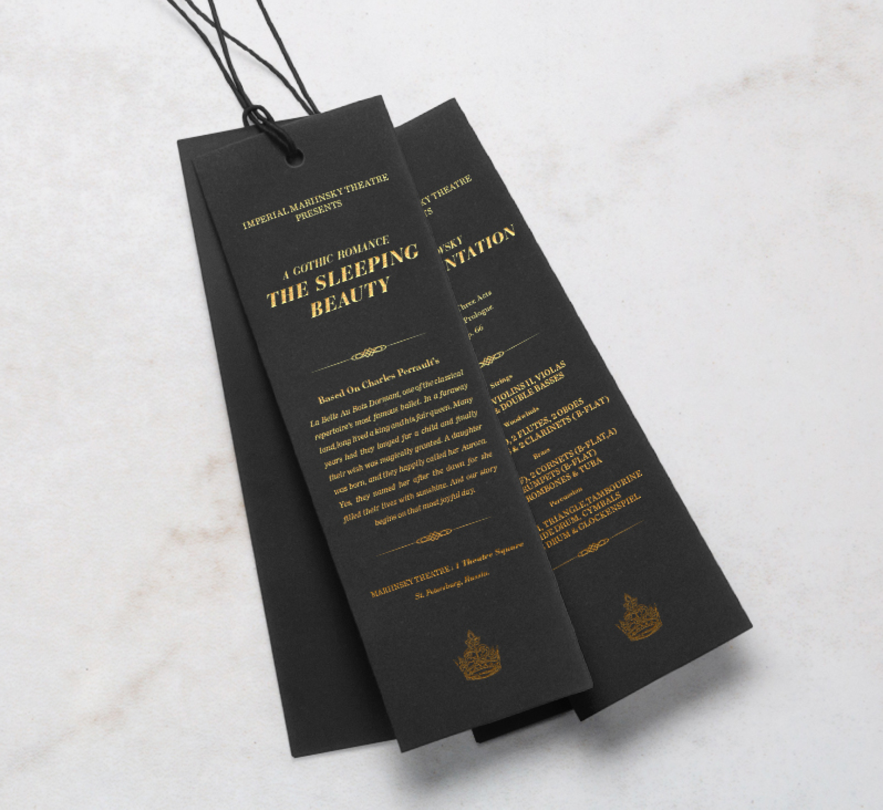
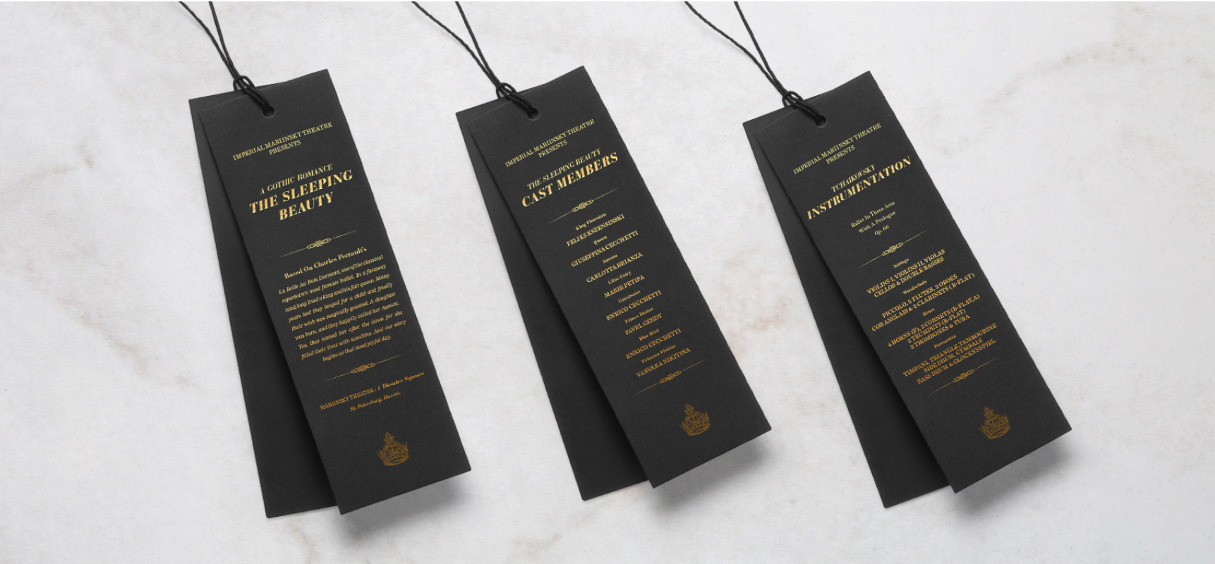
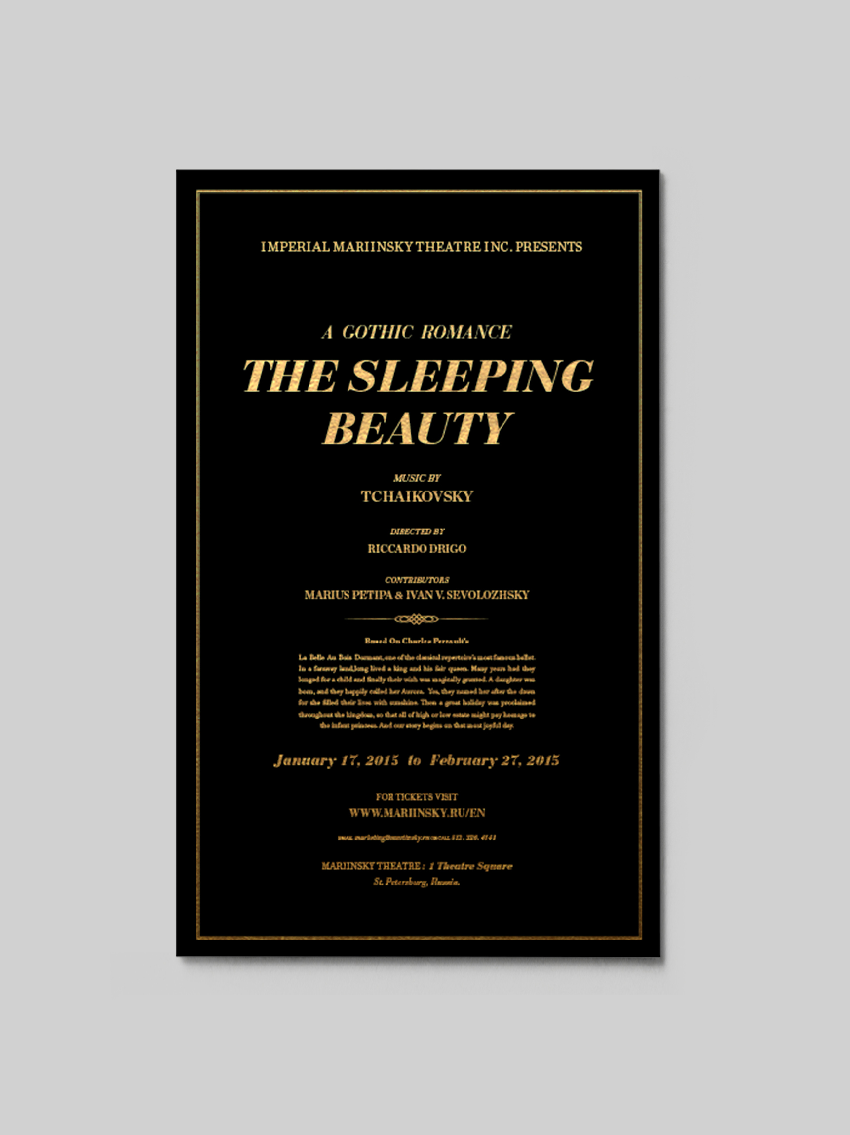
Promotional neoclassical poster was designed for the ballet show 'The Sleeping Beauty' as well as the collateral material for the event. The piece is purely typographical, good use of hierarchy is used so it is easier for the reader to get a lot of information about the show in a fast manner. Minimal use of color is used as it is an elegant black tie event.
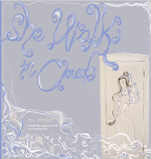
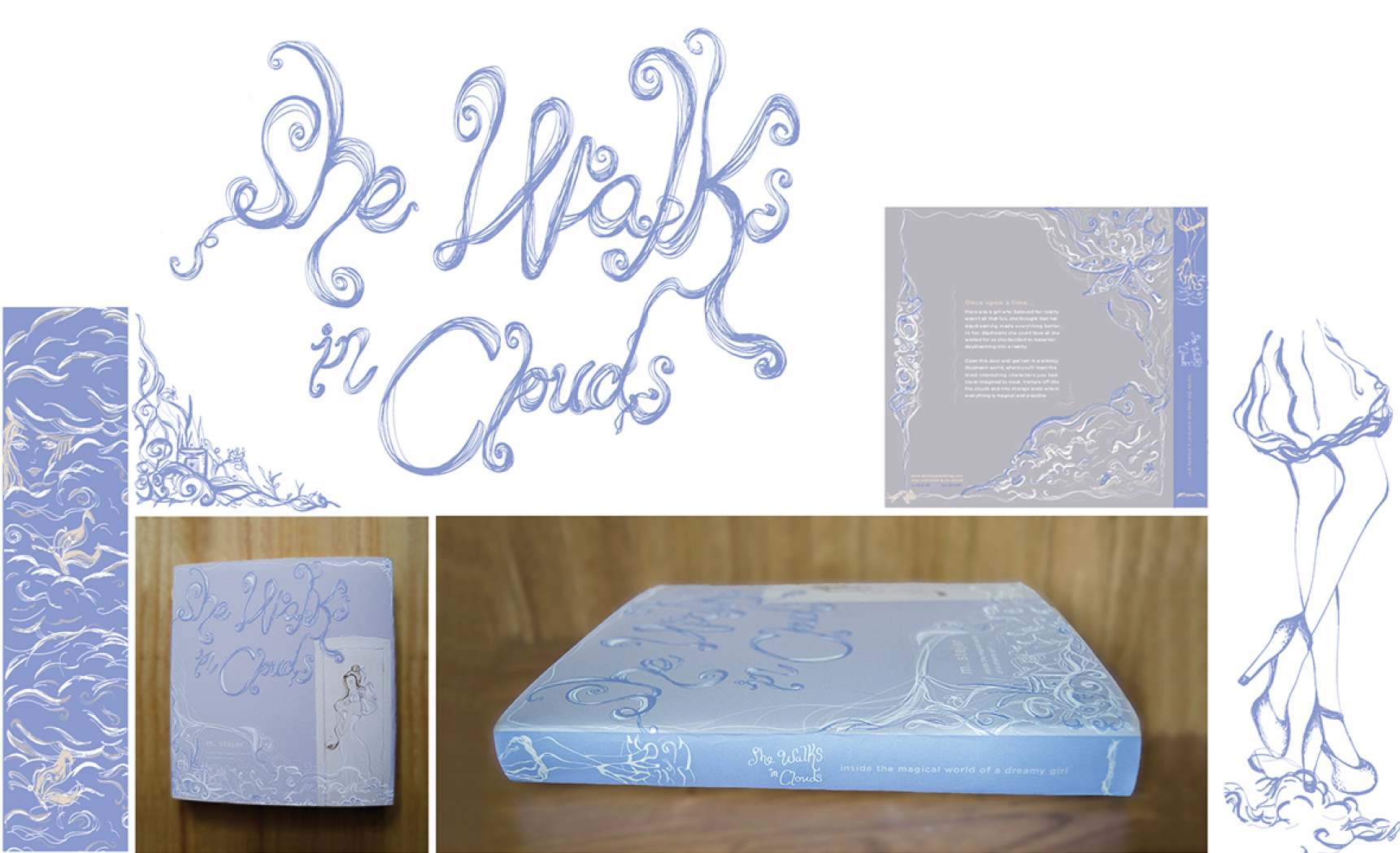
Illustration, lettering typographic mark, color palette and overall look created for a fantasy book novel. It needed to feel ethereal and airy to go with the story of a dreamy girl who discovers another world up in the clouds.
Here are some of my favorite motion graphics & animation projects, enjoy!
Stop Motion Animation Gummy Bears! from Martha Stejar on Vimeo.
My First Stop Motion Animation! from Martha Stejar on Vimeo.
Fan Poster Animation from Martha Stejar on Vimeo.
Visual Poem from Martha Stejar on Vimeo.
Food Show Bumper from Martha Stejar on Vimeo.
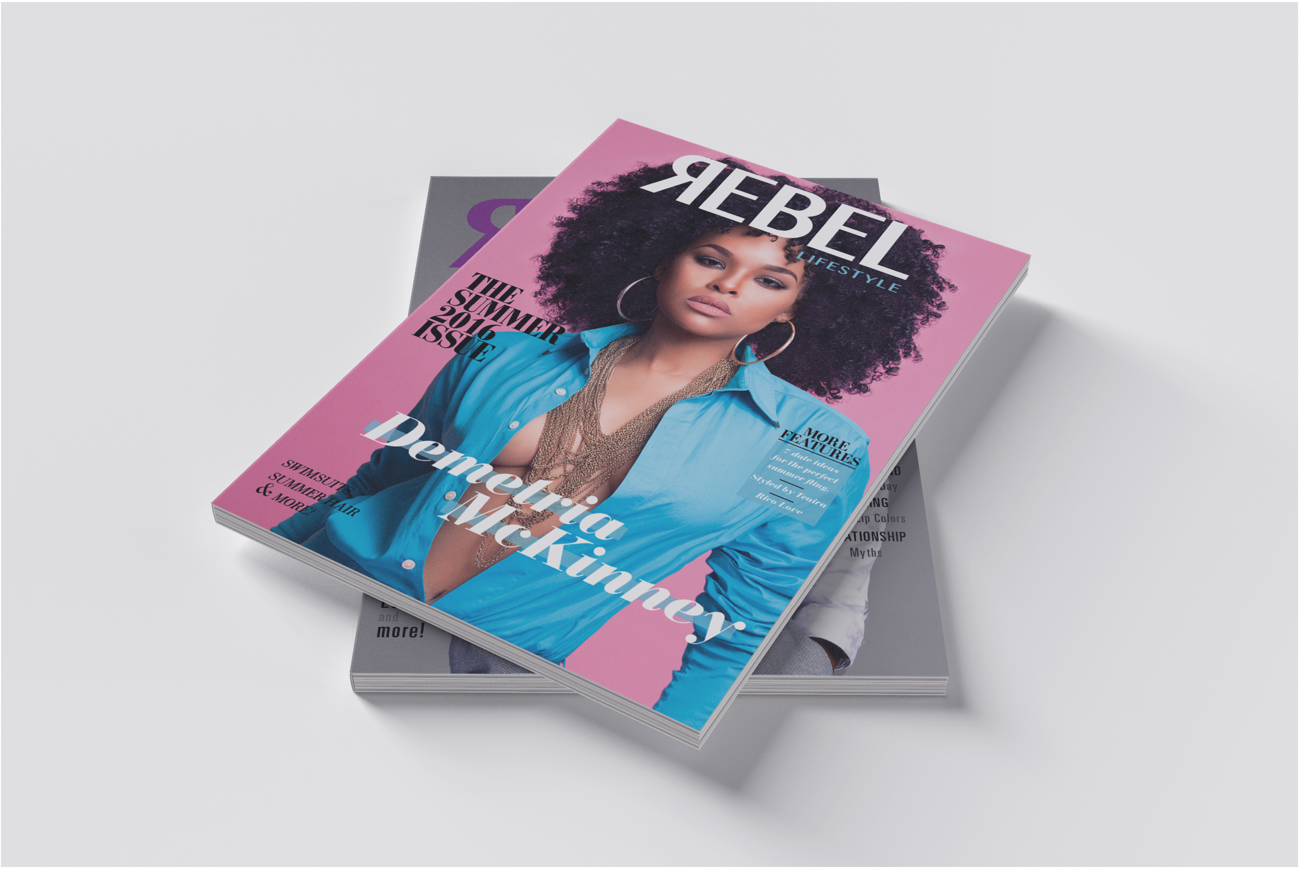
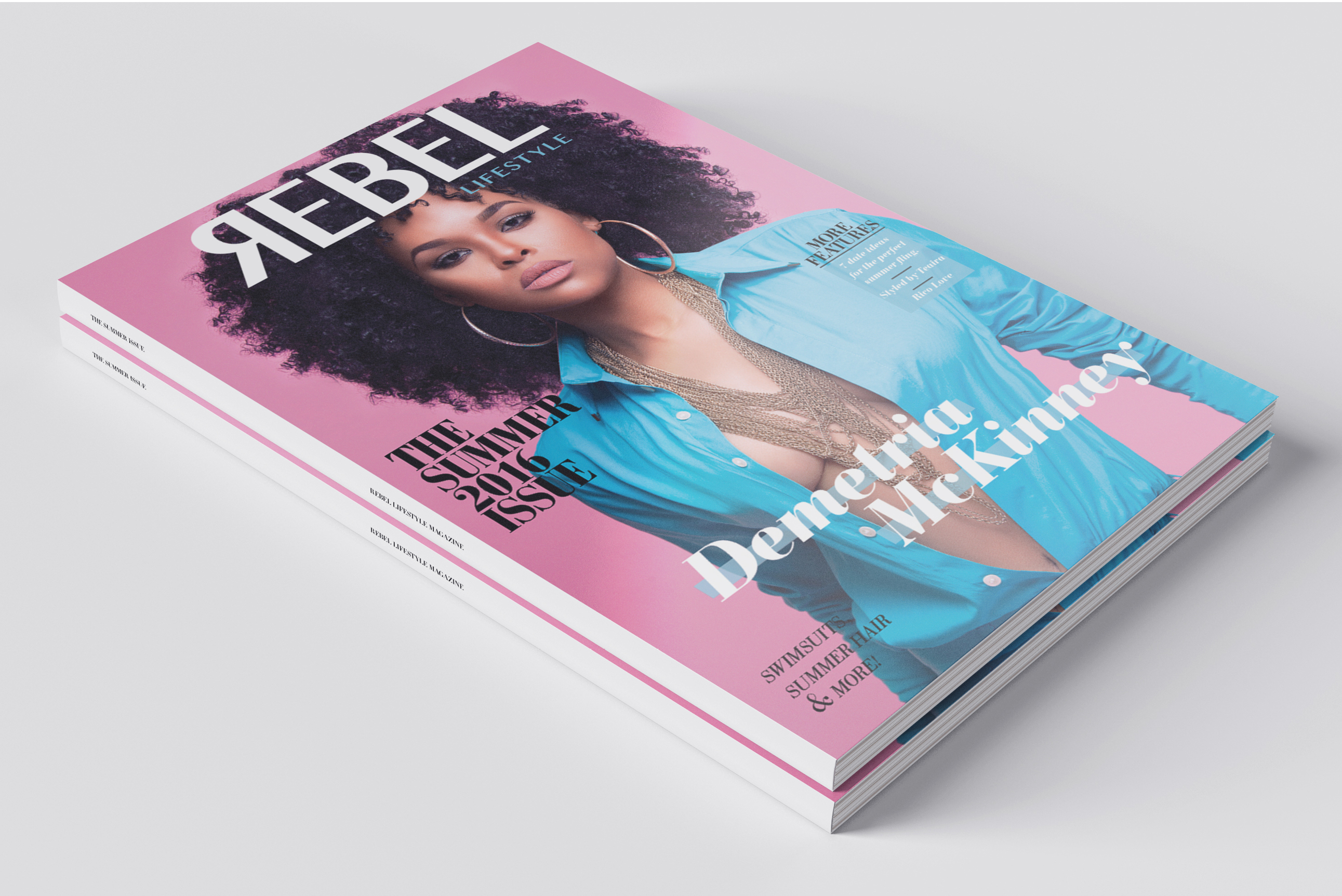
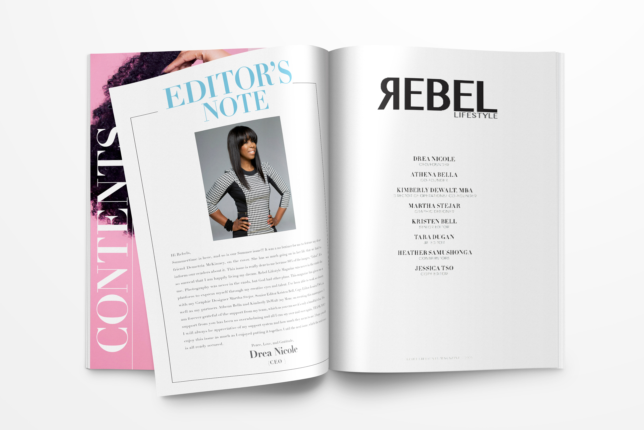
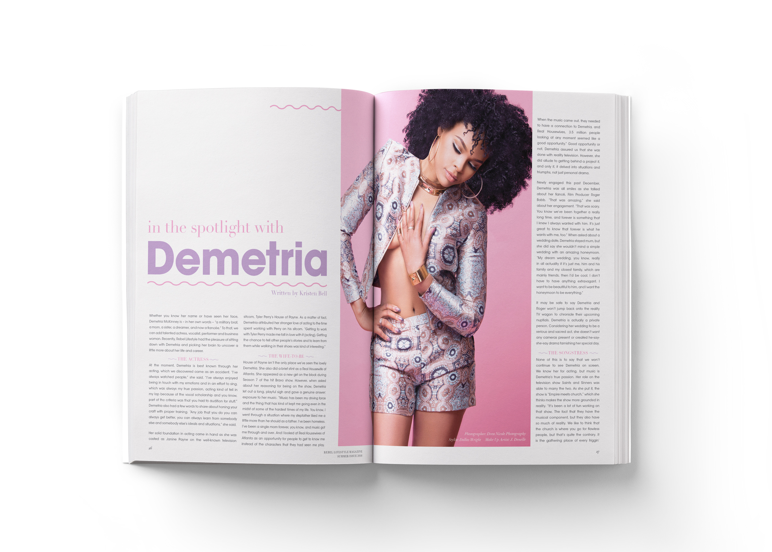
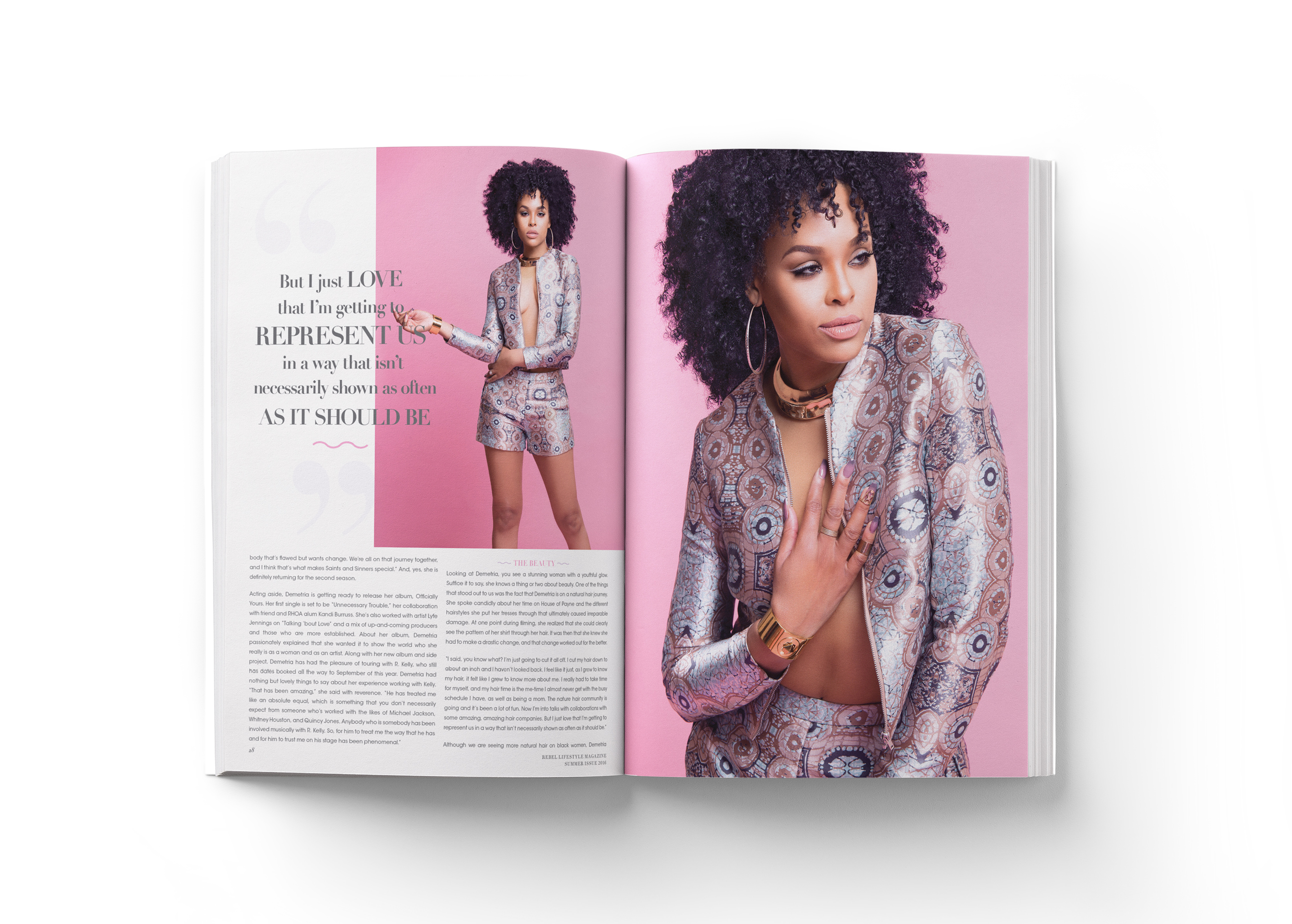
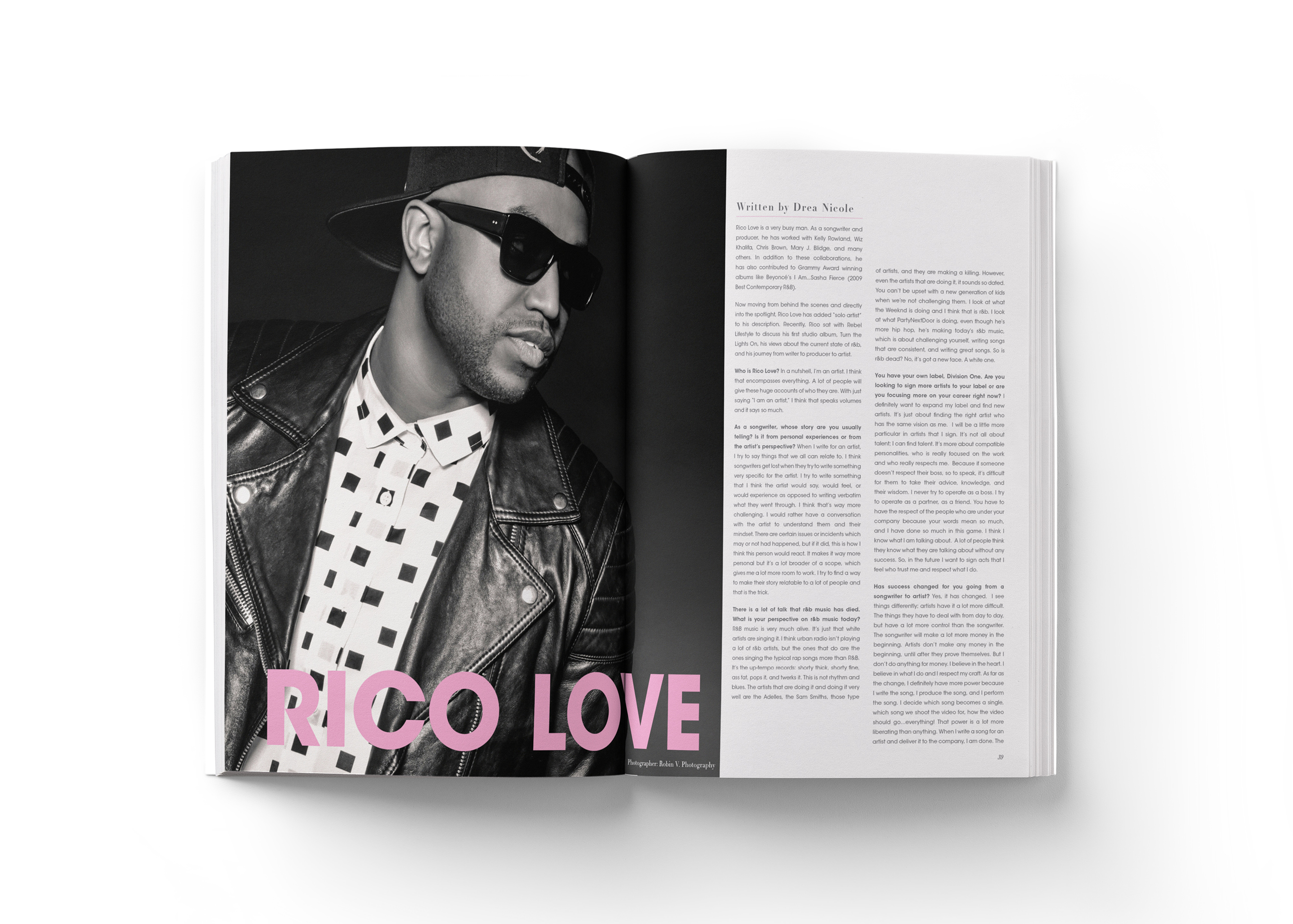
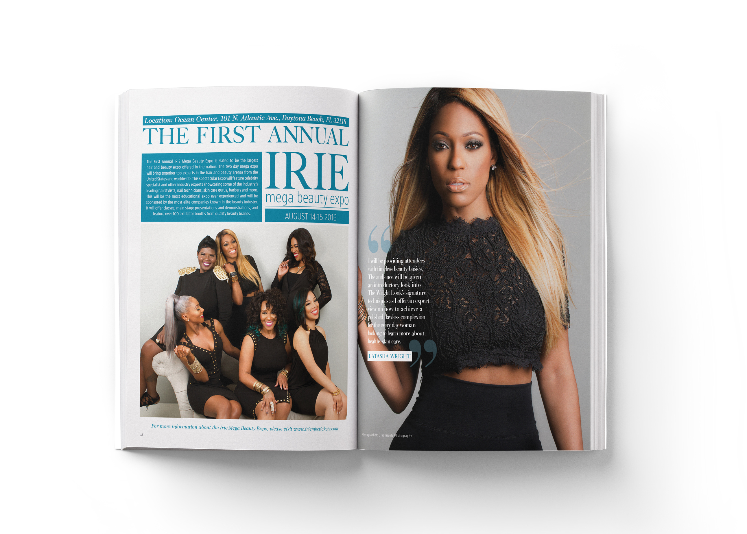
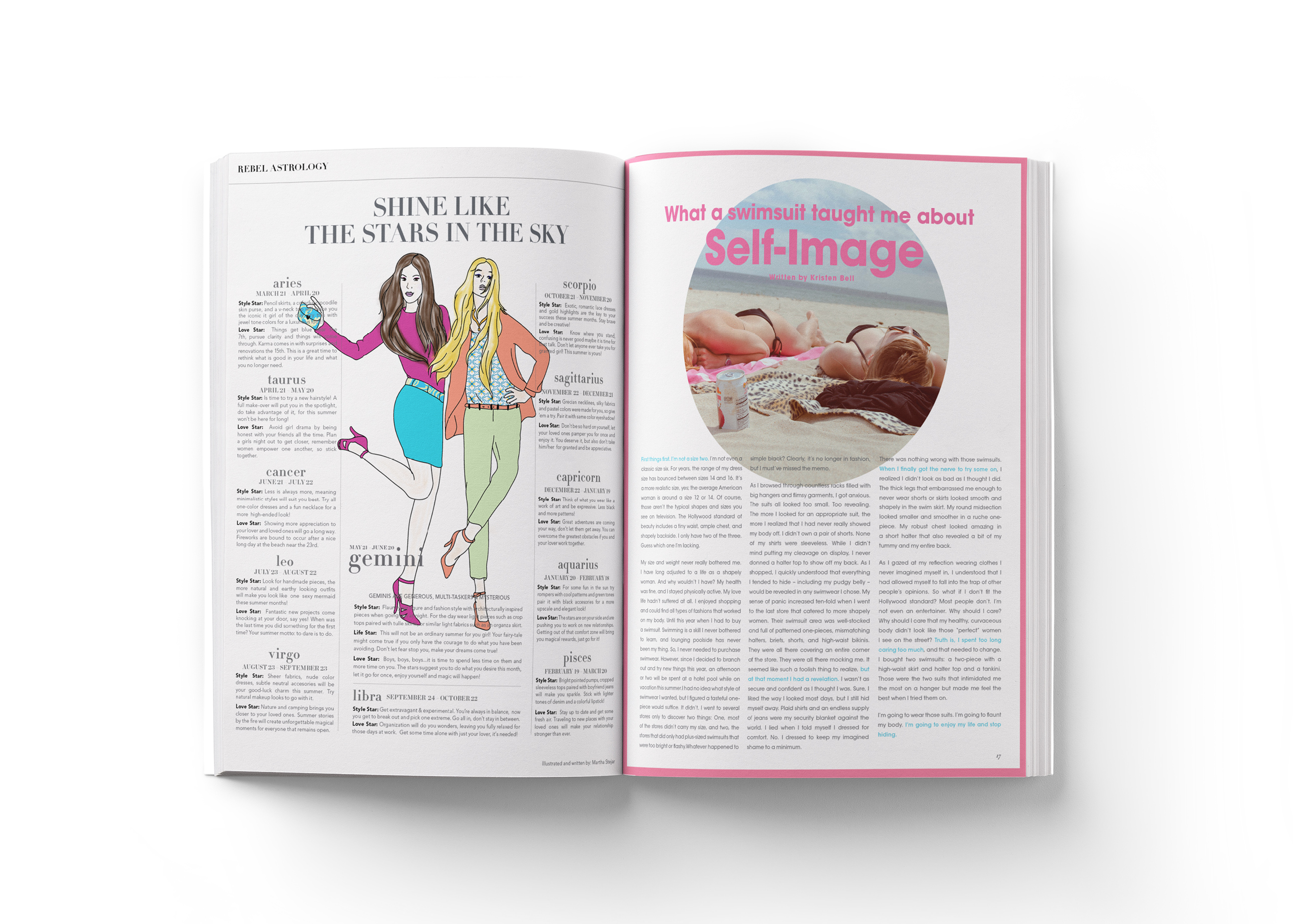
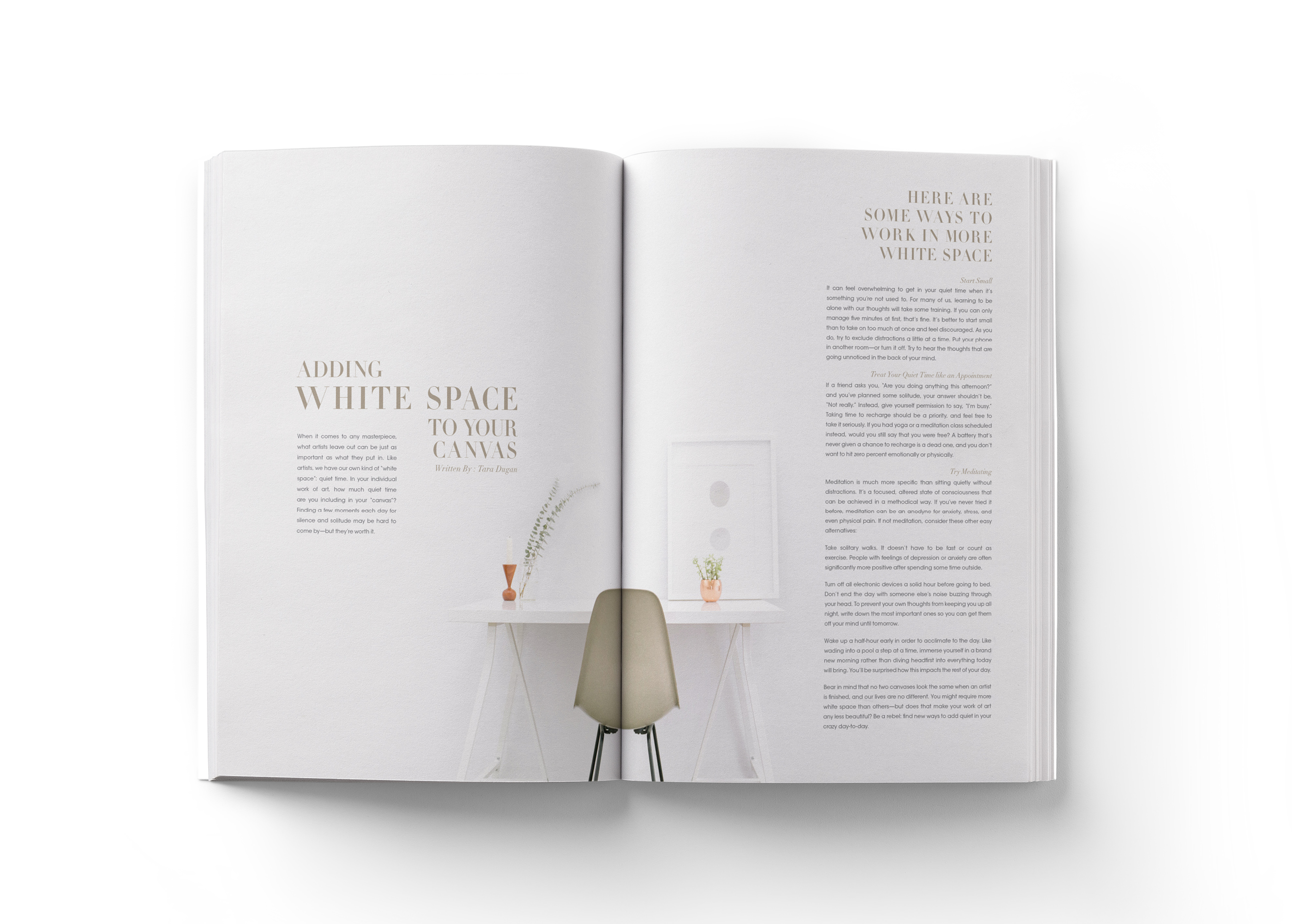
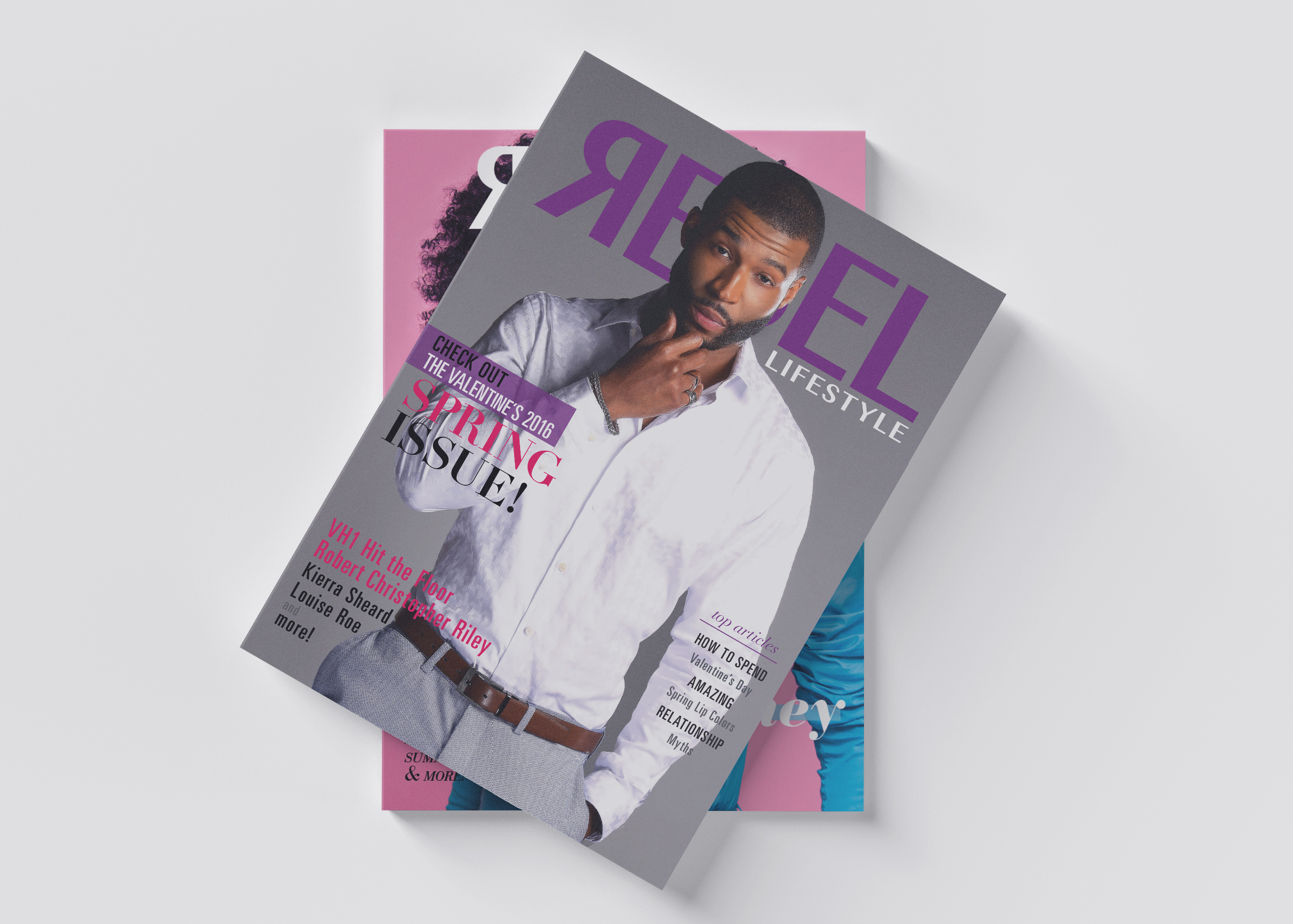
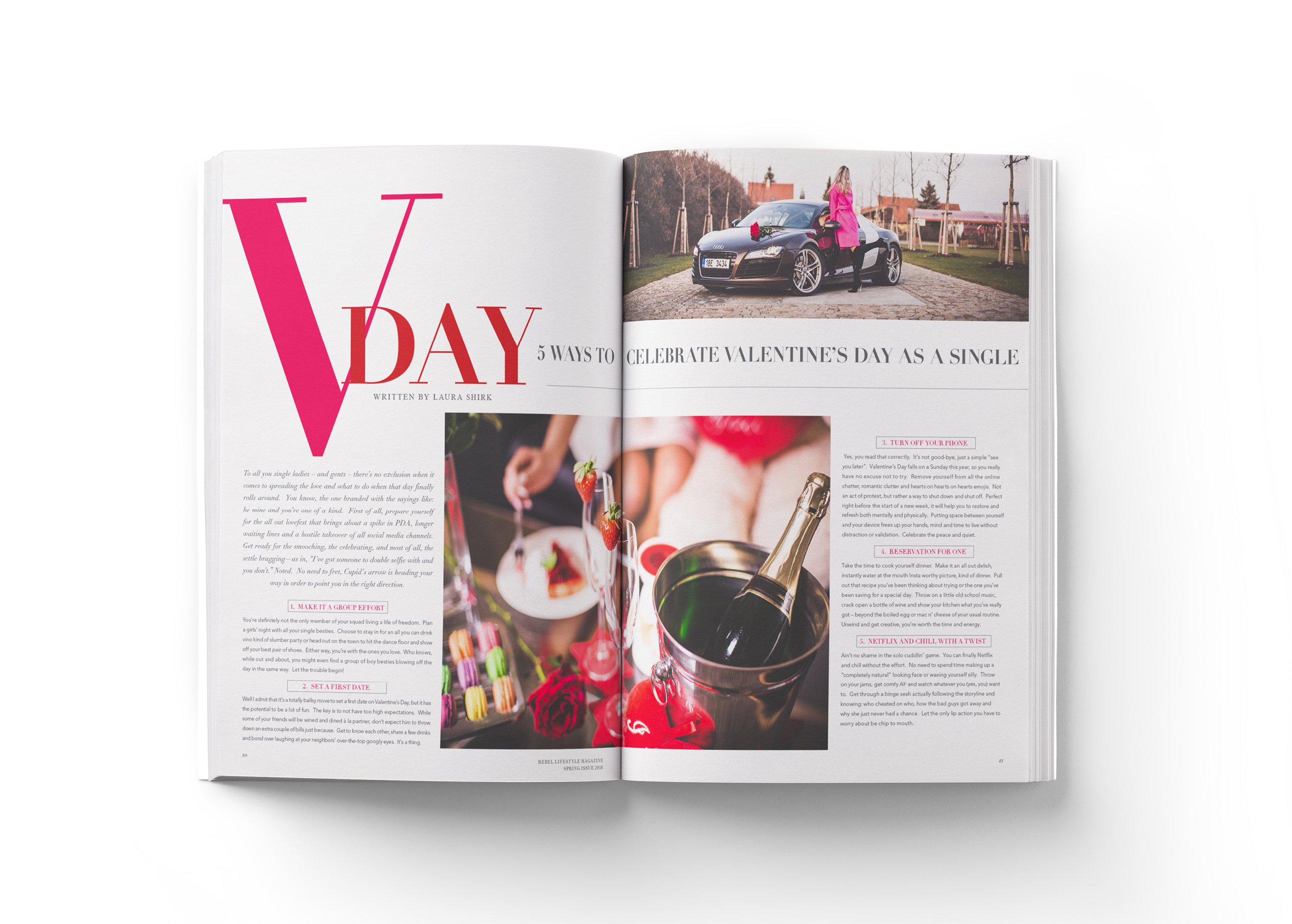
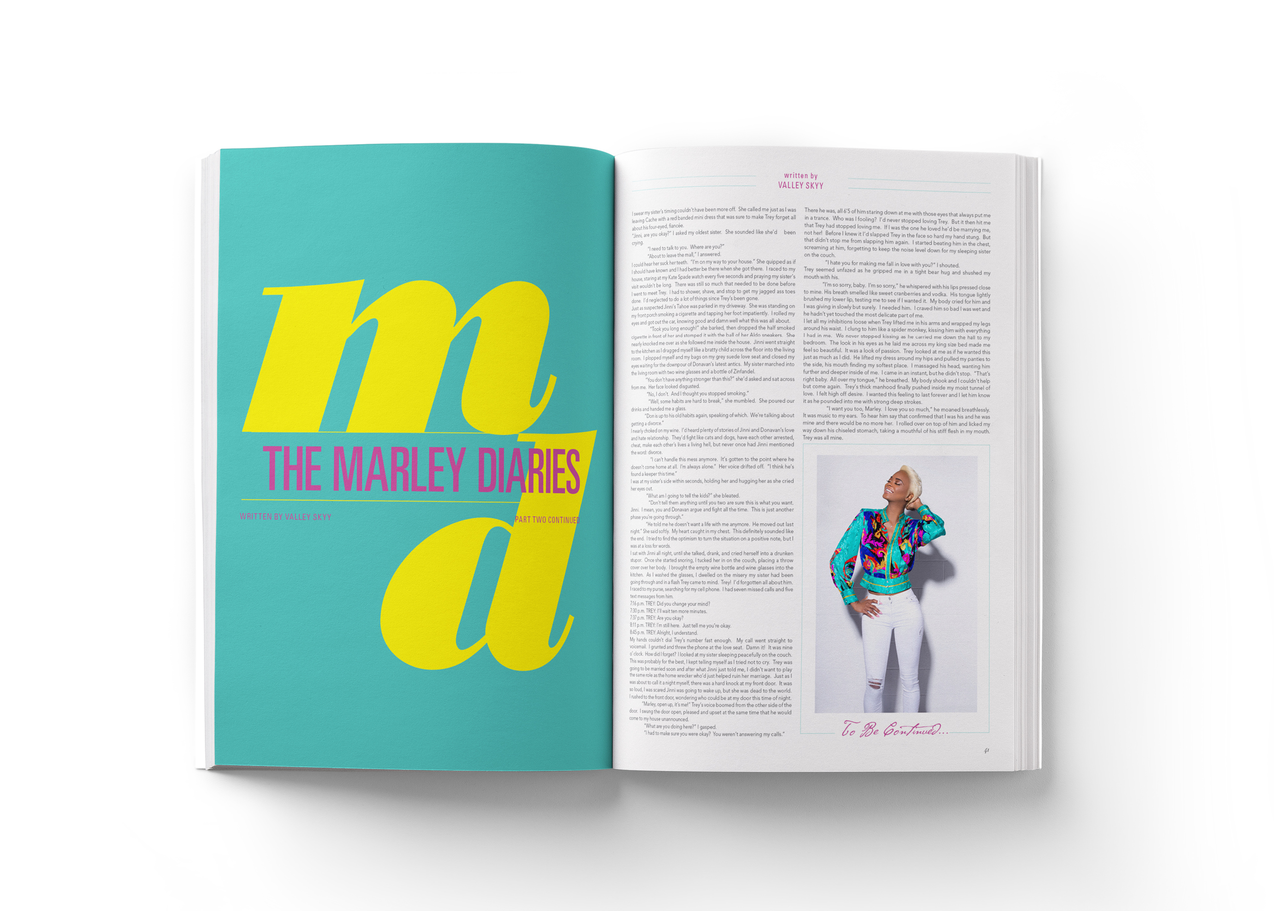
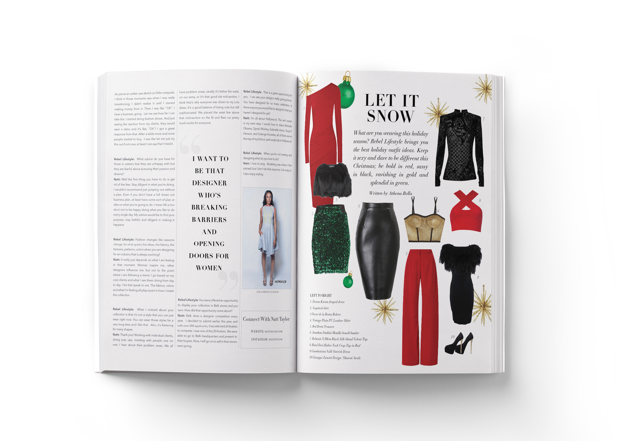
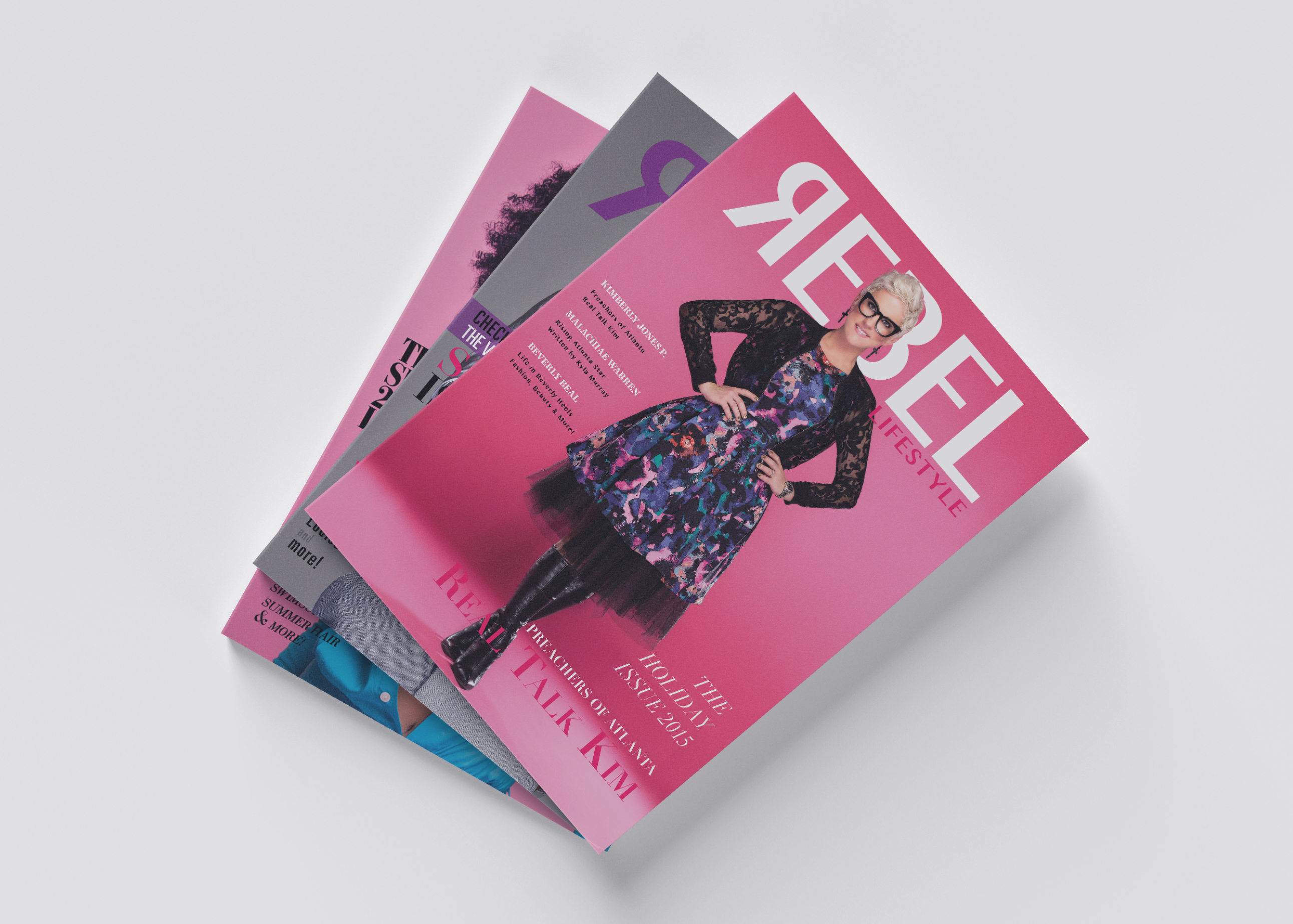
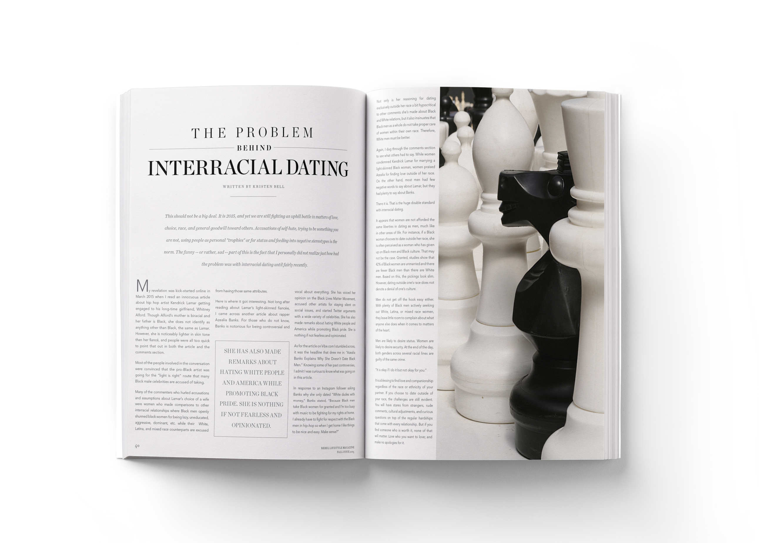
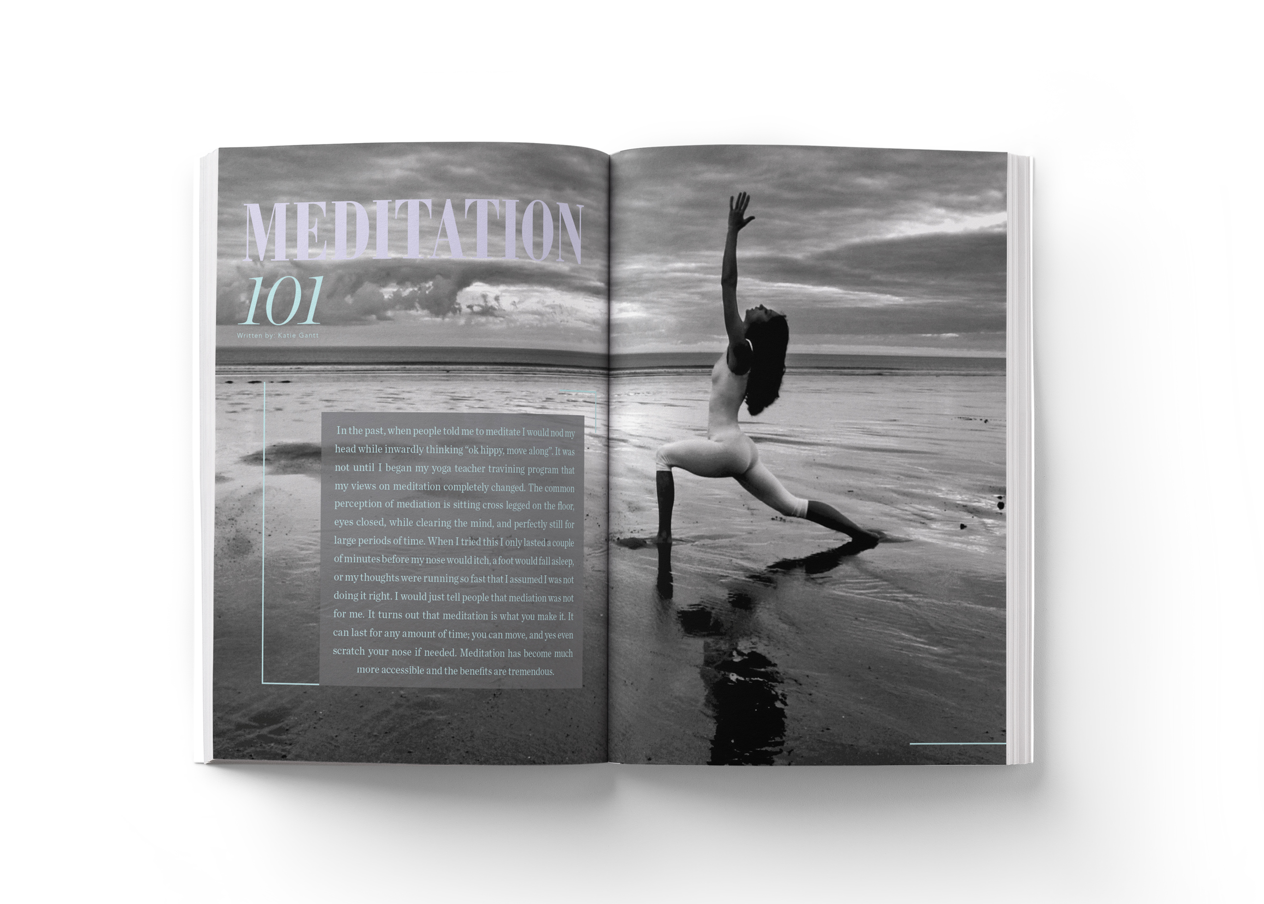
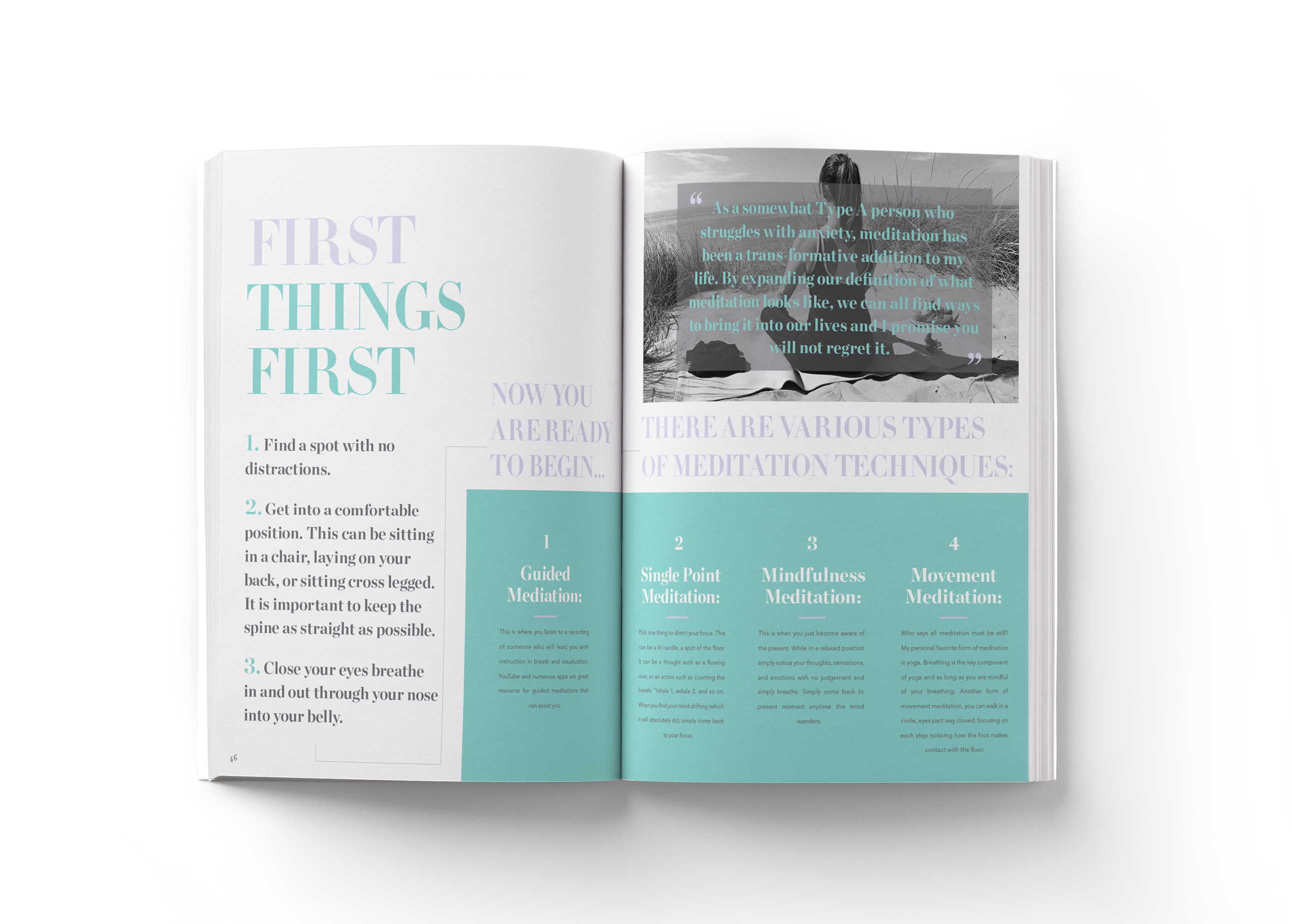
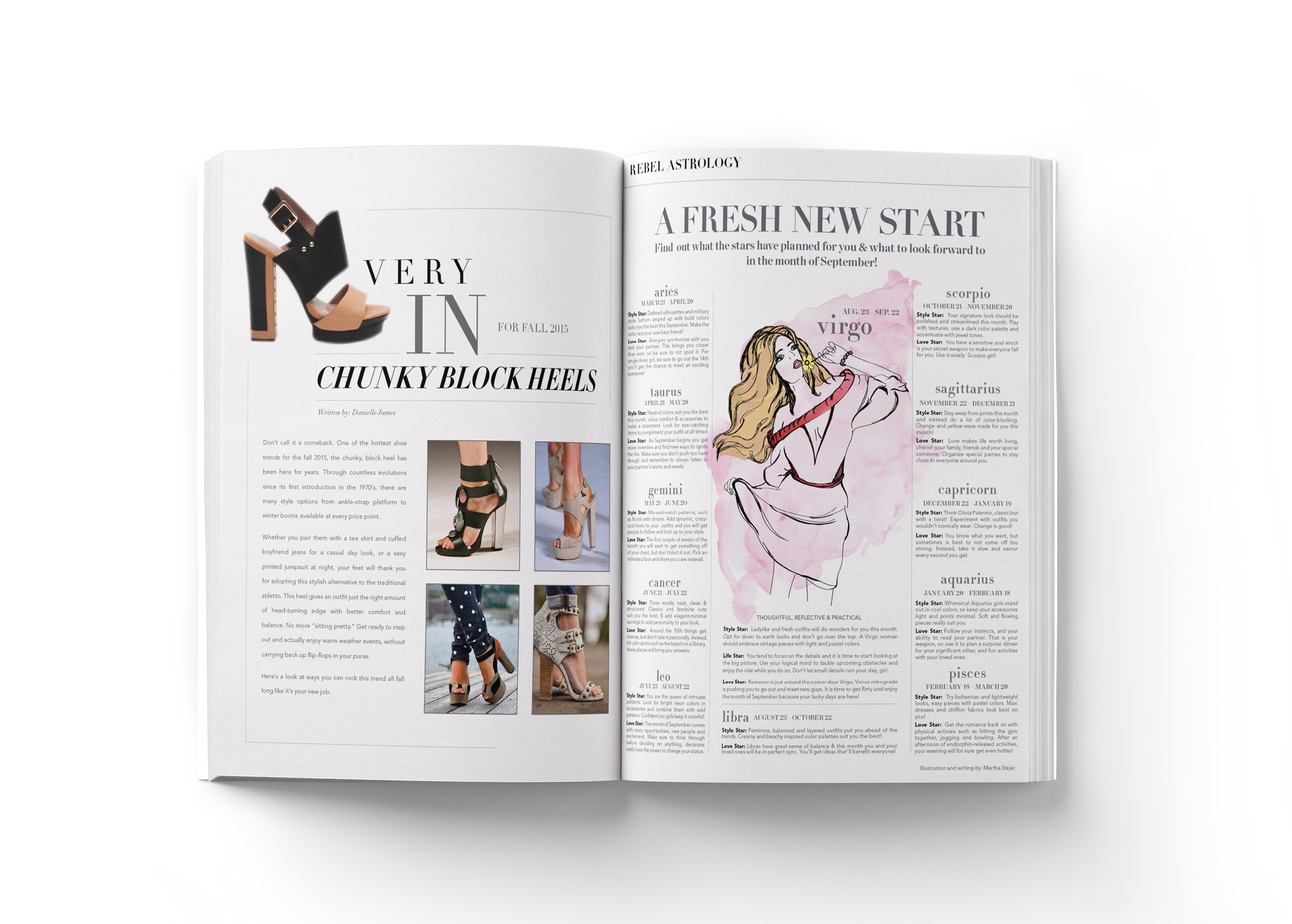
Here are just a few of my layouts and spreads I have designed as the Graphic Designer for Rebel Lifestyle Magazine. The magazine's feel is rebellious and playful yet still sophisticated. For the Horoscope section I did all the writing myself as well as the illustrations and layout design.
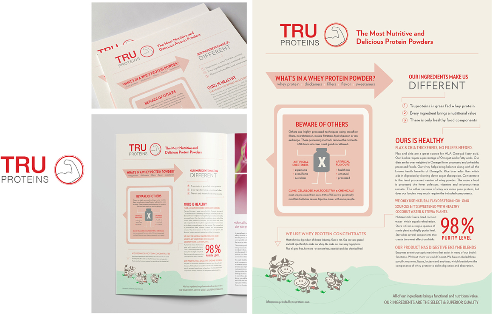
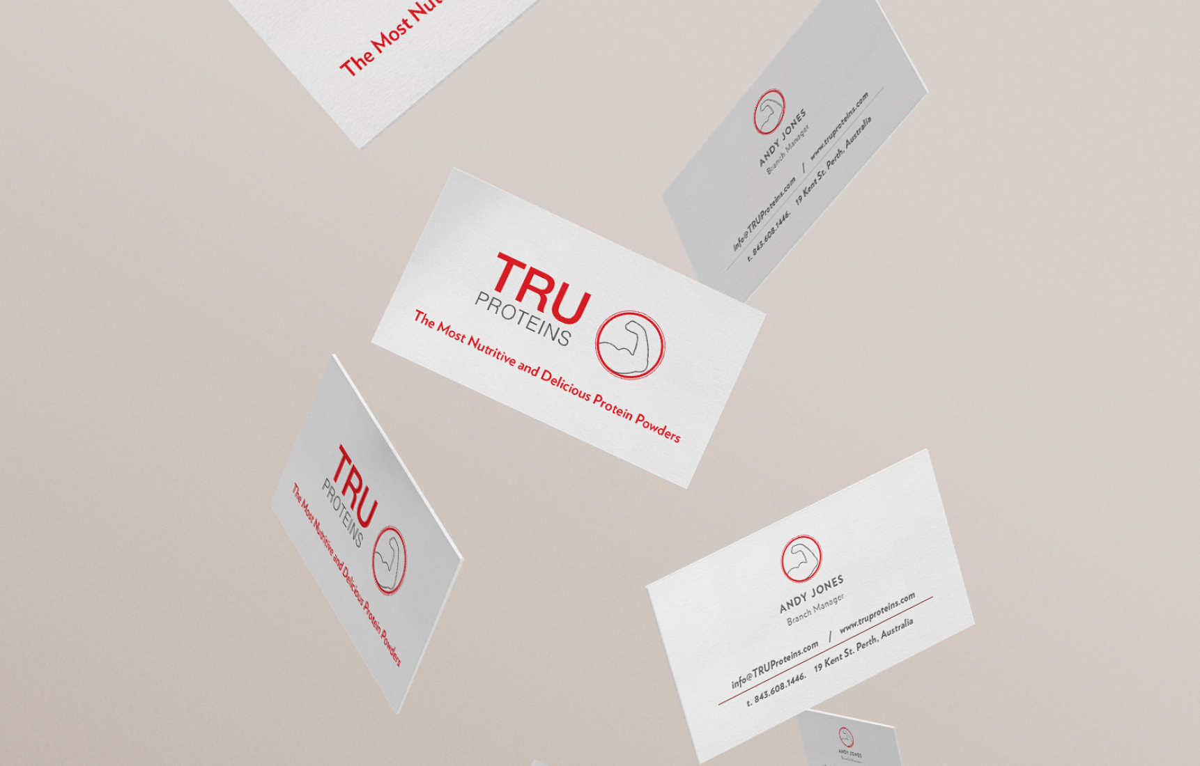
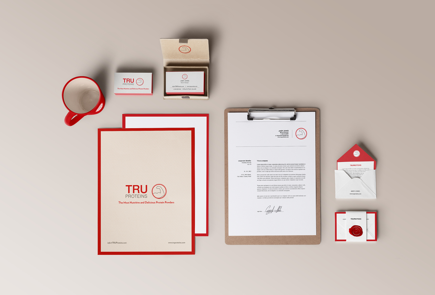
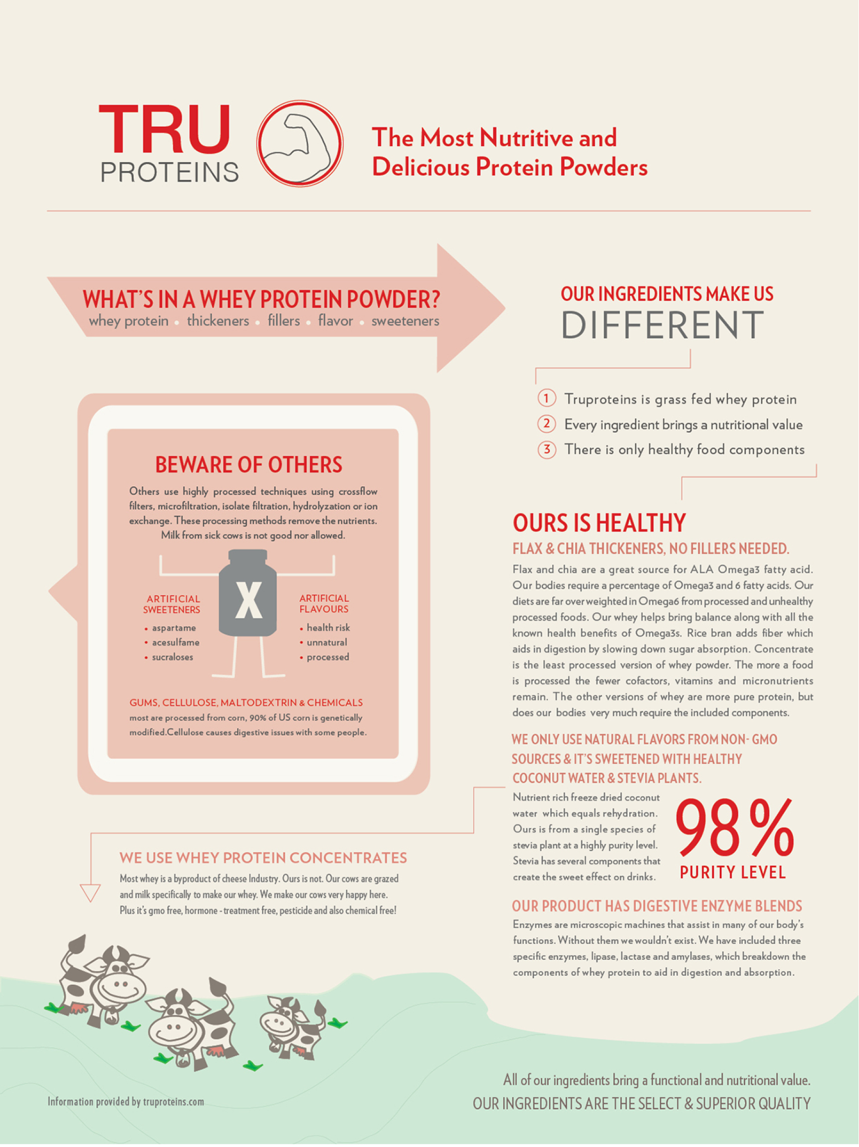
As a freelance designer I created an infographic for the Tru Proteins Australian brand, the objective was to inform people about the ingredients used in their protein powder versus what other brands use. The client wanted an infographic that would show these differences in ingredients in a clear but interesting way.
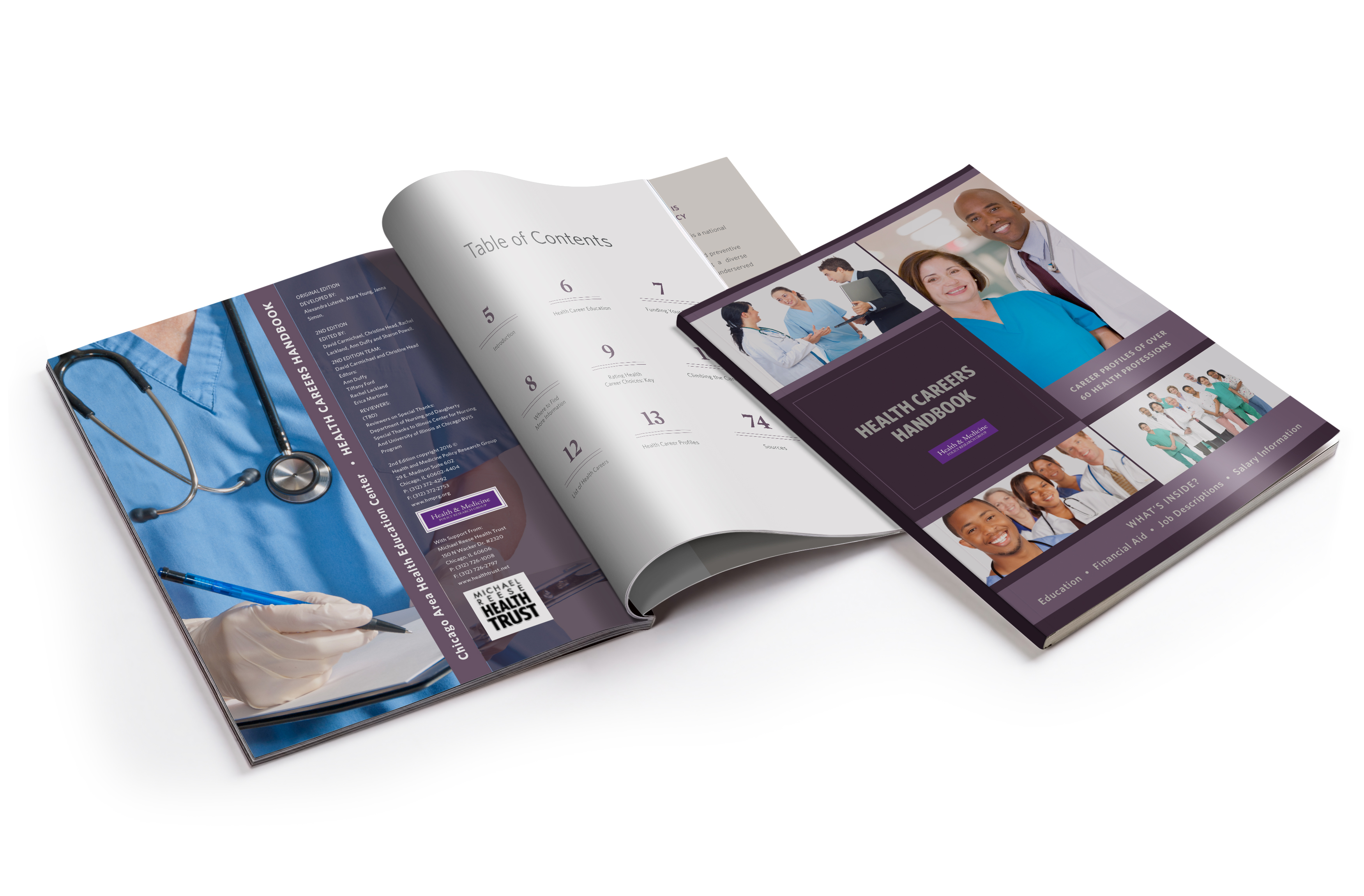
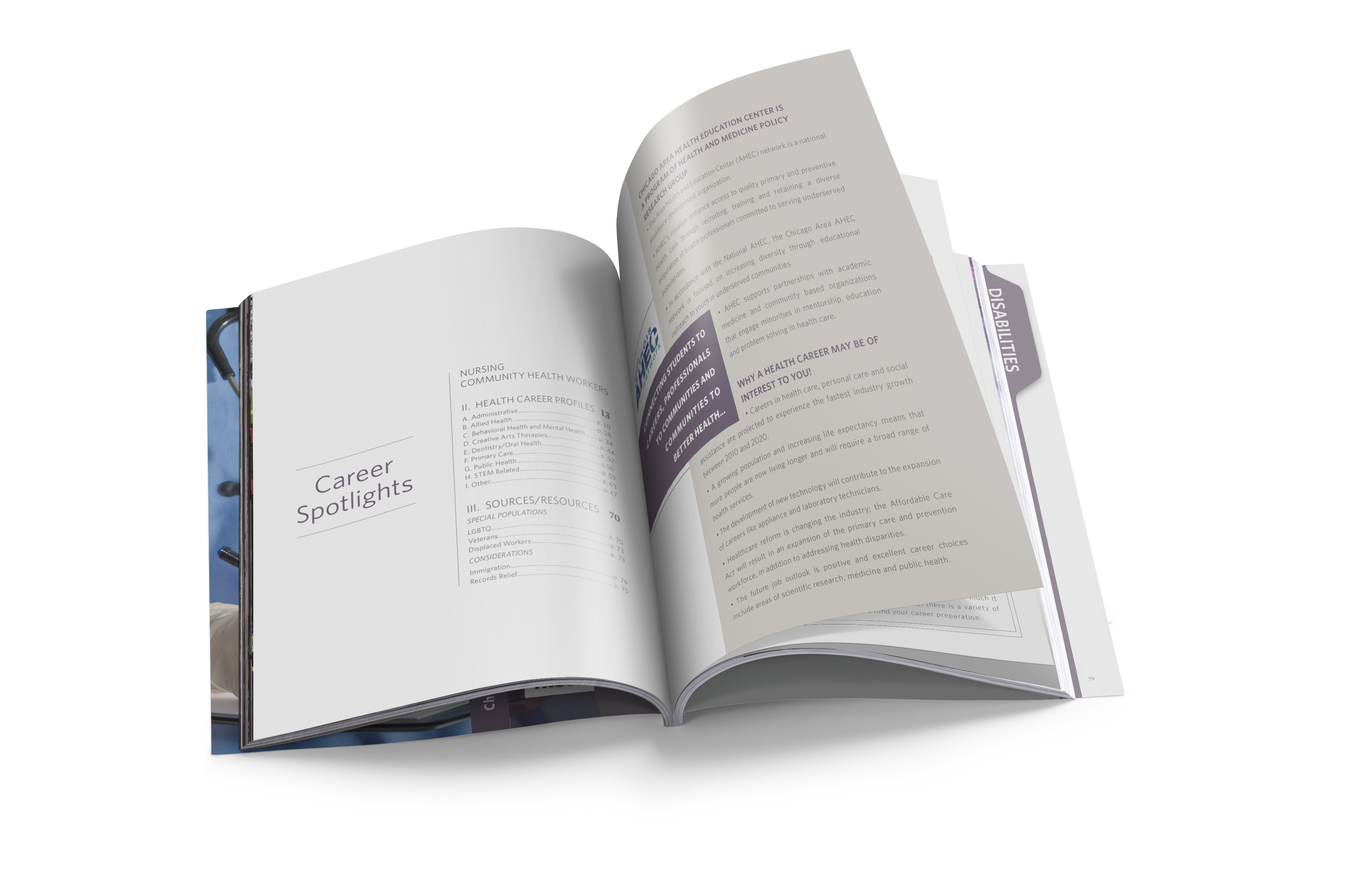
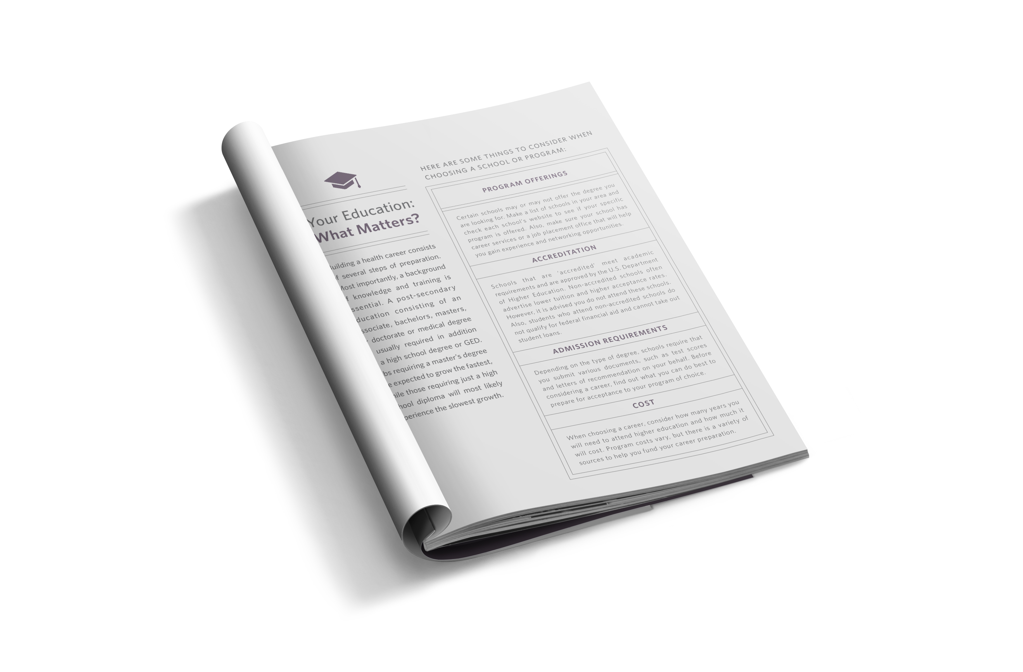
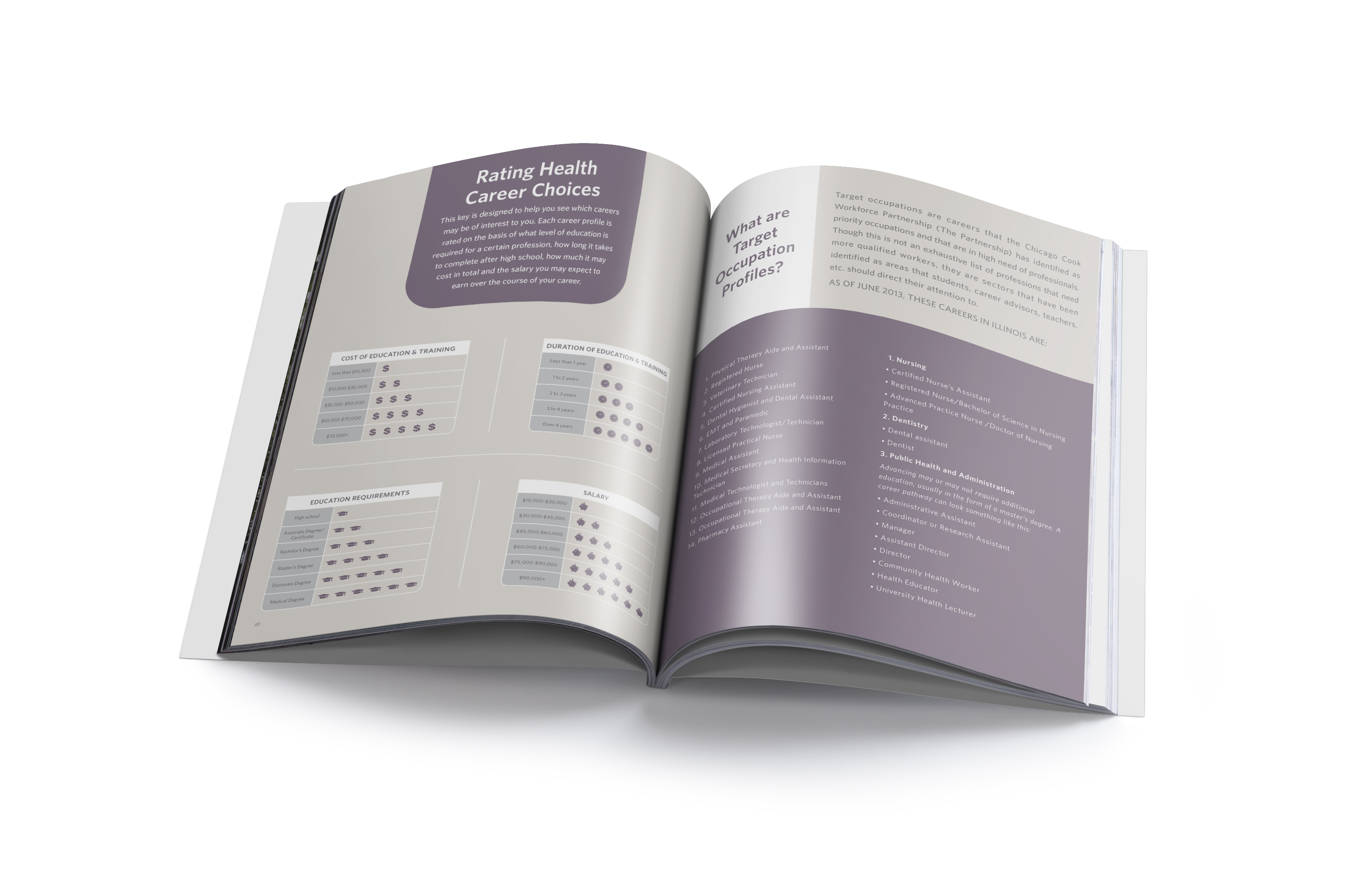
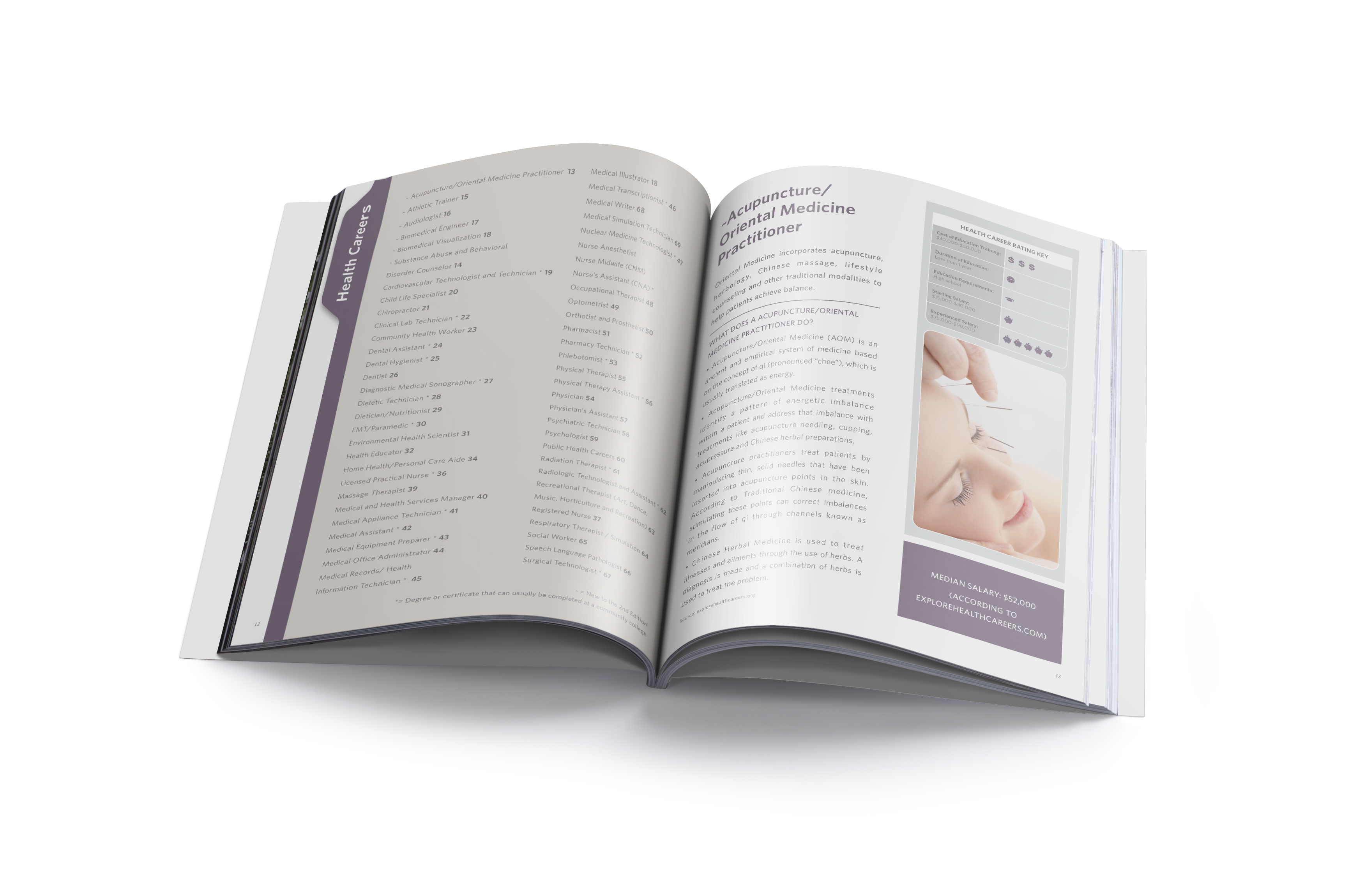
HMPRG works to improve the health of all people in Illinois by promoting health equity. I am happy I got the chance to conceptualize and execute the cover for their newest health career’s book. I designed and organized the book interiors and sections. Created a cohesive look throughout while following the company’s branding. I also get to assist the marketing team and contribute creatively by designing sleek marketing print materials, such as invitations, postcards, program books, mailers and more.
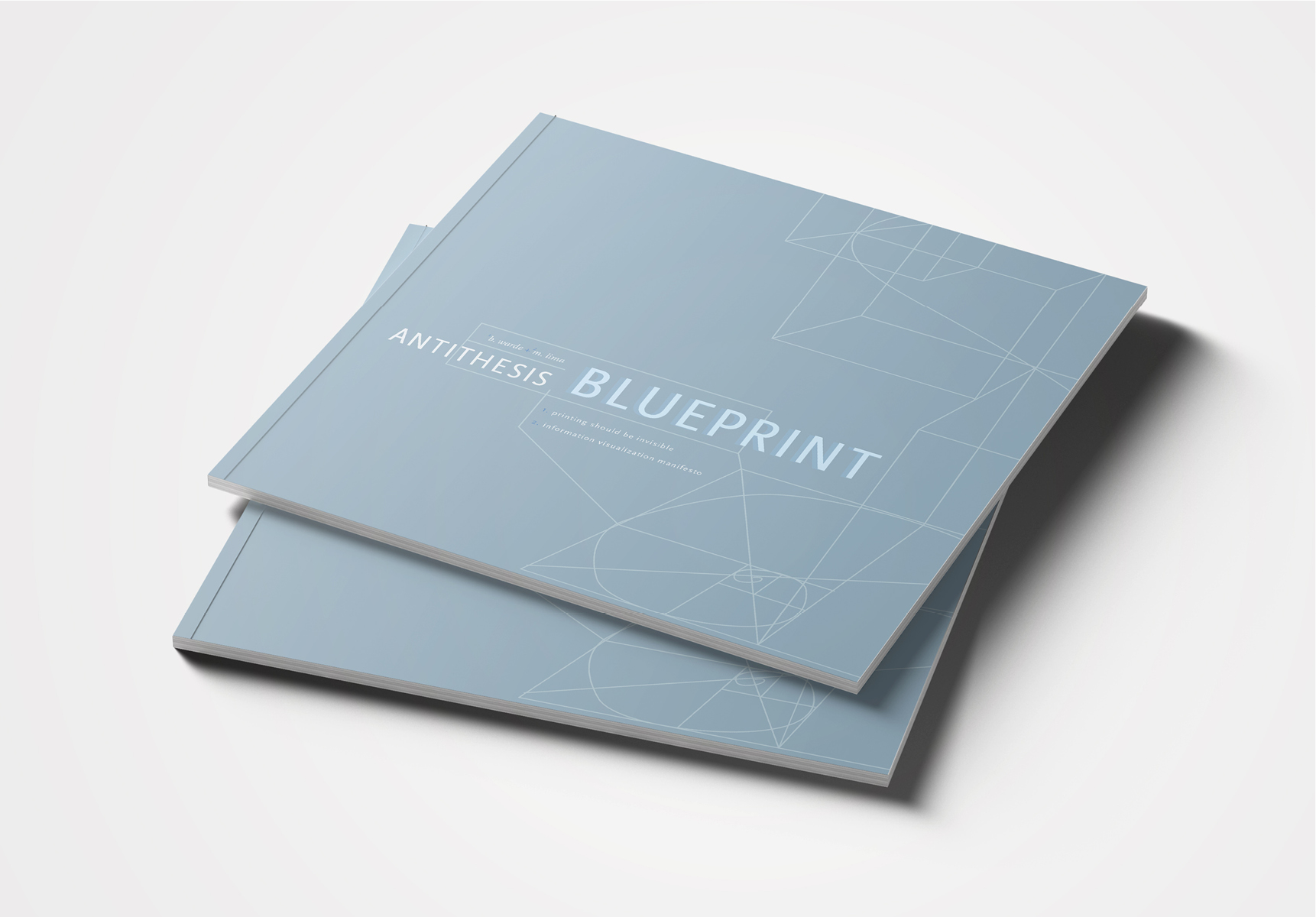
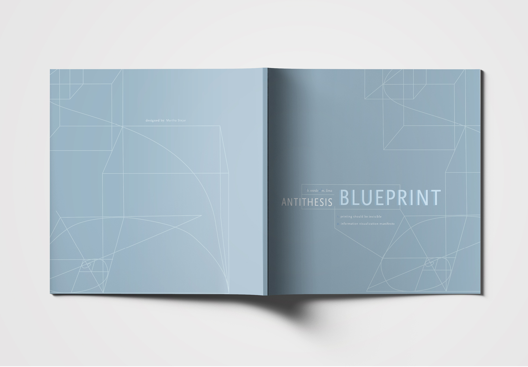
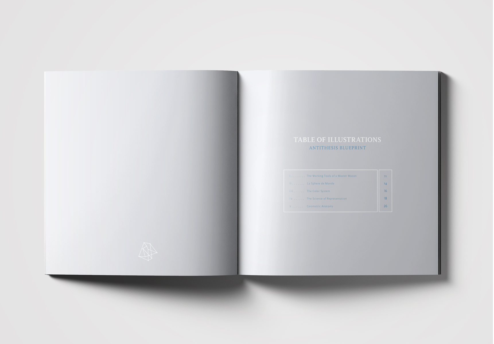
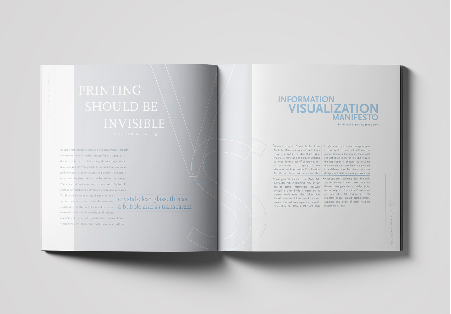
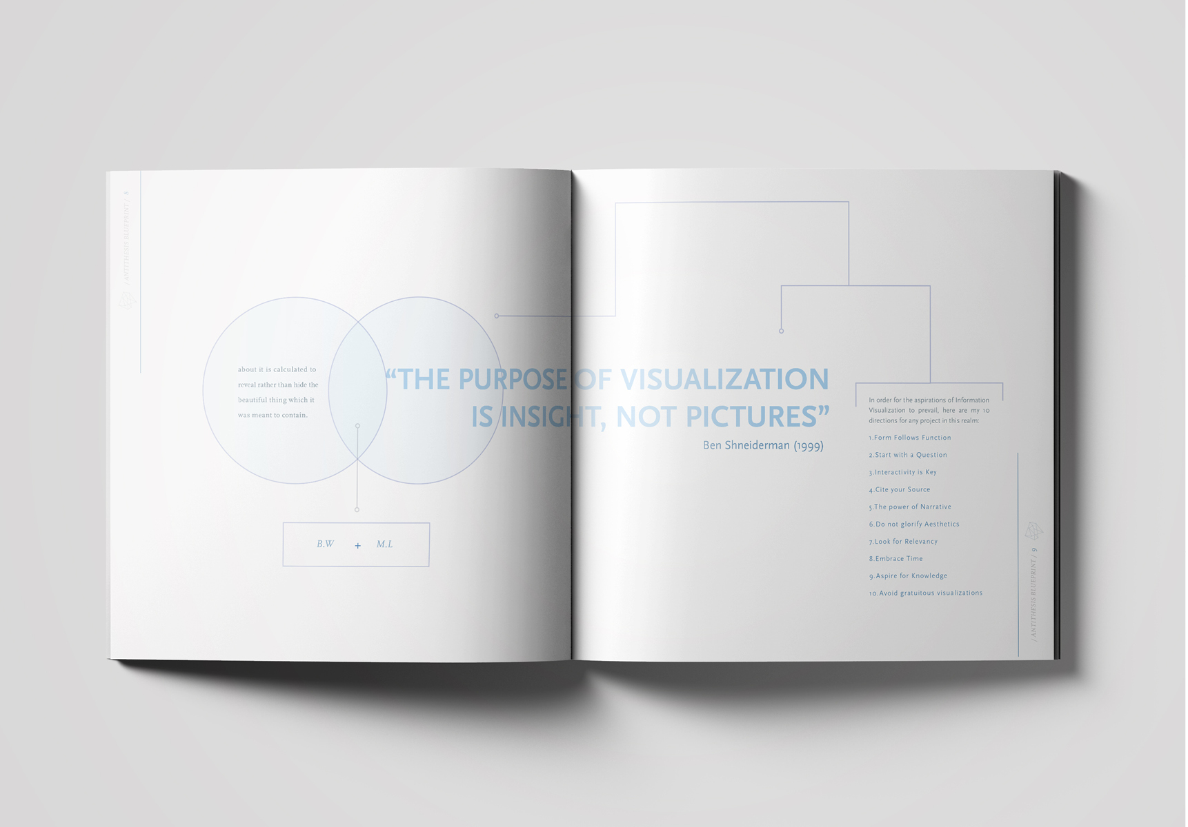
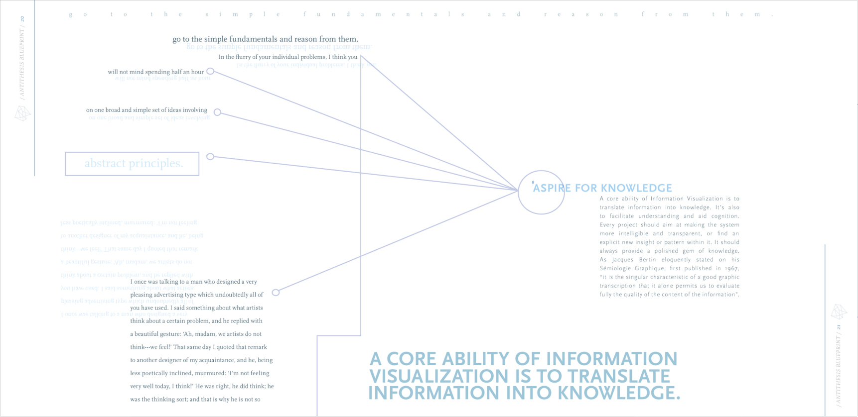
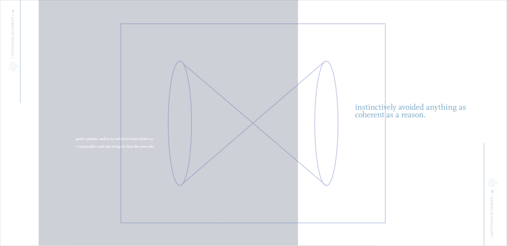
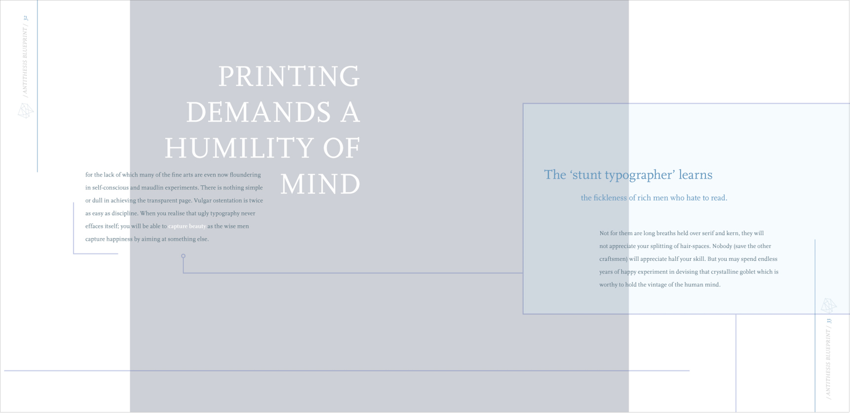
This book features the written works of Beatrice Warde and Manuel Lima. It is put together and visually designed to go against their beliefs, they both agree that typography & information should follow clarity and be precise rather than experimental. So I decided to do the opposite and glorify aesthetics. The illustrations are inspired by Manuel Lima writings about schematics and information design.
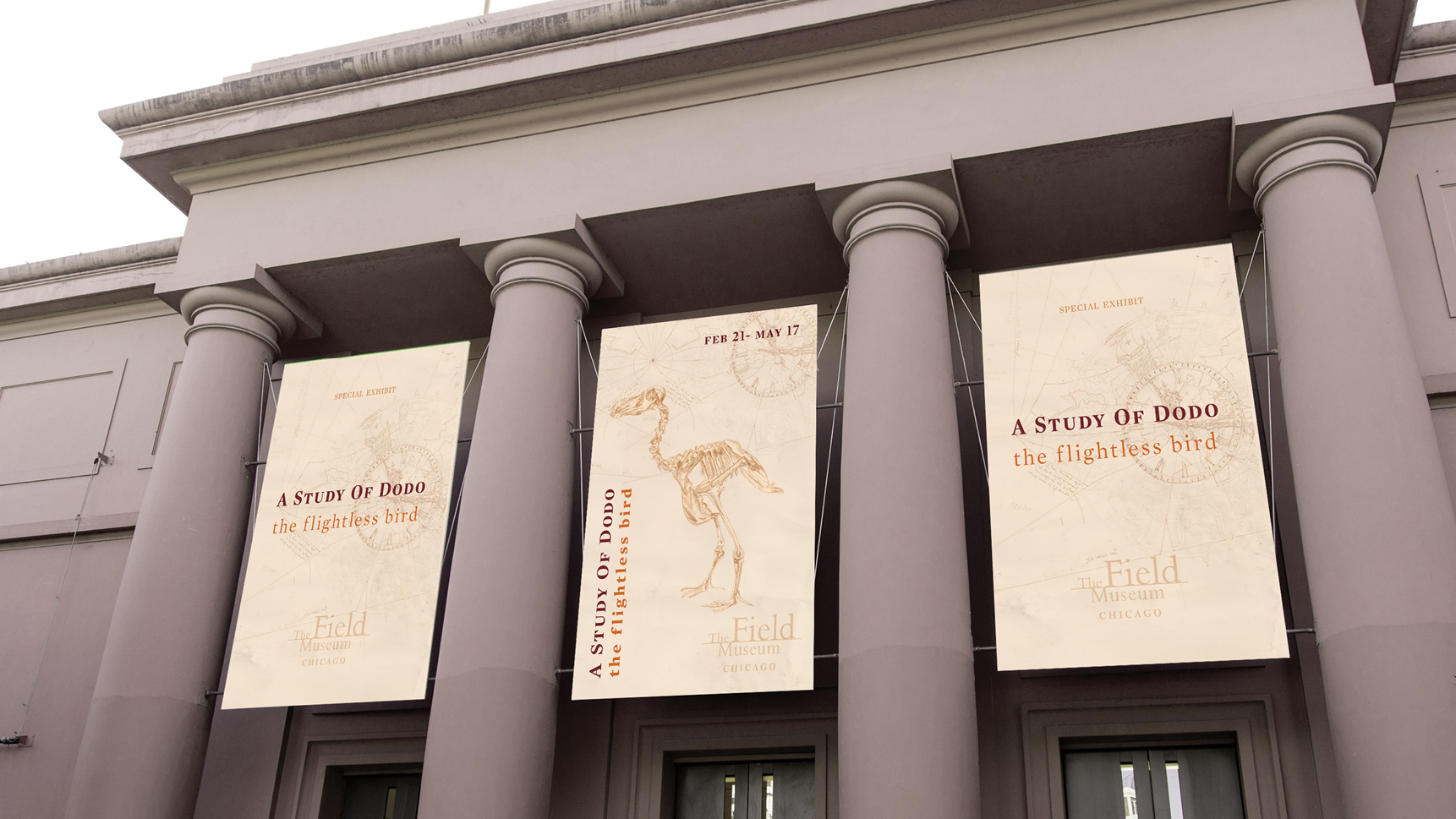
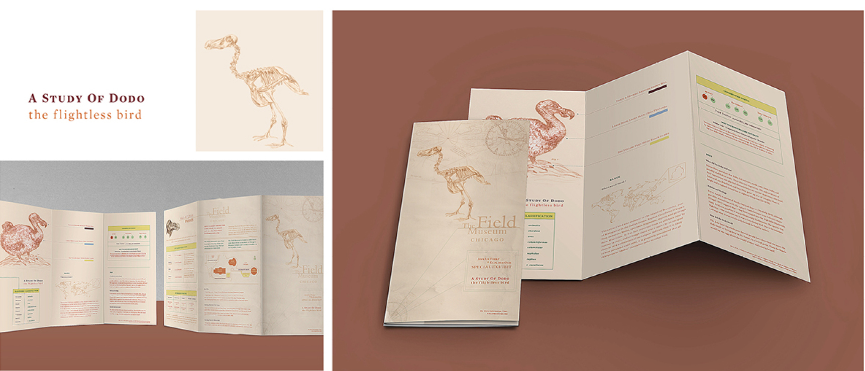
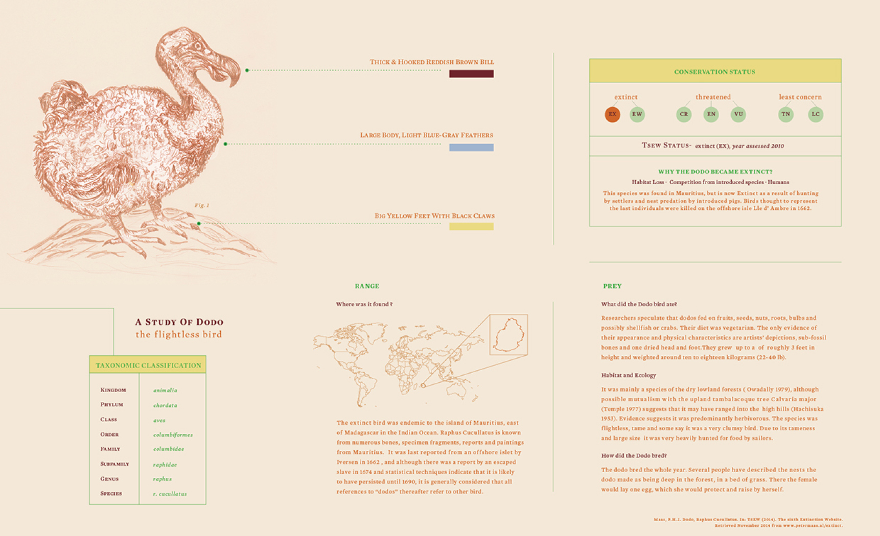
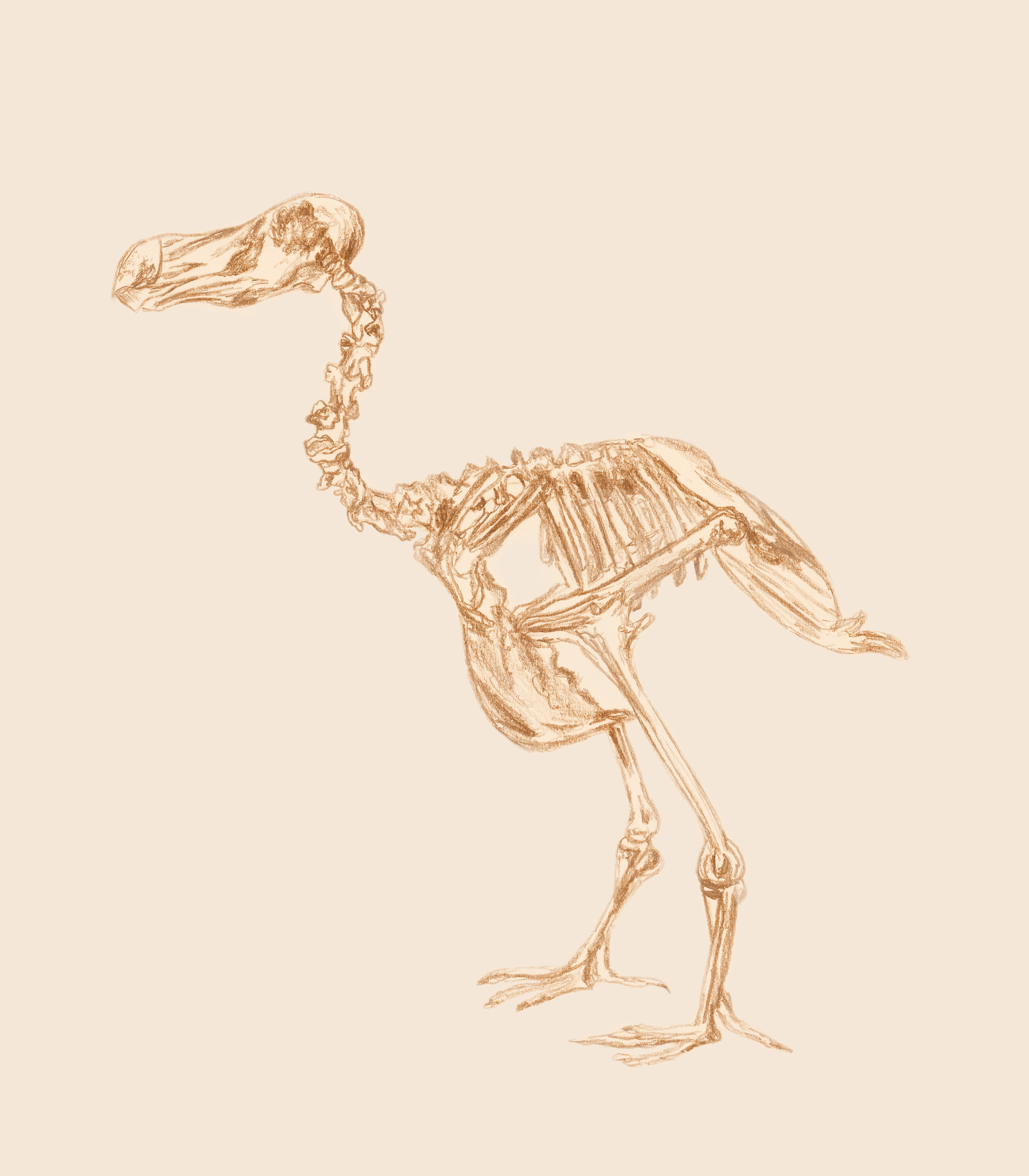
Brochure created for a museum to explain information about an organism that is extinct, this information needed to be organized clearly but in an non-boring way so the viewer would get motivated to keep reading. The color palette is inspired by antique archaeological findings. Illustration was hand-drawn then scanned in and digitally colored to make the project cohesive.
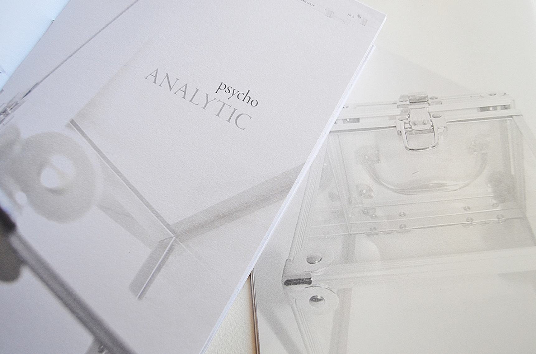
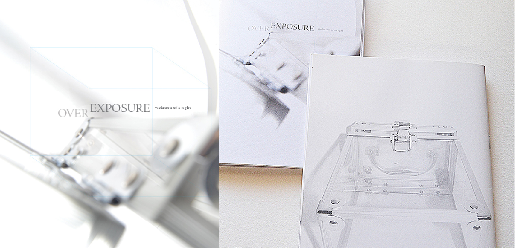
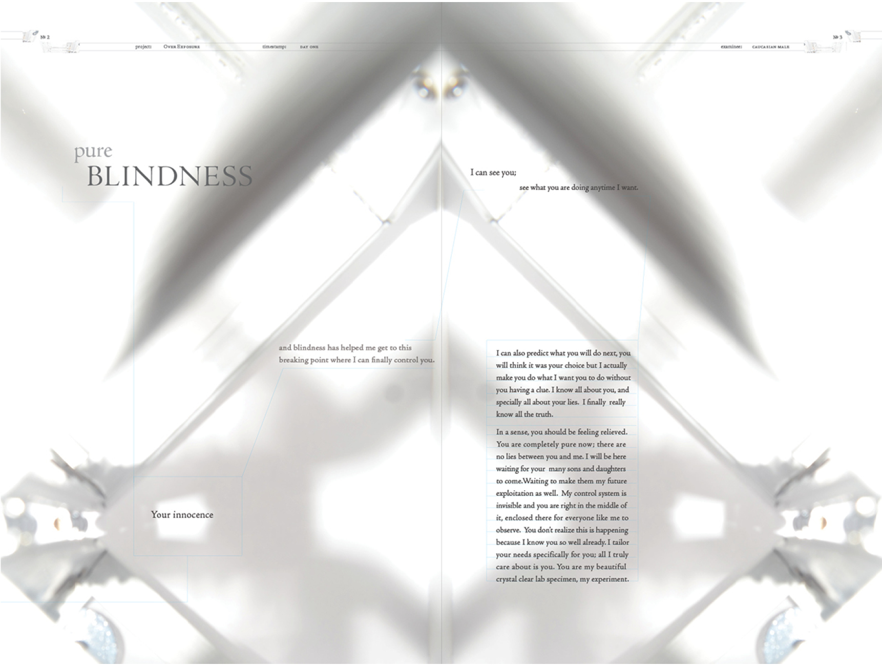
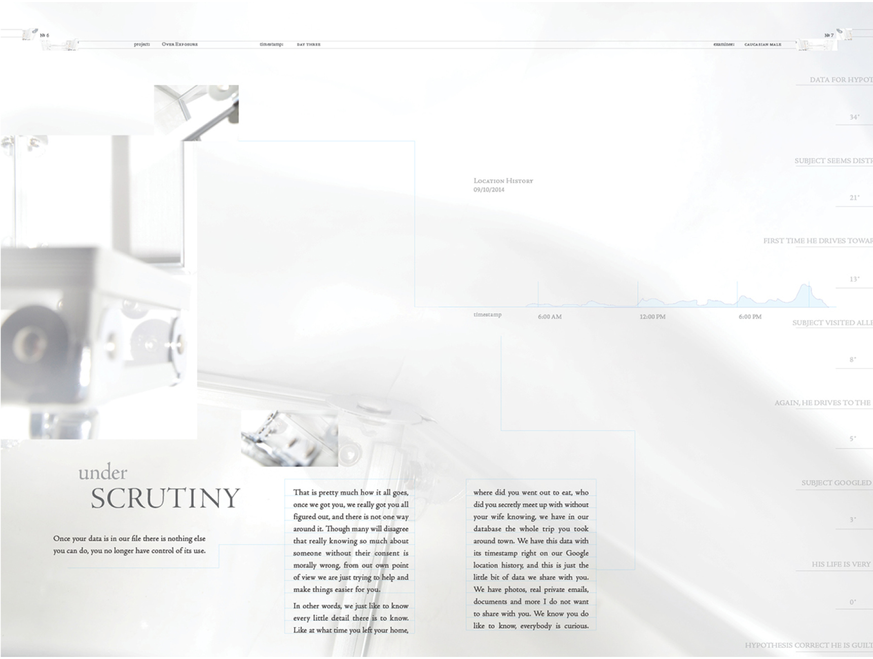
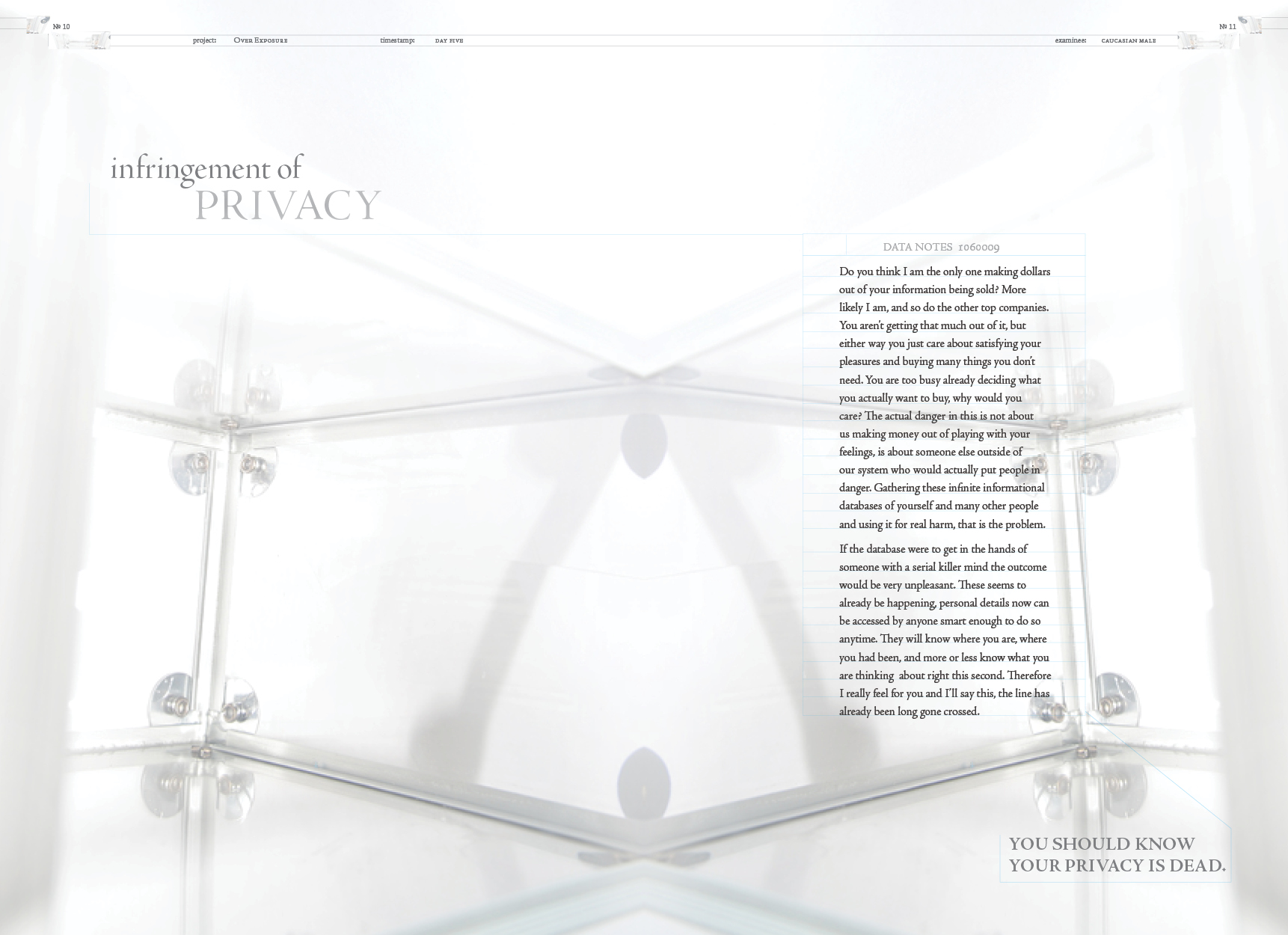
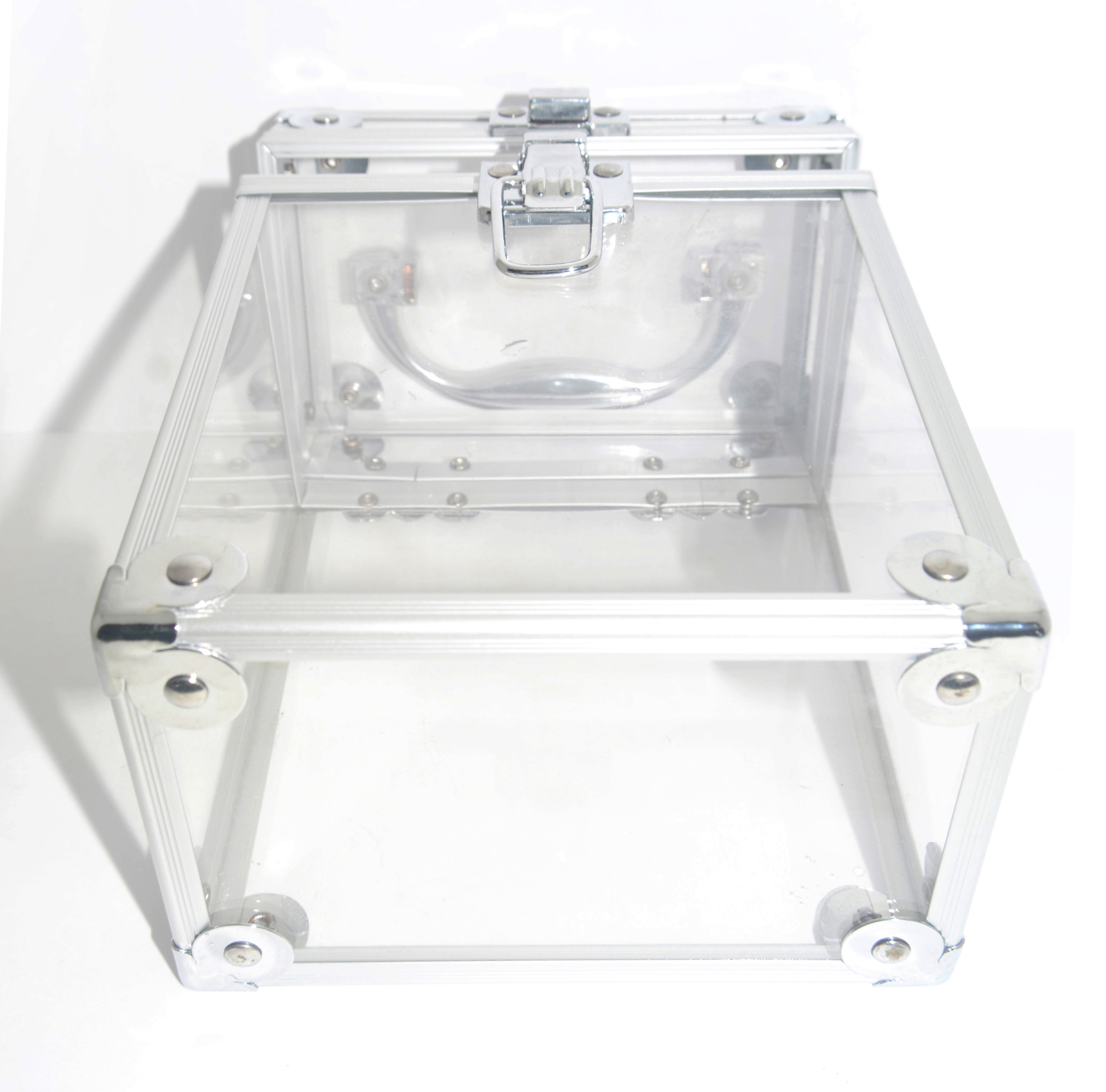
Over Exposure is a booklet I designed and wrote to bring awareness in how our private information is being used by media and marketeers. An empty crystal clear box is used to represent people after the media has taken all of our information. It talks about how we are being closely examined / analyzed by marketeers in order to figure out what we really want.
Also talks about the psychological techniques they use on us. The box is empty because they have found out all of our lies, they found our truth ( lightness) so we basically become see- through for them, just like the crystal clear box. Layout design includes an infographic and is laid out like such since my topic of writing deals with people's private information.
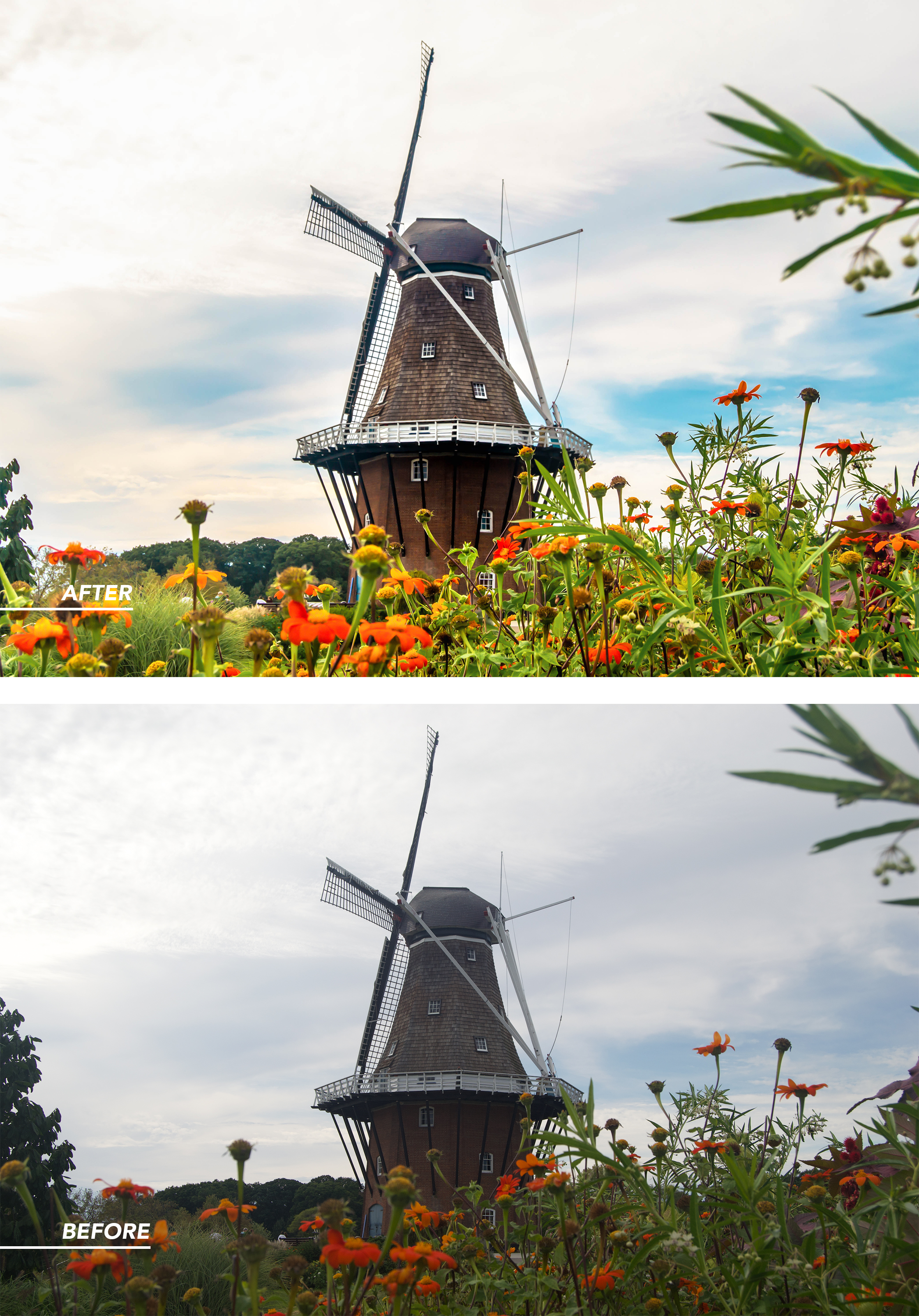
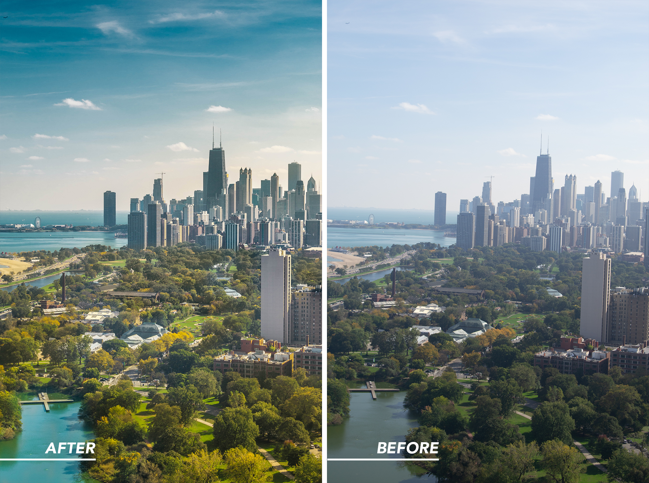
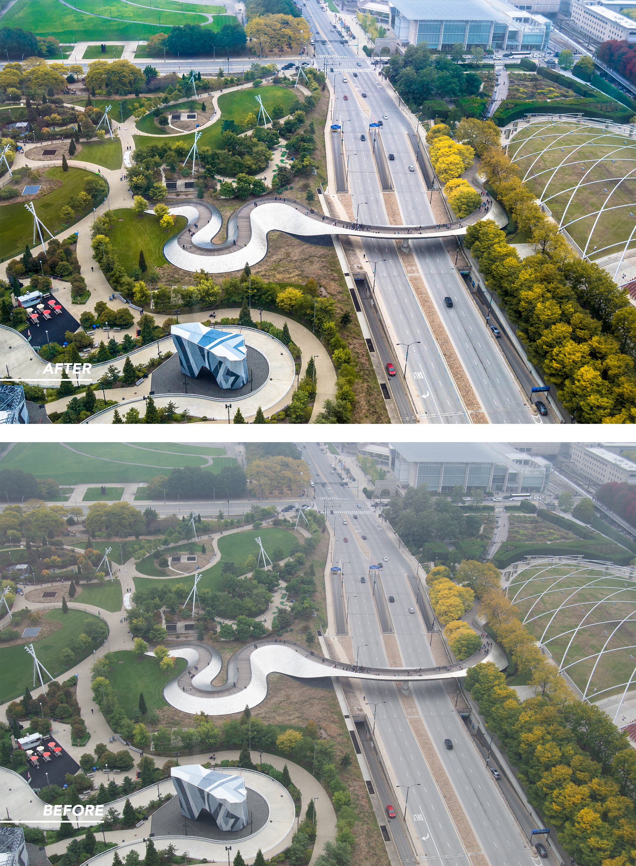
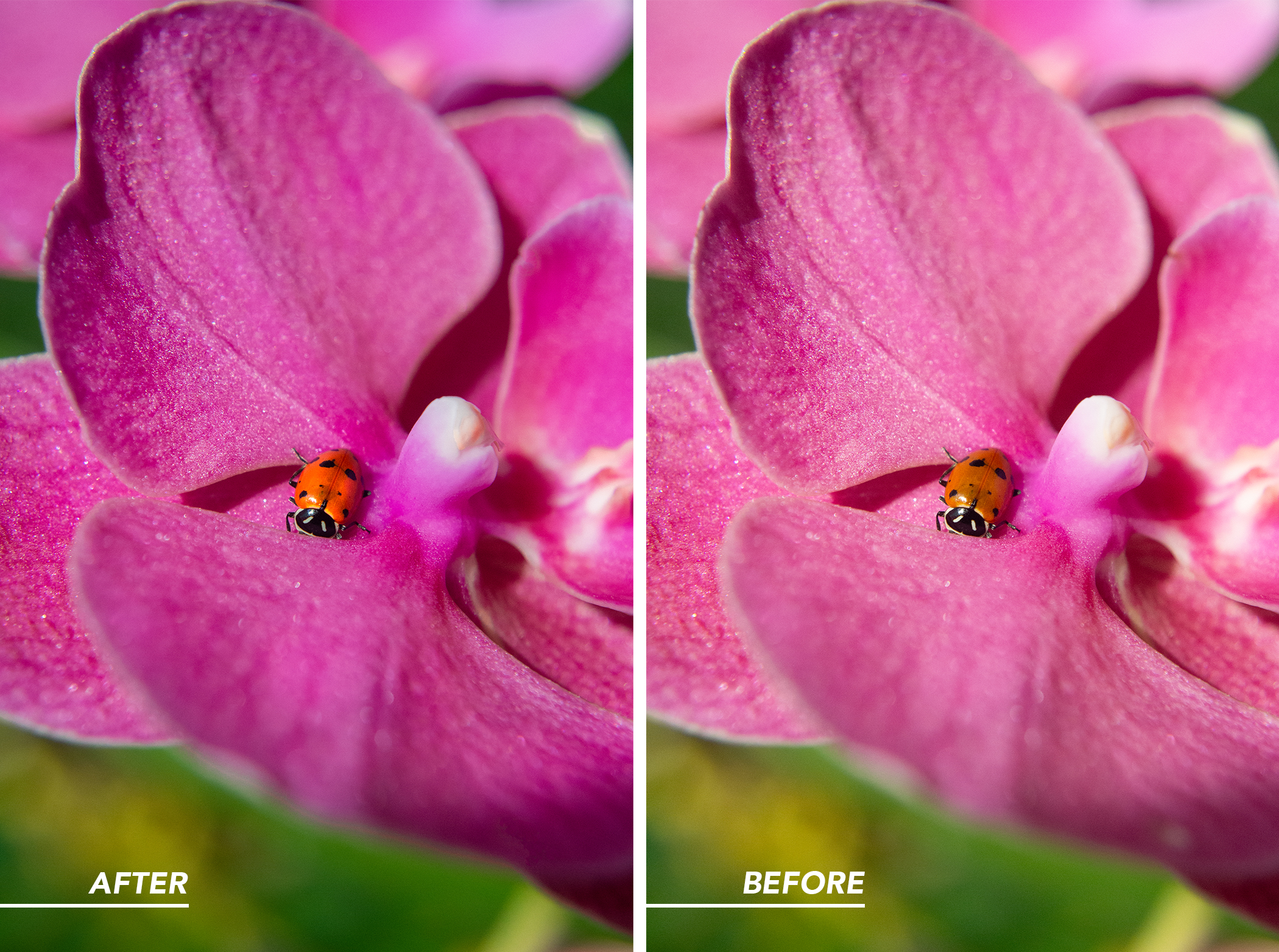
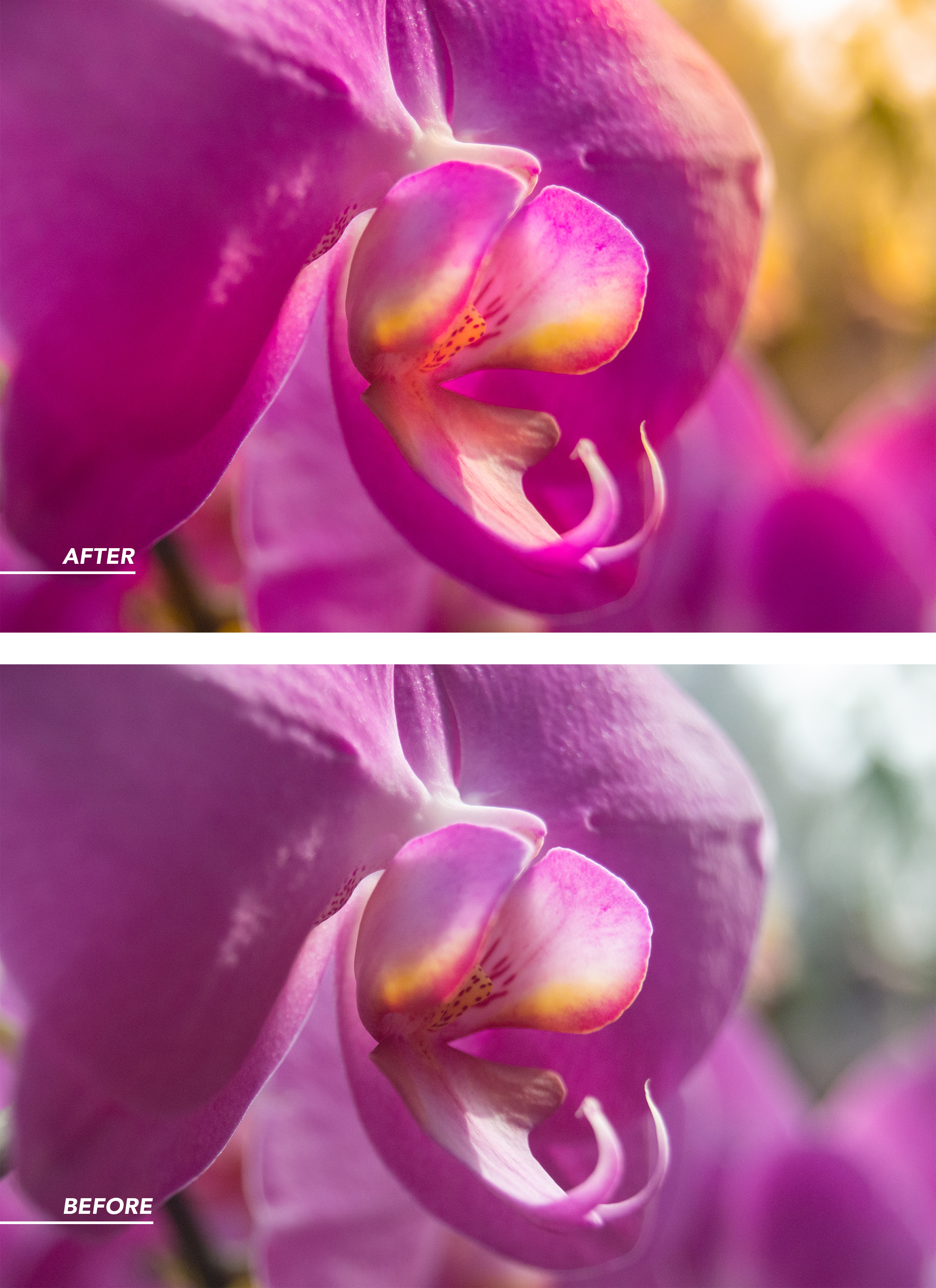
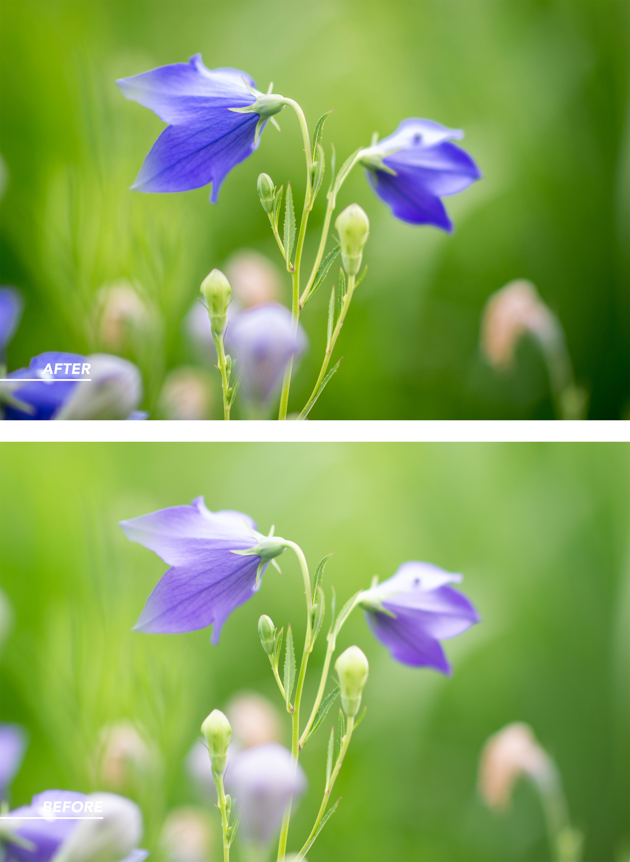
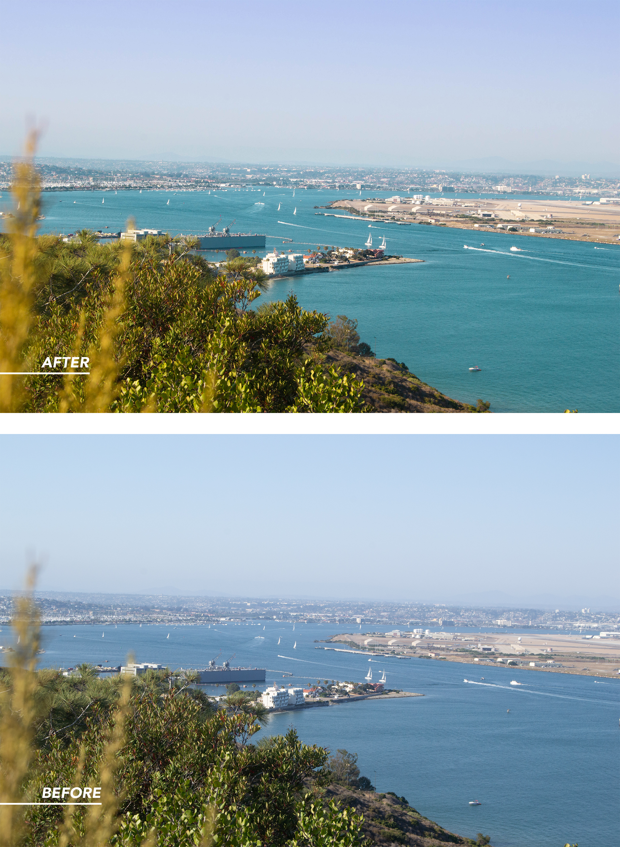
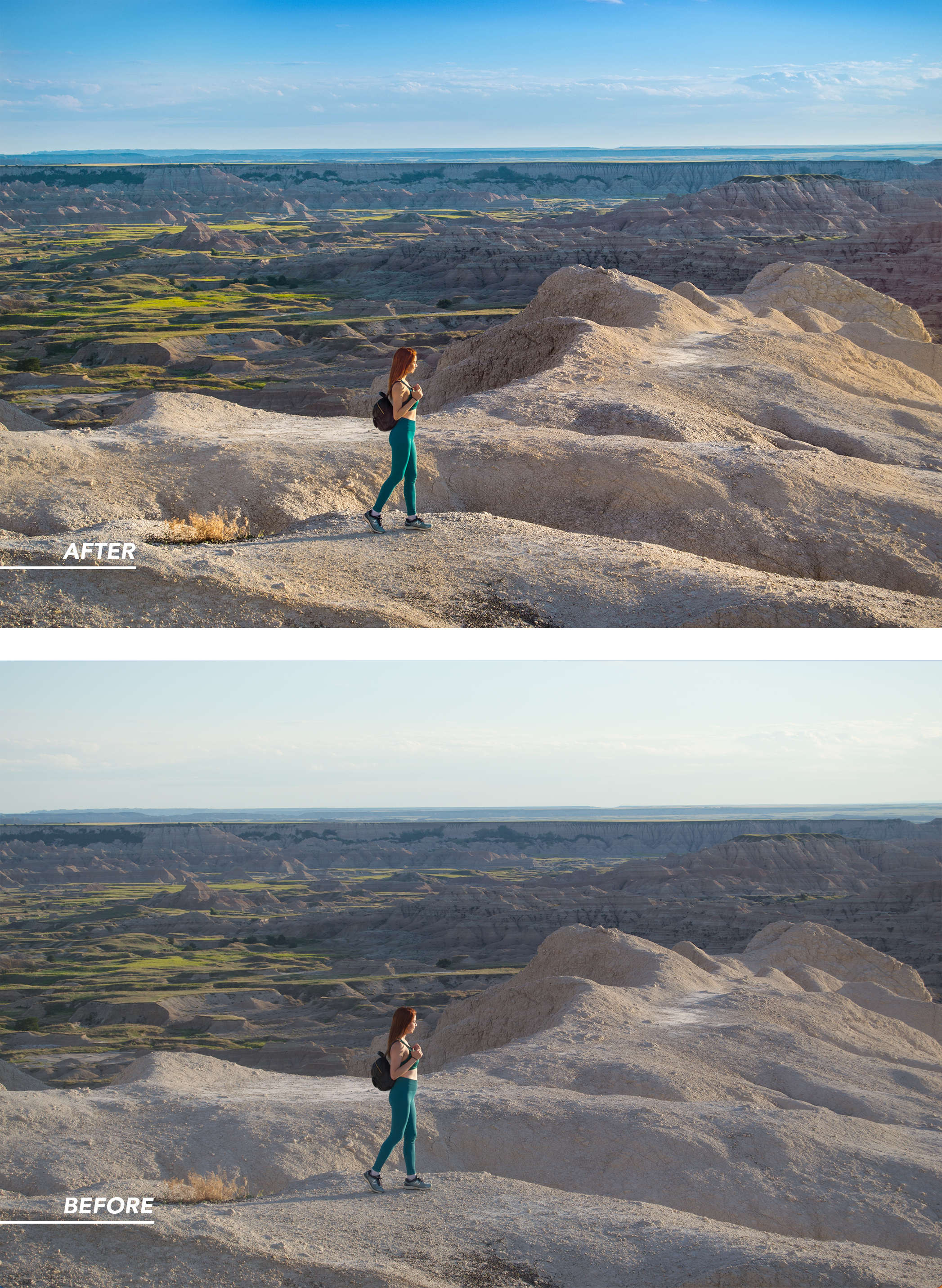
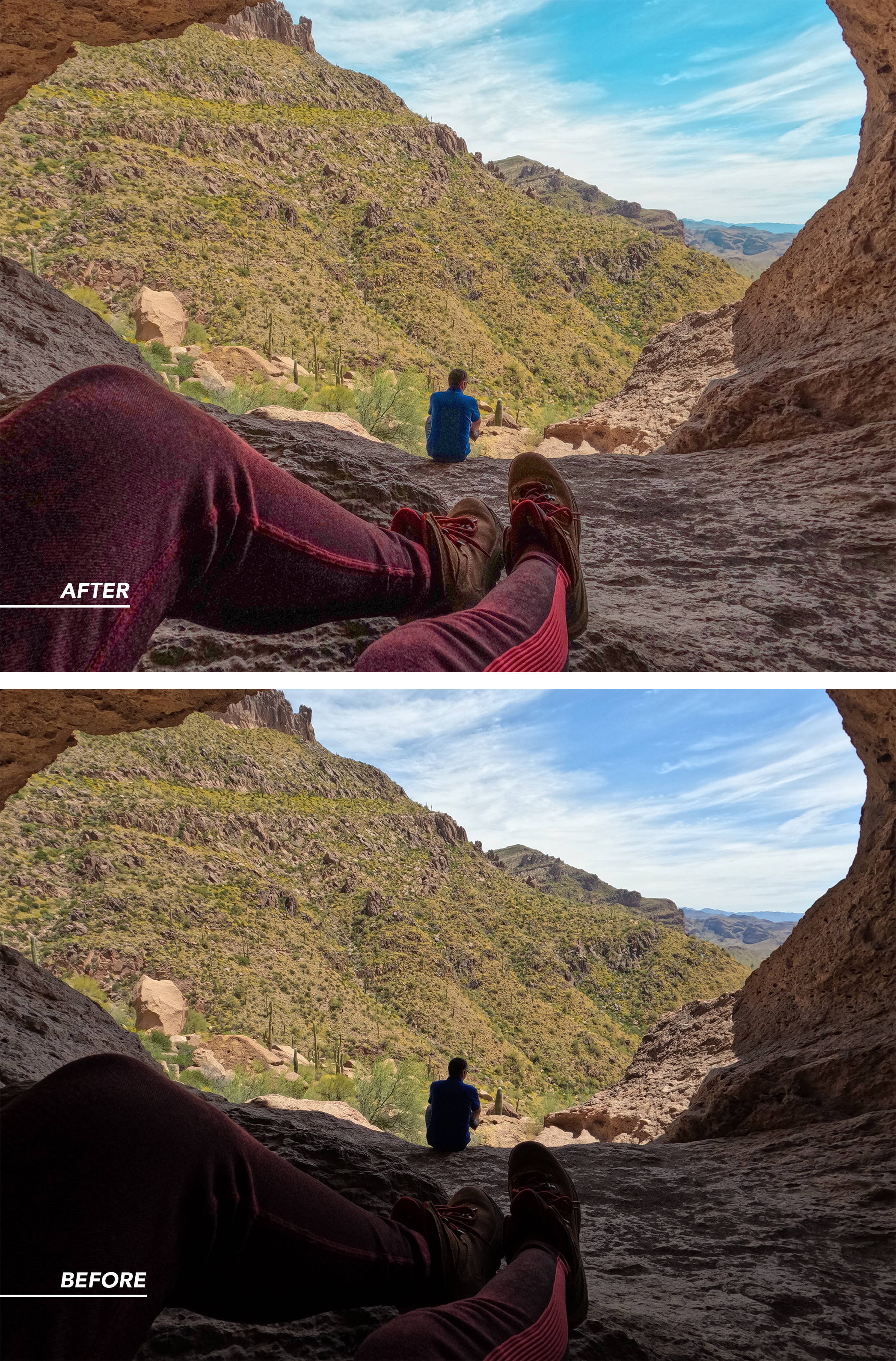
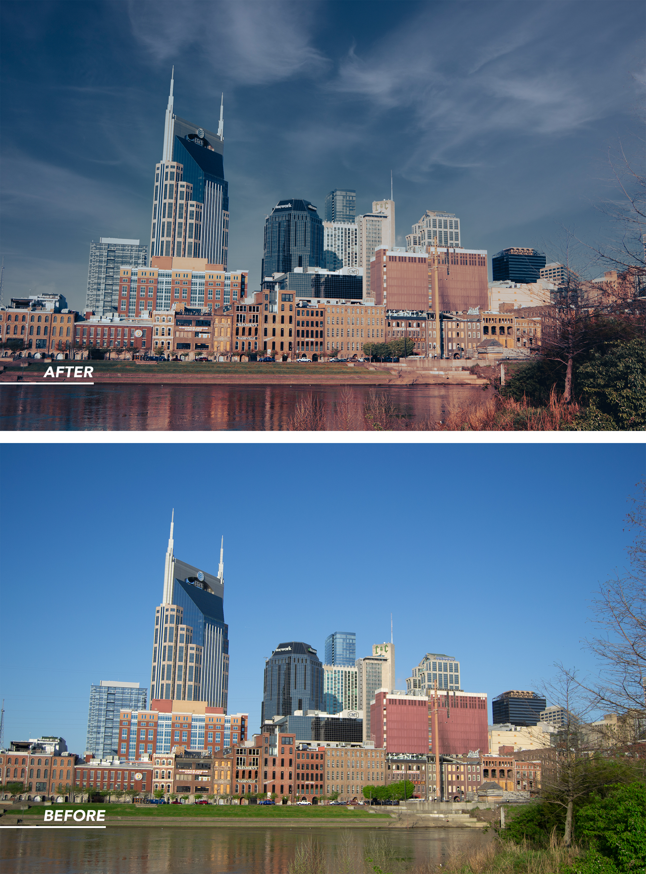
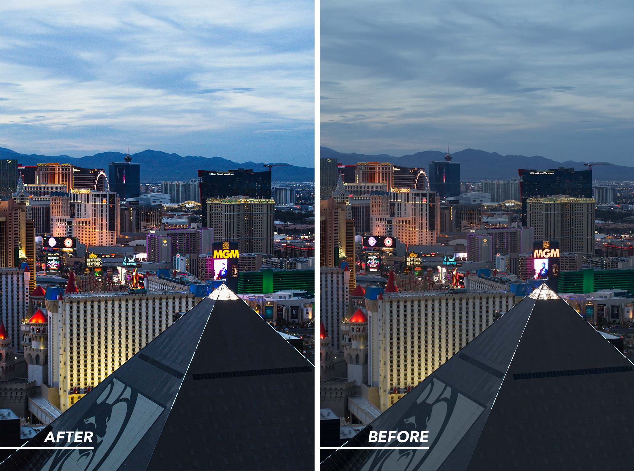
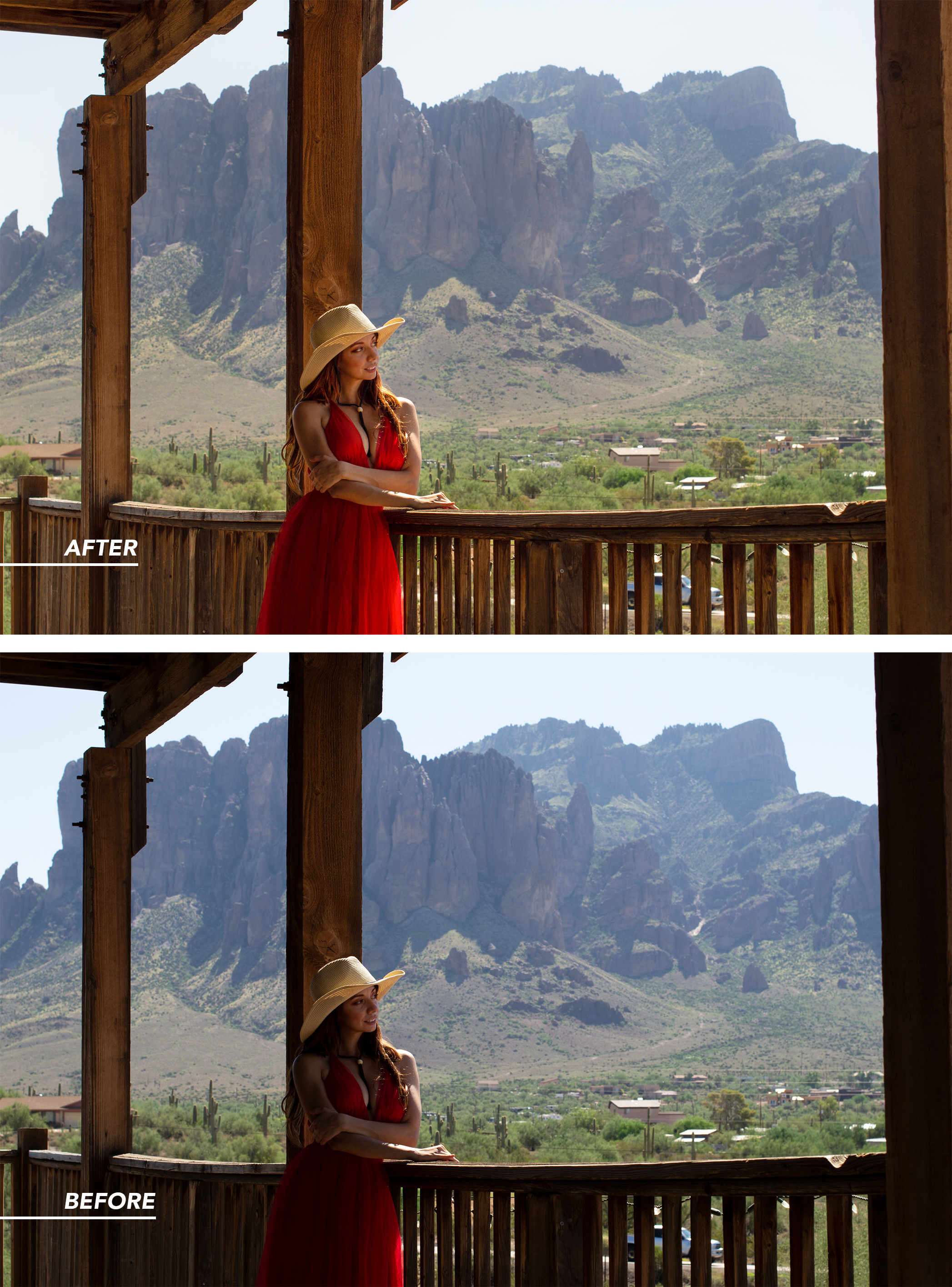
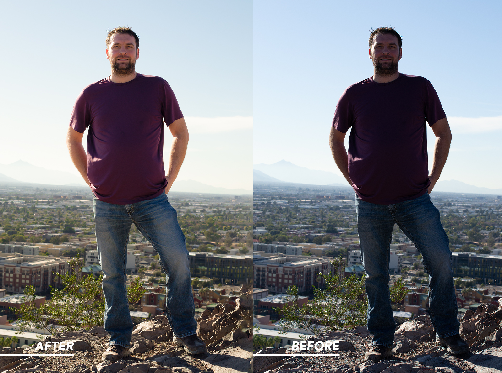
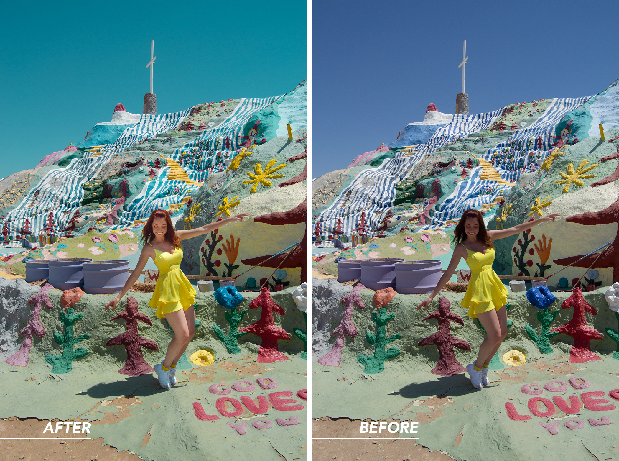
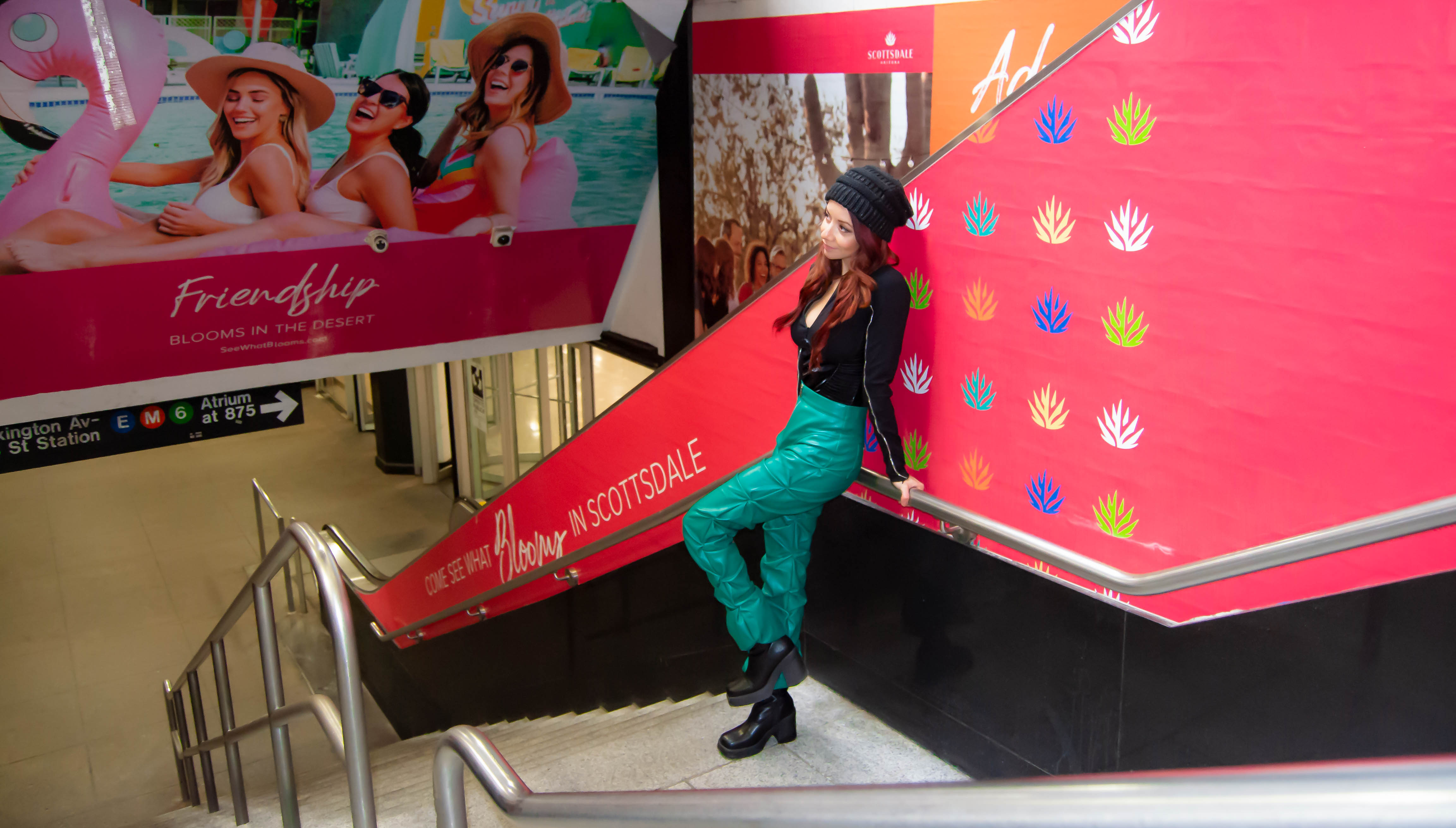
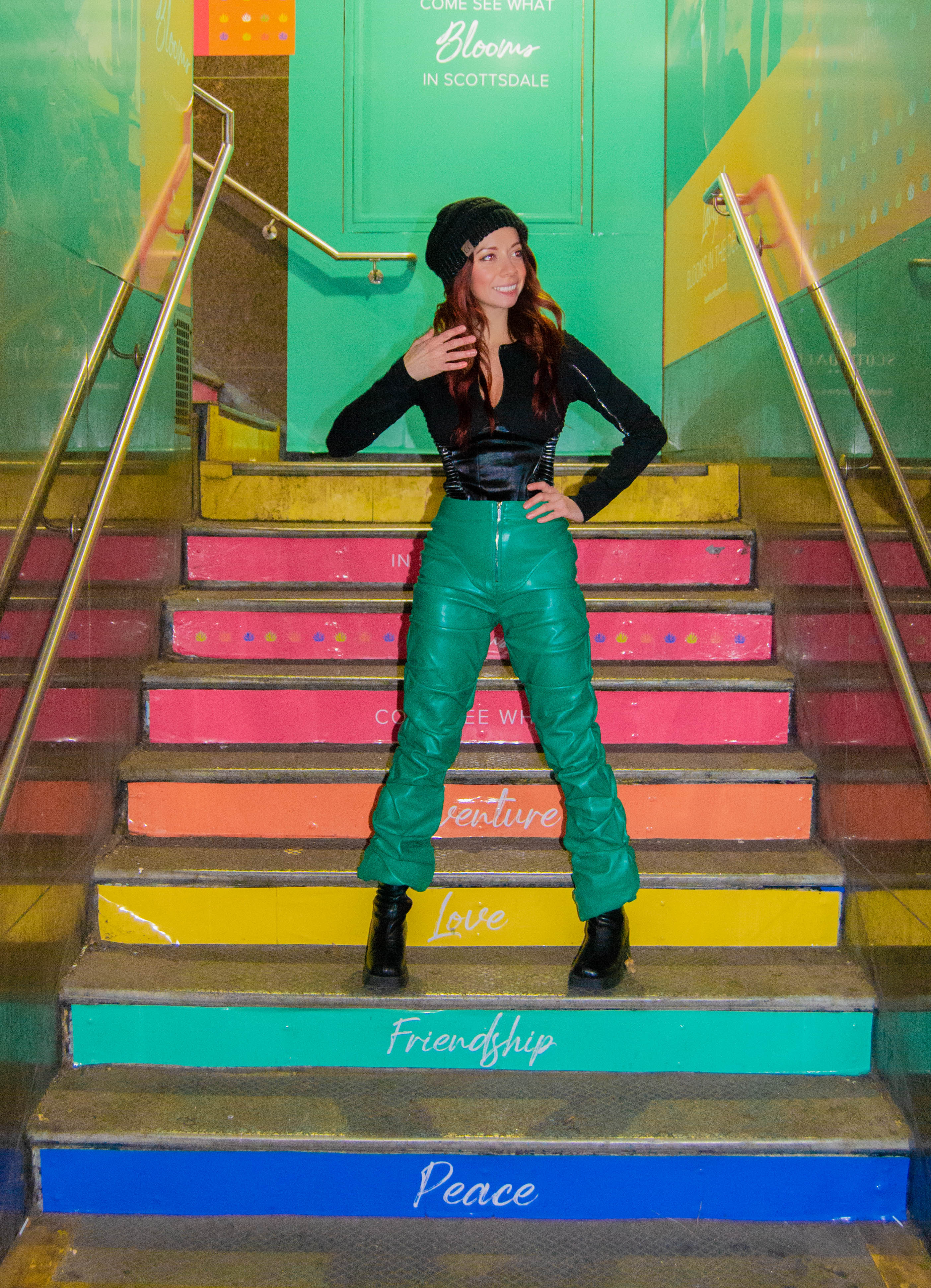
Compilation of my photo edits, photography and photo art directing the pictures where I am in the portrait.
